Category

Magazine

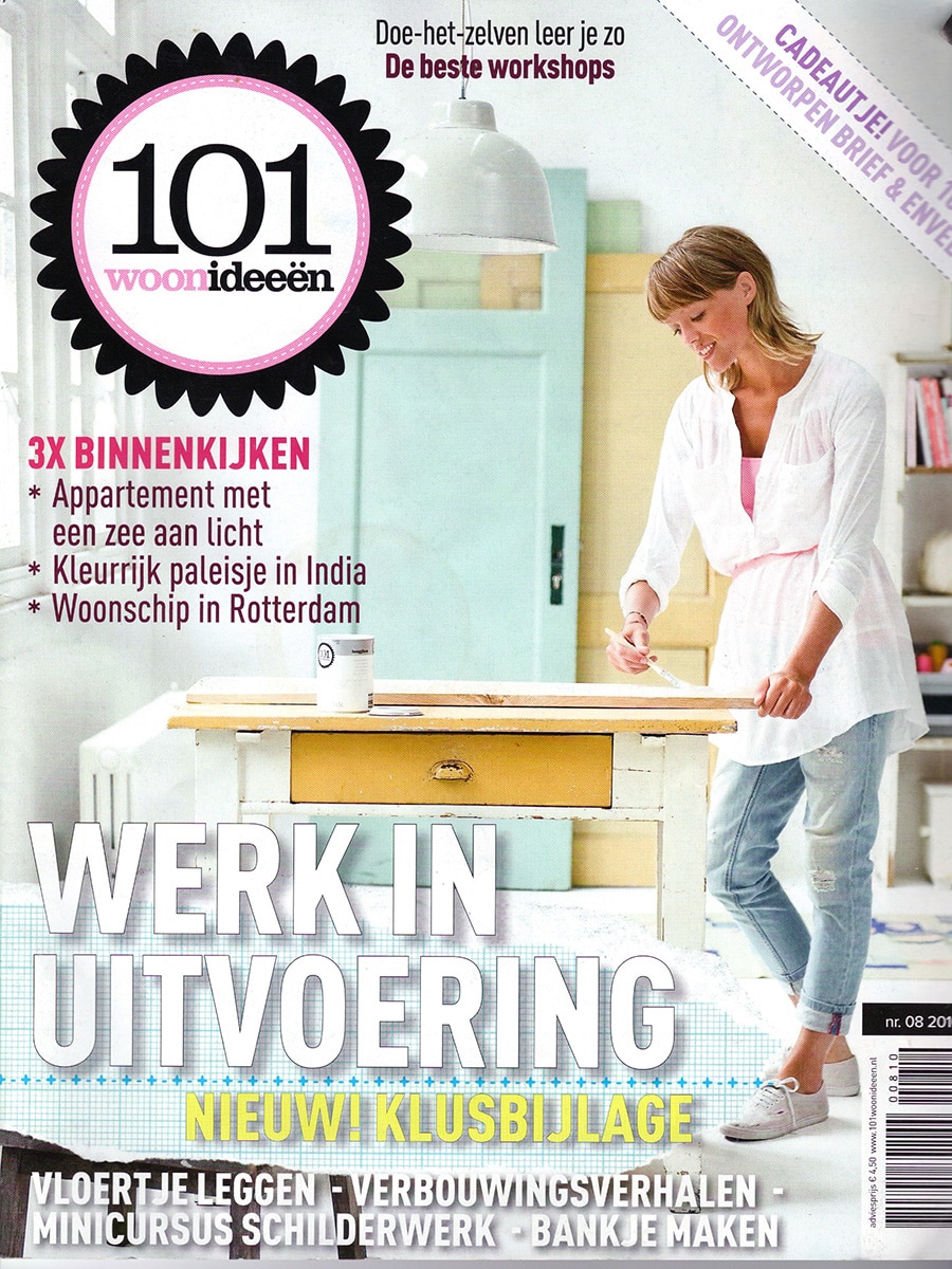
101 Home Decor Ideas

By Magazine

101 Woonideeën – Reflections by Karin van der Zanden

Dutch Interior Magazine Highlights Reflections as Contemporary Design News

Published in 101 Woonideeën, August 2010

Dutch interior magazine 101 Woonideeën featured Reflections, the sculptural vase collection designed by Karin van der Zanden, in its design news section highlighting noteworthy contemporary products for the home.

Presented among a selection of furniture, lighting, and accessories, Reflections was recognized for its striking geometric appearance and highly reflective surface. The publication emphasized the way the faceted forms interact with light, giving the vases a constantly changing visual character.

Reflections

Reflections is a collection of stainless steel vases that transforms surrounding light and space into part of the design itself.

Constructed from precisely folded metal surfaces, each vase consists of multiple geometric facets that capture and mirror their environment. The result is an object that appears different from every angle, creating an ever-changing play of reflections and highlights.

The collection balances sculptural presence with everyday functionality.

A Study in Light and Reflection

The name Reflections refers directly to the central idea behind the design.

Rather than decorating the surface, the polished stainless steel actively reflects its surroundings. Natural daylight, interior lighting, colors, and movement all become part of the visual experience. This interaction ensures that no two moments—and no two interiors—look exactly the same.

The faceted geometry further enhances this effect by breaking reflections into multiple planes.

From Design Academy to International Recognition

As noted in the magazine, Karin van der Zanden developed the collection during her studies at the Design Academy Eindhoven.

The project attracted attention for its combination of architectural geometry and material experimentation. By using reflective stainless steel instead of more traditional vase materials, the design explores the relationship between object, light, and environment in a distinctly contemporary way.

Sculptural Simplicity

Although functional as flower vases, Reflections also works as a standalone decorative object.

Its clean geometric form and mirror-like finish allow it to fit naturally within modern interiors while maintaining a strong visual identity. Whether displayed individually or as a group, the collection creates a subtle dialogue with the surrounding space.

Product Information

Product: Reflections
Designer: Karin van der Zanden
Brand: STUDIObloomm / Bloomming
Category: Vase Collection
Material: Chrome-plated stainless steel
Characteristics: Geometric, reflective, sculptural

Publication Details

Publication: 101 Woonideeën
Country: The Netherlands
Issue: August 2010
Section: Nieuws (Design News)
Featured Product: Reflections
Designer: Karin van der Zanden
Brand: STUDIObloomm / Bloomming


Original publication summary

“101 Woonideeën featured Reflections by Karin van der Zanden, a collection of faceted stainless steel vases whose mirrored surfaces interact with light and surroundings. The geometric forms create changing reflections, making each vase appear different from every viewing angle.”

Smartlife

By Magazine

Is That the Time? No, Really, Is It?

Published in SmartLife Magazine

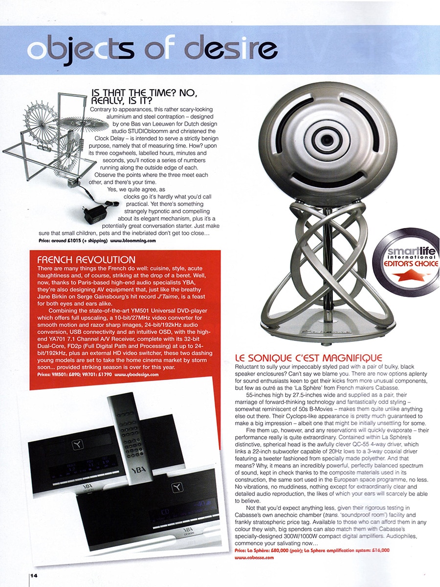
Among the products featured in SmartLife’s Objects of Desire section was Clock Delay, a sculptural clock designed by Bas van Leeuwen for Dutch design studio STUDIOBloomm.

The magazine highlighted the unusual appearance of the design, describing it as a striking aluminum and steel object that looks more like a kinetic sculpture than a traditional clock.

A Different Way of Reading Time

Clock Delay was created to challenge conventional expectations of how a clock should function and appear.

Instead of using traditional hands and a dial, the design displays time through three rotating cogwheels representing hours, minutes and seconds. Numbers run along the outer edge of each wheel, and the current time is determined by observing the point where the three indicators align.

The result is a clock that transforms the act of telling time into an engaging visual experience.

Technology as Sculpture

While the publication humorously acknowledged that Clock Delay is not the most practical way to read the time, it praised the design for its hypnotic quality and elegant mechanical appearance.

The exposed mechanism invites viewers to observe the movement of time itself rather than simply reading a number from a display. In doing so, the clock becomes both a functional object and a conversation piece.

According to the magazine, the design possesses a compelling presence that encourages people to stop, look and interact with it.

International Recognition

Clock Delay was featured as one of the magazine’s selected design objects and was presented alongside high-end audio equipment and luxury lifestyle products.

The publication described the clock as a memorable and distinctive design that stands apart from conventional timepieces through its exposed mechanics and sculptural character.

About Clock Delay

Product: Clock Delay
Designer: Bas van Leeuwen
Studio: STUDIOBloomm (later Bloomming)
Materials: Aluminum and steel
Function: Clock displaying time through three rotating cogwheels representing hours, minutes and seconds
Price at publication: Approximately £1,015 plus shipping
Website: www.bloomming.com

Publication Details

Publication: SmartLife Magazine
Section: Objects of Desire
Featured designer: Bas van Leeuwen
Company: STUDIOBloomm
Featured product: Clock Delay
Topics: Product design, kinetic design, clocks, exposed mechanics, Dutch design

Beau Monde

By Magazine

Beau Monde – Facet by Bloomming

Dutch Lifestyle Magazine Features Facet in a Rising Culinary Destination

Published in Beau Monde, January 2011

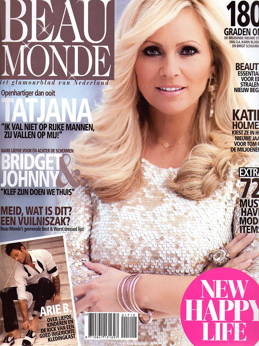
Dutch lifestyle magazine Beau Monde featured Facet, the modular room divider designed by Mireille Meijs and Bas van Leeuwen for Bloomming, in its culinary guide to the most promising restaurant destinations of 2011.

The publication highlighted Restaurant Le Défi in Sprang-Capelle as one of the Netherlands’ rising gastronomic stars and showcased Facet as an integral part of the restaurant’s interior. The sculptural divider appears in the dining room, where it subtly separates spaces while preserving openness and light.

Facet

Facet is a modular room divider composed of individually rotatable geometric elements.

Each module can be adjusted independently, allowing users to create unique patterns of transparency, light, and privacy. The result is a dynamic architectural surface that continuously changes appearance depending on the viewing angle and the position of the individual facets.

Unlike traditional partitions, Facet creates separation without completely closing off a space, making it particularly suited to hospitality environments.

Creating Atmosphere Through Space

Restaurants rely on carefully balanced atmospheres. Guests often appreciate a sense of intimacy while still feeling connected to the surrounding environment.

Facet addresses this challenge by dividing spaces visually rather than physically. The semi-transparent structure filters views, softens sightlines, and creates distinct zones within larger interiors while maintaining an open and welcoming character.

Design for Hospitality Interiors

The installation at Restaurant Le Défi demonstrates how Facet can contribute to a refined dining experience.

Its geometric pattern introduces visual interest while the adjustable modules allow the degree of openness to be tailored to the space. The divider functions simultaneously as an architectural element, a decorative feature, and a practical tool for defining areas within the restaurant.

Product Information

Product: Facet
Designers: Mireille Meijs & Bas van Leeuwen
Brand: Bloomming
Category: Modular Room Divider
Material: High-quality synthetic material with stainless steel suspension system
Feature: Individually rotatable modules for adjustable transparency and privacy

Design Meets Fine Dining

By appearing in one of the Netherlands’ leading lifestyle magazines, Facet reached an audience interested not only in design, but also in luxury experiences, hospitality, and contemporary living.

The feature demonstrated how thoughtful interior design can enhance the atmosphere of a restaurant and contribute to the overall guest experience without compromising openness or natural light.

Publication Details

Publication: Beau Monde
Country: The Netherlands
Issue: January 2011
Section: Culinair
Featured Product: Facet
Designers: Mireille Meijs & Bas van Leeuwen
Brand: Bloomming
Location Featured: Restaurant Le Défi, Sprang-Capelle


Original publication summary

“Beau Monde featured Restaurant Le Défi as one of the Netherlands’ rising culinary destinations. The accompanying interior photograph showcased Facet by Bloomming, a modular room divider that creates elegant separation within the dining space while maintaining openness, light, and visual connection.”

Excellent

By Magazine

Excellent – Leven & Wonen (Eindhoven Edition) — Winter 2009

Lightfacet featured in a trend report on timeless interiors

In the Winter 2009 edition of Excellent – Leven & Wonen, Lightfacet was featured in a curated shopping and interior trends section titled “Tijdloos sfeervol” (Timeless atmosphere). The article explored the enduring appeal of monochrome interiors, highlighting how white, gray, and black continue to create elegant and sophisticated living environments.

Timeless atmosphere

The feature focused on products that embrace simplicity, strong silhouettes, and refined patterns. Rather than following short-lived trends, the selected objects demonstrated how carefully chosen design pieces can create a lasting sense of style and harmony within the home.

Among decorative accessories, furniture, and homeware, Lightfacet was presented as a striking architectural element that brings both visual interest and practical functionality to an interior.

A room divider shaped by light and pattern

The magazine described Lightfacet as a room divider composed of interconnected diamond-shaped modules that can each be opened or closed individually. This allows users to create changing patterns throughout the surface while adjusting the balance between openness and privacy.

Its geometric appearance perfectly complemented the article’s theme of monochrome elegance, where texture, shadow, and form take center stage.

Design that evolves with the space

Unlike conventional partitions, Lightfacet was presented as an interactive interior element. By rotating individual facets, users can continuously transform the appearance of the divider, creating unique compositions that respond to changing needs and lighting conditions.

The result is a room divider that functions not only as a spatial separator, but also as a sculptural design object.

Publication details

Publication: Excellent – Leven & Wonen (Eindhoven Edition)
Date: Winter 2009
Article title: Tijdloos sfeervol
Section: Shop
Product: Lightfacet
Designers: Bas van Leeuwen & Mireille Meijs
Company: Bloomming

Featured description

The magazine described Lightfacet as a room divider consisting of interconnected diamond-shaped plastic elements that can each be opened or closed individually. The design allows users to create ever-changing patterns while introducing structure, privacy, and visual rhythm into a space.

Why this feature mattered

Excellent positioned Lightfacet within a broader interior trend focused on timeless design rather than seasonal fashion. By featuring the divider alongside carefully selected lifestyle products, the magazine highlighted Lightfacet’s ability to function simultaneously as architecture, decoration, and a flexible spatial solution—qualities that would become central to Bloomming’s design philosophy.

Zuiderlucht

By Magazine

Design from the Cradle

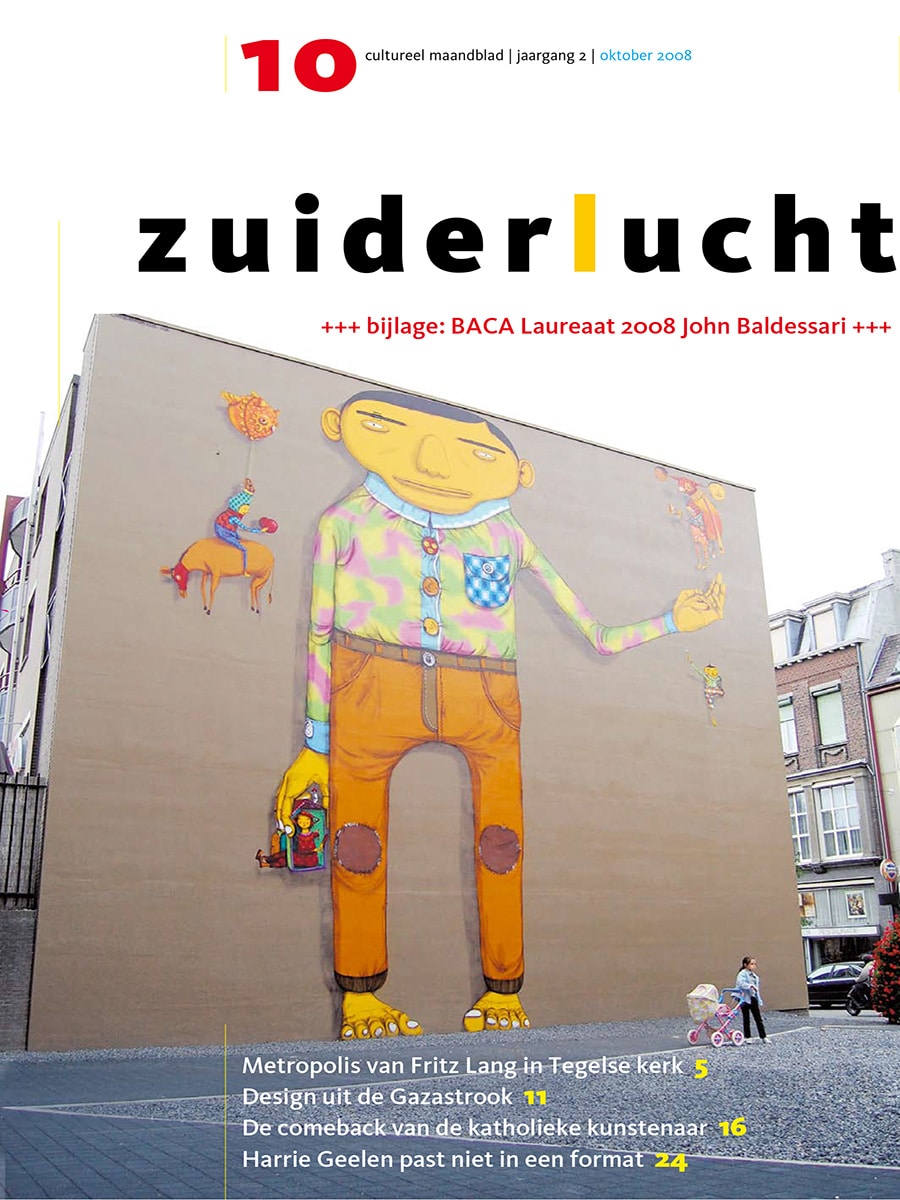
Published in Zuiderlucht, October 2008

In October 2008, sustainability was a major theme at both Dutch Design Week in Eindhoven and Interieur Kortrijk in Belgium. Designers, architects, and thought leaders explored how products could be created with greater consideration for resources, reuse, and longevity.

One of the concepts receiving considerable attention at the time was Cradle to Cradle, developed by Michael Braungart and William McDonough. Rather than creating products that eventually become waste, the philosophy promotes designs in which materials can be continuously reused.

Delay by Bloomming

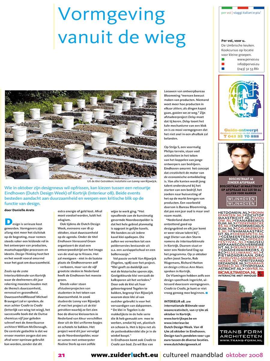
At Dutch Design Week, designer Bas van Leeuwen presented Delay, a project developed through Bloomming.

The project originated from a simple observation:

“Nobody knows anymore how products are put together; if they break, we simply throw them away.”

With Delay, Van Leeuwen sought to restore appreciation for technology and craftsmanship. Instead of concealing the mechanics of a clock behind a traditional dial, the design exposes its inner workings and turns the mechanism itself into the focal point.

By revealing how time is measured, Delay encourages users to engage with the object, understand its operation, and develop a stronger connection with the product. The project reflects Bloomming’s belief that thoughtful design can create lasting value and help reduce our throwaway mentality.

Eindhoven’s Creative Ecosystem

The article also highlighted Eindhoven’s growing reputation as a center for design and innovation. Through initiatives at Strijp-S and Dutch Design Week, young designers and entrepreneurs were supported in developing products, launching businesses, and bringing new ideas to market.

Bloomming was mentioned as one of the emerging creative companies contributing to this movement.

According to Bas van Leeuwen:

“The Netherlands remains exceptionally strong in design. Every year new talent emerges.”

About Delay

Delay transforms the traditional clock into a sculptural object that celebrates technology rather than hiding it. By exposing the mechanism behind the passage of time, the design invites reflection on how products are made and how we interact with them.

The project became an early example of Bloomming’s interest in sustainability, product longevity, and creating meaningful connections between people and the objects that surround them.

Publication Details

Publication: Zuiderlucht
Issue: October 2008
Featured designer: Bas van Leeuwen
Company: Bloomming
Featured project: Delay
Topics: Dutch Design Week, sustainability, Cradle to Cradle, product design, Eindhoven

Lourens

By Magazine

Lourens Magazine – Reflections by Bloomming

Dutch Lifestyle Magazine Features Bloomming’s Sculptural Steel Vases

Published in Lourens Magazine, Winter 2010

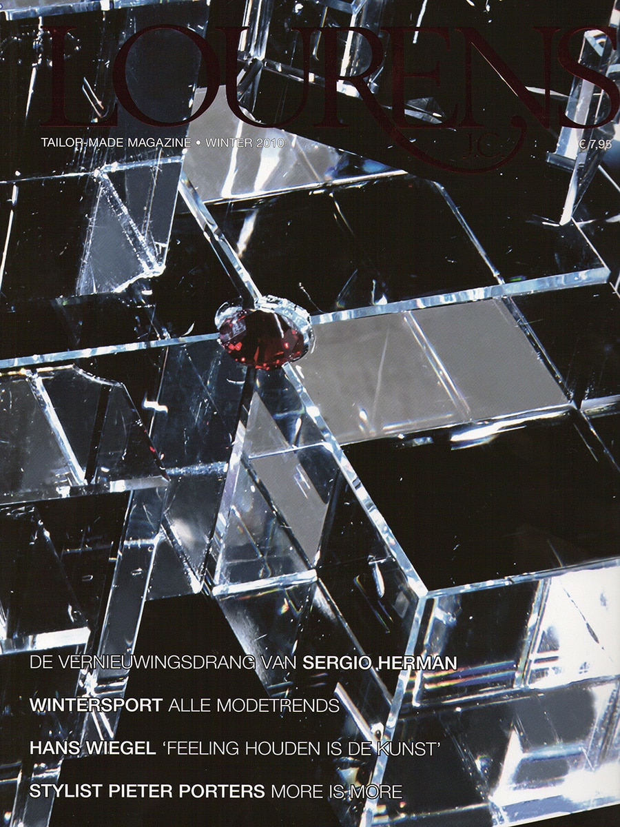
Dutch lifestyle publication Lourens Magazine featured Reflections, the sculptural vase collection designed by Mireille Meijs for Bloomming, in its home and interior design section.

Presented alongside a curated selection of luxury home accessories and contemporary design objects, Reflections was highlighted for its distinctive geometric form and architectural appearance.

Reflections

Reflections transforms the traditional vase into a sculptural object.

Crafted from folded stainless steel, the design consists of faceted surfaces that create constantly changing reflections of light and surroundings. The angular geometry gives the vases a strong architectural presence while maintaining an elegant and minimalist character.

Even when not holding flowers, the objects function as standalone design pieces that interact with their environment through reflection, shadow, and perspective.

Inspired by Geometry

The design language of Reflections reflects Bloomming’s ongoing exploration of faceted forms, geometry, and spatial perception.

Each surface captures and reflects its surroundings differently, causing the appearance of the vase to change depending on the viewer’s position and the available light. This dynamic quality gives the object a sense of movement despite its static form.

Functional Sculpture

While fully functional as flower vases, Reflections was designed to blur the boundary between product design and sculpture.

The folded metal construction creates a striking silhouette that draws attention whether displayed individually or as a pair. The design demonstrates how everyday objects can become architectural elements within an interior.

Product Information

Product: Reflections
Designer: Mireille Meijs
Brand: Bloomming
Category: Vase / Decorative Object
Material: Stainless steel
Finish: Brushed metal
Design: Faceted geometric construction

International Design Language

Reflections formed part of a broader collection of geometric designs developed by Bloomming during this period. The project explored themes of light, reflection, and form that would later become central to many of the studio’s internationally published works.

The feature in Lourens Magazine positioned Reflections within a growing movement of contemporary Dutch design characterized by experimentation, craftsmanship, and architectural thinking.

Publication Details

Publication: Lourens Magazine
Country: The Netherlands
Issue: Winter 2010
Section: Home Sweet Home
Featured Product: Reflections
Designer: Mireille Meijs
Brand: Bloomming


Original publication summary

“Lourens Magazine featured Reflections by Bloomming in its home design section, describing the collection as striking steel vases. Designed by Mireille Meijs, the faceted objects combine geometric form, reflective surfaces, and sculptural presence, transforming a functional vase into an architectural design piece.”

Vogue

By Magazine

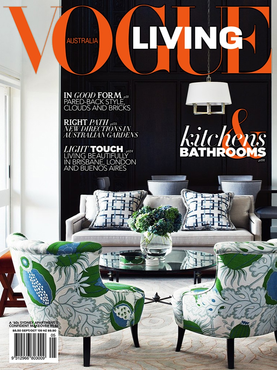
Vogue Living Australia — September / October 2009

Lightfacet Featured in Vogue Living’s Exploration of Buckminster Fuller’s Legacy

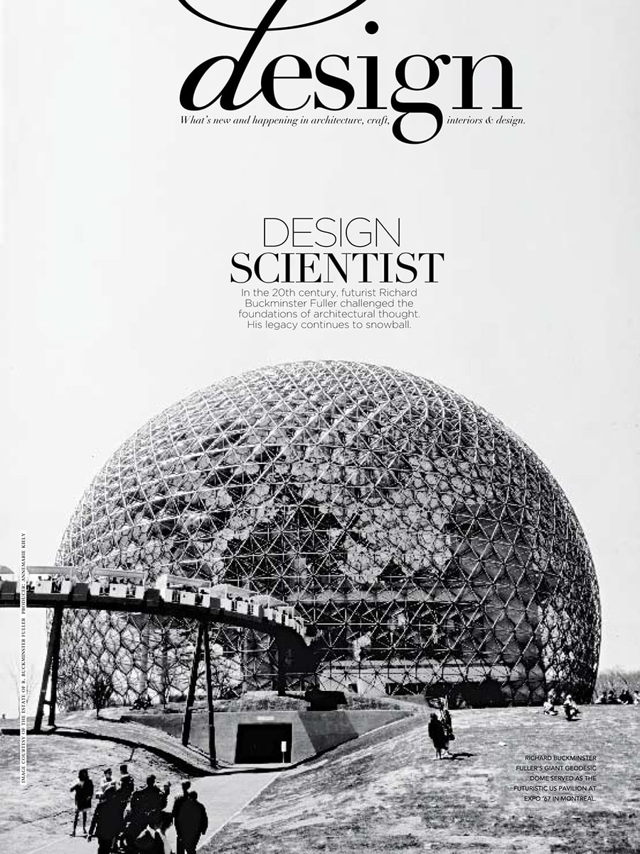
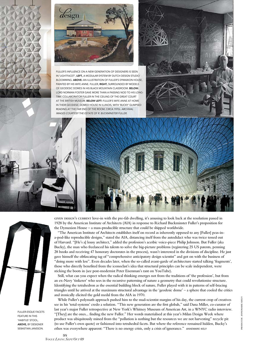
In the September/October 2009 issue of Vogue Living Australia, Lightfacet was featured in a major editorial examining the lasting influence of visionary architect, inventor, and futurist Richard Buckminster Fuller. The article, titled “Design Scientist”, explored how Fuller’s ideas continue to inspire contemporary designers, architects, and makers around the world.

A New Generation Inspired by Fuller

The article traced the impact of Fuller’s work on modern design, from geodesic domes and lightweight structures to contemporary products influenced by geometric systems and modular thinking. According to the magazine, a new generation of designers was rediscovering Fuller’s ideas and translating them into products that combine efficiency, flexibility, and visual innovation.

Lightfacet was selected as one of the examples illustrating this continuing influence.

Geometry as a Design Language

Within the feature, Lightfacet was presented as a modular room divider by Dutch design studio Bloomming. The publication highlighted the design’s repeating geometric structure and its ability to transform space through a system of interconnected triangular and diamond-shaped elements.

Much like Fuller’s fascination with geometric principles as building blocks of nature, Lightfacet uses a simple modular element to create larger architectural compositions that can adapt to different environments and requirements.

Beyond Decoration

Rather than functioning solely as a decorative screen, Lightfacet was featured as an example of design that actively engages with space, light, and human interaction. By rotating individual facets, users can continuously alter transparency, visibility, and pattern, creating a dynamic relationship between openness and privacy.

This adaptability reflected many of the principles celebrated throughout the article: efficiency, modularity, and intelligent use of structure.

Publication Details

Publication: Vogue Living Australia
Issue: September / October 2009
Article title: Design Scientist
Section: Design
Product: Lightfacet
Designers: Bas van Leeuwen & Mireille Meijs
Company: Bloomming

Featured Mention

The article noted that the influence of Buckminster Fuller on a new generation of designers could be seen in “Lightfacet, a modular system by Dutch design studio Bloomming.” The design was presented alongside examples of Fuller’s work and contemporary interpretations of his geometric thinking.

Why This Feature Mattered

Being featured in Vogue Living Australia placed Lightfacet within an international design conversation rather than solely an interior design context. Instead of focusing on its function as a room divider, the magazine positioned the design within a broader architectural and conceptual framework, connecting it to the ideas of one of the twentieth century’s most influential design thinkers.

The feature underscored how Lightfacet embodies principles of modularity, adaptability, and geometric innovation—qualities that continue to define the design today.

And Mag

By Magazine

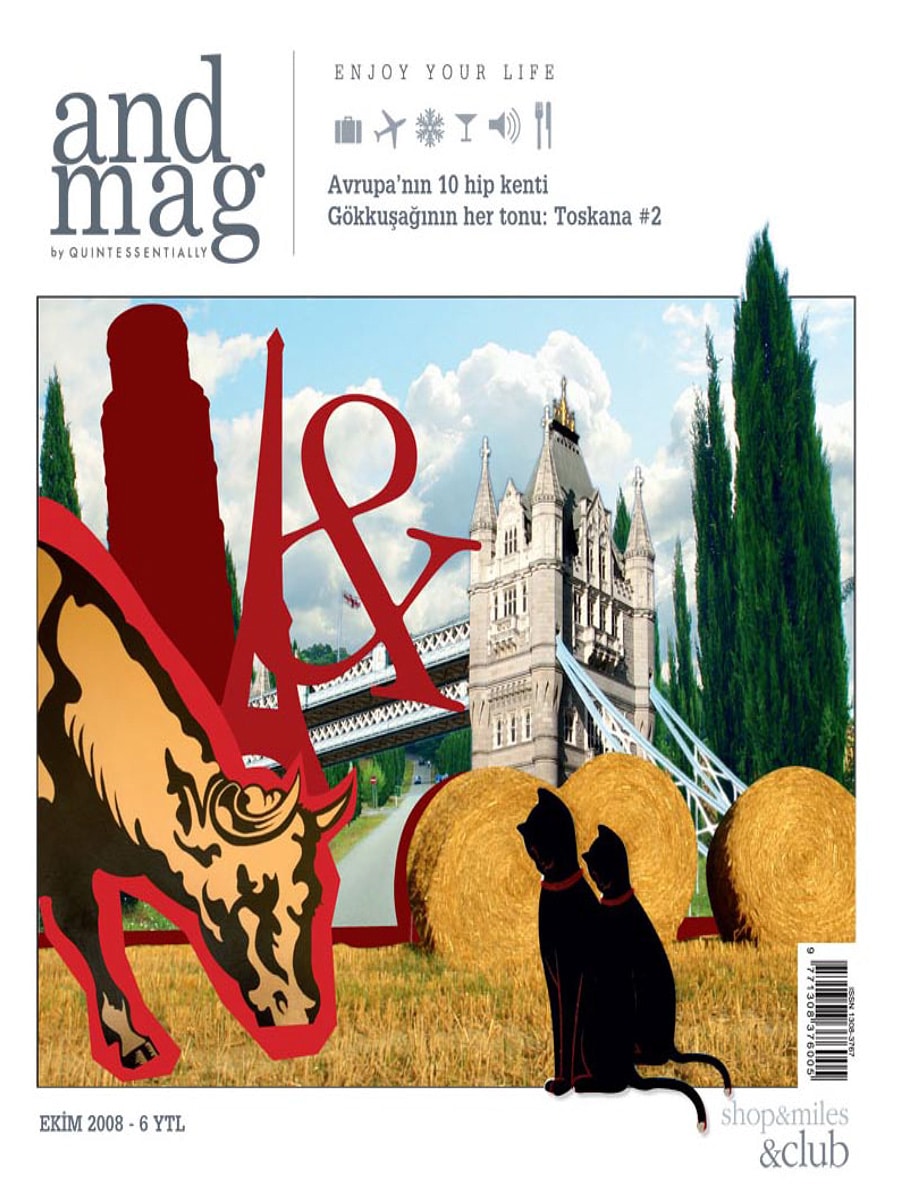
Andmag – Clock Delay by Bloomming

Turkish Lifestyle Magazine Highlights an Unconventional Dutch Clock

Published in Andmag, October 2008

Turkish lifestyle magazine Andmag featured Clock Delay, the experimental clock designed by Bas van Leeuwen for Dutch design studio STUDIObloomm (later Bloomming), in its design and trend section.

The publication presented Clock Delay as an innovative response to a modern culture of consumption, drawing attention to the clock’s exposed mechanics and unconventional way of displaying time.

Clock Delay

Clock Delay challenges the familiar image of a clock.

Rather than relying on traditional hands and a printed dial, the design uses three separate rotating wheels that represent:

  • Hours
  • Minutes
  • Seconds

The current time is revealed at the point where the three wheels intersect. This unusual approach transforms the act of reading time into a more conscious and engaging experience.

Constructed from stainless steel and aluminum, the clock exposes the mechanical process normally hidden inside conventional timepieces.

Design Inspired by a Throwaway Society

According to the article, the concept behind Clock Delay emerged from the observation that many products are purchased, used, and discarded without any appreciation for how they work.

The designers sought to counter this tendency by creating an object that celebrates technology and mechanical ingenuity rather than concealing it.

By making the movement visible, Clock Delay encourages people to reconnect with the fascination of mechanisms and craftsmanship.

No Clock Hands Required

One of the most distinctive features of Clock Delay is the complete absence of traditional clock hands.

Instead, the interaction between the rotating gears becomes the display itself. The time is determined by observing where the hour, minute, and second wheels meet.

This unconventional method gives the clock a sculptural presence while maintaining its practical function.

Design as Conversation

More than a tool for measuring time, Clock Delay was conceived as a conversation piece.

Its exposed structure, moving components, and industrial appearance invite curiosity and encourage viewers to spend time understanding how the object works. The design rewards observation, making the passage of time visible in a way that conventional clocks rarely do.

Product Information

Product: Clock Delay
Designer: Bas van Leeuwen
Studio: STUDIObloomm / Bloomming
Materials: Stainless steel and aluminum
Dimensions: Approximately 35 × 35 × 48 cm
Category: Clock / Kinetic Sculpture

International Recognition

The appearance in Andmag contributed to the growing international attention Clock Delay received during 2008 and 2009. The project was featured in publications across Europe, North America, and Asia and became one of Bloomming’s most widely published early designs.

The clock’s combination of mechanical honesty, conceptual thinking, and sculptural aesthetics resonated with editors looking for products that challenged conventional expectations.

Publication Details

Publication: Andmag
Country: Turkey
Issue: October 2008
Section: Trend
Featured Product: Clock Delay
Designer: Bas van Leeuwen
Studio: STUDIObloomm / Bloomming


Original publication summary

“Clock Delay is an unusual clock that displays hours, minutes, and seconds on three separate rotating wheels. Designed in stainless steel and aluminum, it was created as a response to a culture in which products are bought, used, and discarded without appreciation for the technology behind them.”

IDN

By Magazine

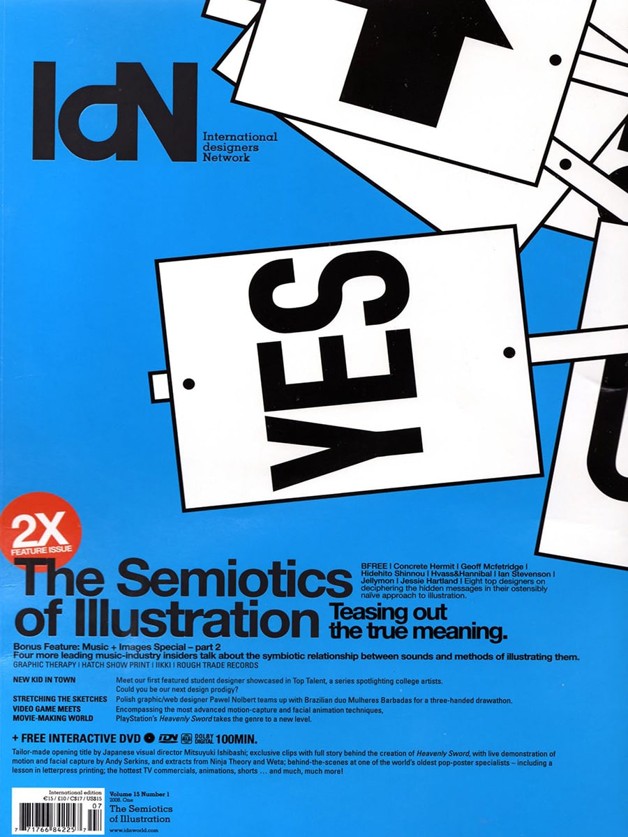
IdN – International Designers Network, Volume 15 Number 1, 2008

IdN (International Designers Network) is a Hong Kong-based international design magazine founded in 1992, distributed across more than 40 countries and widely regarded as one of the most influential graphic design and visual communication publications in the world. The magazine covers graphic design, illustration, typography, motion graphics, and creative culture, with a strong focus on emerging and established talent from across the global design community. Volume 15 Number 1 (2008) is a double-feature issue covering The Semiotics of Illustration and a Music and Images Special, with a bonus interactive DVD included.

Within this issue, pages 101 to 105 feature a multi-page editorial report on Dutch Design Week 2007, written by Petra von Mel and titled “Dutch Designers Buck Bleak Trend.” The article takes the theme of Dutch Design Week ’07 — “Design Works” — as its starting point, arguing that Dutch designers reject dystopian visions of the future in favor of pragmatic, human-centered, and optimistic approaches to design.

Dutch Designers Buck Bleak Trend – The Article

The feature opens with a bold typographic spread introducing the article’s argument: that while Hollywood and popular culture tend to depict the future as a dark and chaotic place, the designers shown at Dutch Design Week 2007 in Eindhoven demonstrated that design holds the key to an ever-improving quality of life. The article profiles several Dutch designers exhibited at the event, using their work to illustrate the broader character of Dutch design — functional, conceptual, clear, and never over-elaborate, yet always surprising.

Designers featured in the article alongside Bloomming include Michiel van der Kley, whose work is presented at the opening of the piece, and other participants in Dutch Design Week 2007, including Bart Hess and Angela Jansen.

Mireille Meijs and Light Facet

On page 105, the article profiles Mireille Meijs as one of the talented young designers whose work exemplifies the Dutch design spirit. The editorial describes Light Facet as a snowflake-like window shade with a poetic twist, and frames it as Meijs’s response to her instinctive urge to design objects that improve life. The article explains that the inspiration for Light Facet came from a friends’ gathering at her home, where sunlight was pouring through the window. Since she considers sunlight too beautiful to be blocked entirely by ordinary curtains, she developed a product that people can adjust according to how many rays of light they want to enter the room.

The article places Meijs’s design philosophy clearly within its Dutch context. She is quoted describing Dutch design as strongly conceptual, simple, and clear, but always surprising — and noting that compared to other design traditions, Dutch designers tend to be very down-to-earth. The feature characterizes her as a designer who finds solutions for different situations, driven by a desire to make things more beautiful and brighter.

Multiple photographs of Light Facet are shown across the spread, including large-scale installation views showing the product suspended from a ceiling in what appears to be an exhibition setting at Dutch Design Week. The images show visitors interacting with and walking around the installation, conveying the product’s physical scale and its ability to transform an interior space. Close-up photographs show the individual faceted, diamond-shaped leaves in detail, demonstrating how their geometry creates shifting patterns of light and shadow.

Publication Context

The article appears in IdN alongside coverage of Dutch Design Week 2007 as part of a broader editorial interest in the Dutch design scene and its global relevance. The framing of the feature — Dutch designers as optimistic pragmatists who use design to improve everyday life — positions Light Facet and its designer within a wider cultural narrative about the character and international standing of Dutch design.

IdN’s international distribution meant that this feature introduced Mireille Meijs and Light Facet to a readership of graphic designers, creative directors, art directors, and design professionals across Asia, Europe, North America, and beyond — audiences not typically reached by Dutch interior design or architecture publications.

Publication Details

Publication: IdN – International Designers Network
Volume: 15, Number 1
Year: 2008
Article title: Dutch Designers Buck Bleak Trend
Author: Petra von Mel
Pages: 101–105
Product featured: Light Facet room divider / window shade
Designer featured: Mireille Meijs
Company: Bloomming
Context: Dutch Design Week 2007, Eindhoven, the Netherlands
Category: International graphic design and visual culture magazine

Why this feature mattered

IdN’s international reach and its audience of creative professionals across Asia and the wider world made this feature particularly significant for Bloomming. The article placed Light Facet within a serious editorial discussion about the philosophy and character of Dutch design, presenting it not simply as a product but as the outcome of a considered design process rooted in everyday observation and a genuine desire to improve life. Being featured in IdN alongside other notable participants in Dutch Design Week 2007 gave Bloomming visibility in an international creative community well beyond the Netherlands, at a pivotal early stage in the studio’s development.

Leolux Magazine

By Magazine

Leolux Collection 2009–2010

Lightfacet Featured in the Leolux Collection Catalog

In the 2009–2010 collection catalog of Dutch furniture manufacturer Leolux, Lightfacet was presented as part of a curated interior setting alongside the iconic Wibber lounge chair. The inclusion positioned Lightfacet not merely as a room divider, but as an architectural object that complements high-end furniture and contemporary interior environments.

A Sculptural Backdrop for Contemporary Interiors

Within the catalog, Lightfacet appears suspended as a series of elegant vertical panels, creating rhythm, depth, and visual separation within the space. The geometric surface interacts with light and shadow, adding texture without overwhelming the surrounding furniture.

The presentation highlights one of Lightfacet’s defining qualities: its ability to function simultaneously as an architectural element, a decorative object, and a practical spatial divider.

Dialogue Between Furniture and Architecture

The catalog paired Lightfacet with the Wibber chair, originally designed by Friedrich Hill and later reintroduced by Leolux. The combination demonstrates how geometric furniture and architectural elements can reinforce one another within a cohesive interior concept.

The faceted structure of Lightfacet echoes the angular forms and sculptural character often found in contemporary furniture design, creating a subtle visual dialogue between object and space.

Light, Transparency, and Texture

Unlike traditional partitions, Lightfacet does not create a solid barrier. Its modular composition allows light to pass through while still defining zones within an interior. The individual facets can be rotated, enabling users to continuously adjust transparency and create changing patterns of light and shadow.

This balance between openness and separation makes the design particularly suited to residential interiors, hospitality projects, and contemporary workspaces.

Publication Details

Publication: Leolux Collection Catalog
Edition: 2009–2010 Collection
Publisher: Leolux
Product Featured: Lightfacet
Designers: Bas van Leeuwen & Mireille Meijs
Company: Bloomming

Featured Presentation

Rather than being showcased in isolation, Lightfacet was integrated into a fully styled interior scene. The catalog used the design as a backdrop for the Wibber chair, demonstrating how the modular room divider can enrich a space through texture, geometry, and visual layering.

Close-up photography emphasized the precision of the repeating faceted modules, while wider views illustrated how the system can be used to define areas within an open-plan environment.

Why This Feature Mattered

Leolux is internationally recognized for its design-driven furniture collections and collaborations with leading designers. Being selected for inclusion in the collection catalog placed Lightfacet within a carefully curated portfolio of contemporary design products and demonstrated its compatibility with premium furniture environments.

The feature reinforced Lightfacet’s position as more than a room divider: a modular architectural element capable of shaping atmosphere, creating privacy, and adding sculptural presence to an interior.