Category

Magazine

Living & decoration, 9 creative ideas for beautiful room dividers

Living & decoration

By Magazine

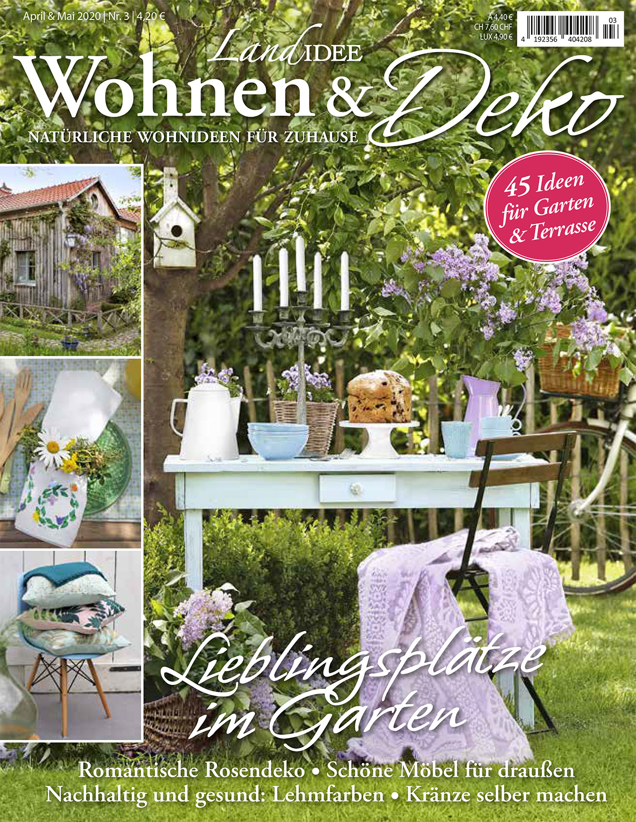
9 Creative Ideas for Beautiful Room Dividers

Published in Living & Decoration

Creating separate living zones within a home is one of the most effective ways to make large spaces feel comfortable and functional. In this feature, Living & Decoration presents nine creative room divider ideas that combine practicality with visual appeal.

The publication highlights a variety of approaches, including shelving units, plants and movable furniture. Among the featured solutions is Facet by Bloomming, selected as one of the magazine’s recommended room divider concepts.

Facet by Bloomming

Listed as idea number three in the feature, Facet is presented as a ceiling-mounted room divider that combines functionality with a sculptural appearance.

According to the magazine, the individually adjustable elements create refined effects of light and shadow while allowing users to configure the divider according to the desired level of openness and privacy.

Unlike traditional room dividers, Facet does not simply block a space. By rotating the individual modules, the pattern can be opened or closed in specific areas, allowing light to pass through while subtly defining separate zones within an interior.

The publication describes Facet as a room divider that transforms space through its interaction with light, making it suitable for both residential and commercial environments.

Room Division Without Walls

The article emphasises that room dividers do not need to be permanent constructions. Shelving units, movable furniture, plants and decorative objects can all be used to create visual separation while maintaining an open and airy atmosphere.

The magazine concludes that elements such as shelving, wall features and floor-standing objects can help define different functions within a room while preserving a sense of spaciousness.

Featured Product

Product: Facet
Company: Bloomming
Type: Hanging room divider
Installation: Ceiling mounted
Features: Individually rotatable modules, adjustable transparency, dynamic light and shadow effects
Application: Residential and commercial interiors

Original Caption

“Ceiling-mounted model. The individually adjustable elements of Facet play with light and shadow. Configurable as desired.”

Publication Details

Publication: Living & Decoration
Feature: 9 Creative Ideas for Beautiful Room Dividers
Featured product: Facet
Company: Bloomming
Topics: Room dividers, interior design, light and shadow, space planning, contemporary interiors
Elemente

By Magazine

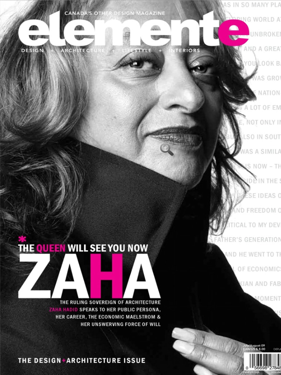
Elemente Magazine (Canada) – Light Facet by Bloomming

Dutch Design Featured in Canada’s Design & Architecture Issue

Published in Elemente Magazine, July/August 2009

Canadian design publication Elemente Magazine featured Light Facet, the modular room divider designed by Mireille Meijs for Dutch design studio Bloomming, in its Design + Architecture Issue.

The publication presented Light Facet as an innovative interior solution that combines privacy, light control and decorative expression within a single adaptable product.

Light Facet

Bloomming’s Light Facet was selected as one of the magazine’s noteworthy contemporary design products.

The publication describes Light Facet as a ceiling-mounted curtain constructed from modular diamond-shaped elements. Each individual facet can be rotated independently, allowing users to influence both the amount and the direction of incoming light.

Unlike traditional room dividers or curtains, Light Facet functions as a dynamic architectural element that can continuously change its appearance.

Original Article Text

Dutch design firm Bloomming has a precious idea for your home: a ceiling-hung curtain of modular, multifaceted white diamonds.

Designed by Mireille Meijs, each panel can be individually tilted up or down, allowing the user to control the amount and shape of the light.

Light Facet can be mounted as a room divider or in a vertical, horizontal or diagonal configuration.

Design Concept

Light Facet was developed around the idea that a room divider should do more than separate spaces.

By rotating the individual modules, users can create varying levels of openness, privacy and transparency. The resulting patterns of light and shadow change throughout the day, giving the divider a constantly evolving appearance.

The modular system allows installations in a wide variety of shapes and sizes, making it suitable for residential interiors, offices, hospitality projects and public spaces.

Product Information (as published)

Product: Light Facet
Designer: Mireille Meijs
Studio: Bloomming
Type: Modular room divider / hanging partition
Material: Lightweight modular diamond-shaped elements
Installation: Ceiling suspended
Configurations: Vertical, horizontal or diagonal

The publication listed the following pricing information at the time:

  • Light Facet: approximately $630 per square metre
  • Attachment system: approximately $126

Why It Matters

This feature marked one of the early international publications of Light Facet outside Europe, helping introduce Bloomming’s design philosophy to a North American audience.

The project would later evolve into Facet, Bloomming’s internationally recognised modular room divider system that continues to be used by architects, interior designers and homeowners around the world.

Publication Details

Publication: Elemente Magazine
Country: Canada
Issue: July / August 2009
Section: Design + Architecture Issue
Featured Product: Light Facet
Designer: Mireille Meijs
Studio: Bloomming


Image caption from the original publication

“Dutch design firm Bloomming presents Light Facet, a ceiling-hung curtain of modular multifaceted white diamonds. Designed by Mireille Meijs, each panel can be individually tilted to control the amount and shape of light entering a space.”

Lourens

By Magazine

Lourens Magazine – Reflections by Bloomming

Dutch Lifestyle Magazine Features Bloomming’s Sculptural Steel Vases

Published in Lourens Magazine, Winter 2010

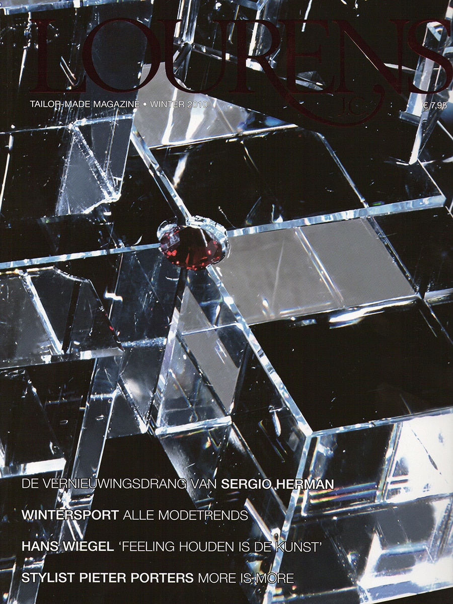
Dutch lifestyle publication Lourens Magazine featured Reflections, the sculptural vase collection designed by Mireille Meijs for Bloomming, in its home and interior design section.

Presented alongside a curated selection of luxury home accessories and contemporary design objects, Reflections was highlighted for its distinctive geometric form and architectural appearance.

Reflections

Reflections transforms the traditional vase into a sculptural object.

Crafted from folded stainless steel, the design consists of faceted surfaces that create constantly changing reflections of light and surroundings. The angular geometry gives the vases a strong architectural presence while maintaining an elegant and minimalist character.

Even when not holding flowers, the objects function as standalone design pieces that interact with their environment through reflection, shadow and perspective.

Inspired by Geometry

The design language of Reflections reflects Bloomming’s ongoing exploration of faceted forms, geometry and spatial perception.

Each surface captures and reflects its surroundings differently, causing the appearance of the vase to change depending on the viewer’s position and the available light. This dynamic quality gives the object a sense of movement despite its static form.

Functional Sculpture

While fully functional as flower vases, Reflections was designed to blur the boundary between product design and sculpture.

The folded metal construction creates a striking silhouette that draws attention whether displayed individually or as a pair. The design demonstrates how everyday objects can become architectural elements within an interior.

Product Information

Product: Reflections
Designer: Mireille Meijs
Brand: Bloomming
Category: Vase / Decorative Object
Material: Stainless steel
Finish: Brushed metal
Design: Faceted geometric construction

International Design Language

Reflections formed part of a broader collection of geometric designs developed by Bloomming during this period. The project explored themes of light, reflection and form that would later become central to many of the studio’s internationally published works.

The feature in Lourens Magazine positioned Reflections within a growing movement of contemporary Dutch design characterised by experimentation, craftsmanship and architectural thinking.

Publication Details

Publication: Lourens Magazine
Country: The Netherlands
Issue: Winter 2010
Section: Home Sweet Home
Featured Product: Reflections
Designer: Mireille Meijs
Brand: Bloomming


Original publication summary

‘Lourens Magazine featured Reflections by Bloomming in its home design section, describing the collection as striking steel vases. Designed by Mireille Meijs, the faceted objects combine geometric form, reflective surfaces and sculptural presence, transforming a functional vase into an architectural design piece.’

Elsevier

By Magazine

Elsevier Thema Interieur (October 2009)

Modern Time – Clock Delay by Bloomming

Published in Elsevier Thema Interieur, October 2009

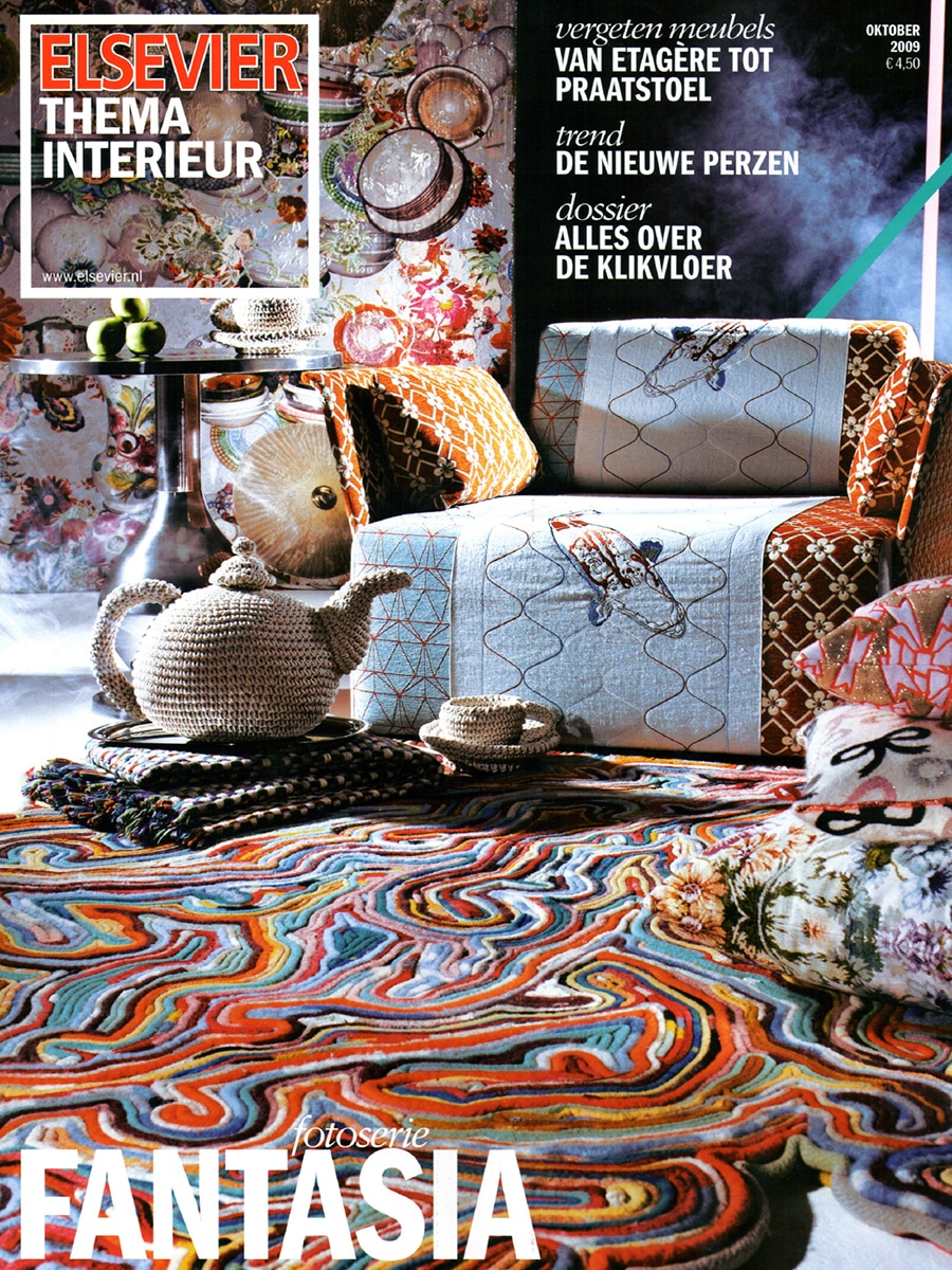
In its overview of contemporary clock design, Elsevier selected Clock Delay by Dutch design studio Bloomming as one of the most remarkable interpretations of timekeeping.

The article explores how modern designers challenge the traditional clock, creating objects that do more than simply display the time. Among designs that use words, minimalist dials and reinterpretations of classic pendulum clocks, Clock Delay stood out for exposing the mechanics of time itself.

Modern Time

The newest generation of clocks does not always reveal the time at a glance. Instead, designers invite users to slow down, observe and interact with the object.

Clock Delay embraces this philosophy by turning timekeeping into a visual experience.

Unlike conventional clocks, Clock Delay consists of three large rotating gear wheels representing:

  • Seconds
  • Minutes
  • Hours

As the gears rotate, the current time can be determined by observing where the three indicators align. Rather than presenting time instantly, the clock encourages a moment of reflection and understanding.

Clock Delay by Bloomming

Elsevier describes Clock Delay as an object that resembles an instrument from a distant era.

Constructed from stainless steel and aluminium, the clock exposes its complete mechanism. Every movement is visible, transforming the hidden workings of a clock into the central design feature.

The result is both functional and sculptural: a mechanical object that continuously demonstrates how time is measured.

Original Article Reference

The publication featured Clock Delay as item number six in its selection of innovative contemporary clocks:

“It looks like an instrument from long-forgotten times, but Delay by the Dutch studio Bloomming is hypermodern. The clock consists of three large gears for the seconds, minutes and hours.”

Product Information

Product: Clock Delay
Designer: Bas van Leeuwen
Studio: Bloomming
Materials: Stainless steel and aluminium
Function: Mechanical time display through rotating gear systems
Year: 2008–2009

Why It Matters

Clock Delay represents an important early Bloomming project and demonstrates the studio’s fascination with revealing hidden systems rather than concealing them.

By exposing the mechanics of time, the design invites users to reconnect with technology and craftsmanship in an age where products increasingly function as closed black boxes.

Publication Details

Publication: Elsevier Thema Interieur
Issue: October 2009
Section: Moderne Tijd (Modern Time)
Featured Product: Clock Delay
Designer: Bas van Leeuwen
Company: Bloomming

IDN

By Magazine

IdN – International Designers Network, Volume 15 Number 1, 2008

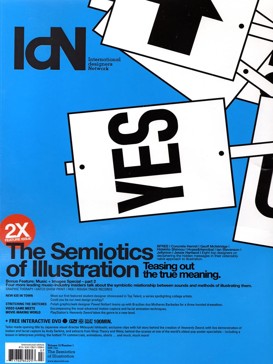
IdN (International Designers Network) is a Hong Kong-based international design magazine founded in 1992, distributed across more than 40 countries and widely regarded as one of the most influential graphic design and visual communication publications in the world. The magazine covers graphic design, illustration, typography, motion graphics and creative culture, with a strong focus on emerging and established talent from across the global design community. Volume 15 Number 1 (2008) is a double feature issue covering The Semiotics of Illustration and a Music and Images Special, with a bonus interactive DVD included.

Within this issue, pages 101 to 105 feature a multi-page editorial report on Dutch Design Week 2007, written by Petra von Mel and titled “Dutch Designers Buck Bleak Trend.” The article takes the theme of Dutch Design Week ’07 — “Design Works” — as its starting point, arguing that Dutch designers reject dystopian visions of the future in favour of pragmatic, human-centred and optimistic approaches to design.

Dutch Designers Buck Bleak Trend – The Article

The feature opens with a bold typographic spread introducing the article’s argument: that while Hollywood and popular culture tend to depict the future as a dark and chaotic place, the designers shown at Dutch Design Week 2007 in Eindhoven demonstrated that design holds the key to an ever-improving quality of life. The article profiles several Dutch designers exhibited at the event, using their work to illustrate the broader character of Dutch design — functional, conceptual, clear and never over-elaborate, yet always surprising.

Designers featured in the article alongside Bloomming include Michiel van der Kley, whose work is presented at the opening of the piece, and other participants in Dutch Design Week 2007 including Bart Hess and Angela Jansen.

Mireille Meijs and Light Facet

On page 105, the article profiles Mireille Meijs as one of the talented young designers whose work exemplifies the Dutch design spirit. The editorial describes Light Facet as a snowflake-like window shade with a poetic twist, and frames it as Meijs’s response to her instinctive urge to design objects that improve life. The article explains that the inspiration for Light Facet came from a friends’ gathering at her home, where sunlight was pouring through the window. Since she considers sunlight too beautiful to be blocked entirely by ordinary curtains, she developed a product that people can adjust according to how many rays of light they want to enter the room.

The article places Meijs’s design philosophy clearly within its Dutch context. She is quoted describing Dutch design as strongly conceptual, simple and clear, but always surprising — and noting that compared to other design traditions, Dutch designers tend to be very down-to-earth. The feature characterises her as a designer who finds solutions for different situations, driven by a desire to make things more beautiful and brighter.

Multiple photographs of Light Facet are shown across the spread, including large-scale installation views showing the product suspended from a ceiling in what appears to be an exhibition setting at Dutch Design Week. The images show visitors interacting with and walking around the installation, conveying the product’s physical scale and its ability to transform an interior space. Close-up photographs show the individual faceted, diamond-shaped leaves in detail, demonstrating how their geometry creates shifting patterns of light and shadow.

Publication Context

The article appears in IdN alongside coverage of Dutch Design Week 2007 as part of a broader editorial interest in the Dutch design scene and its global relevance. The framing of the feature — Dutch designers as optimistic pragmatists who use design to improve everyday life — positions Light Facet and its designer within a wider cultural narrative about the character and international standing of Dutch design.

IdN’s international distribution meant that this feature introduced Mireille Meijs and Light Facet to a readership of graphic designers, creative directors, art directors and design professionals across Asia, Europe, North America and beyond — audiences not typically reached by Dutch interior design or architecture publications.

Publication Details

Publication: IdN – International Designers Network
Volume: 15, Number 1
Year: 2008
Article title: Dutch Designers Buck Bleak Trend
Author: Petra von Mel
Pages: 101–105
Product featured: Light Facet room divider / window shade
Designer featured: Mireille Meijs
Company: Bloomming
Context: Dutch Design Week 2007, Eindhoven, the Netherlands
Category: International graphic design and visual culture magazine

Why this feature mattered

IdN’s international reach and its audience of creative professionals across Asia and the wider world made this feature particularly significant for Bloomming. The article placed Light Facet within a serious editorial discussion about the philosophy and character of Dutch design, presenting it not simply as a product but as the outcome of a considered design process rooted in everyday observation and a genuine desire to improve life. Being featured in IdN alongside other notable participants in Dutch Design Week 2007 gave Bloomming visibility in an international creative community well beyond the Netherlands, at a pivotal early stage in the studio’s development.

Elle Wonen

By Magazine

New Masters: A Design Academy Eindhoven Masterclass with Gerard van den Berg

Published in ELLE Wonen

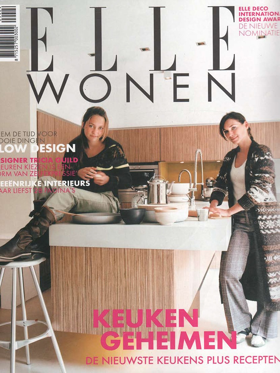
In this feature, ELLE Wonen highlights the results of an intensive furniture design masterclass led by renowned Dutch designer Gerard van den Berg. Students from Design Academy Eindhoven were challenged to rethink existing furniture concepts and transform them into entirely new designs.

Over the course of eight weeks, participants worked on redesigning pieces from the collection of Dutch furniture manufacturer Label. Rather than starting from a blank sheet of paper, the students were asked to reinterpret existing products through experimentation, craftsmanship and material research.

Learning Through Making

Unlike many contemporary design processes, the masterclass deliberately avoided computers. Gerard van den Berg encouraged students to work directly with sketches, prototypes and physical materials.

According to the article, students spent weeks drawing, cutting, gluing, testing and refining concepts before presenting their ideas to a professional jury. The process emphasised creativity, comfort, innovation and manufacturability.

Designer Frederik van Heereveld, himself a former student of Design Academy Eindhoven and a collaborator of Gerard van den Berg, explained:

“You develop a much stronger feeling for a piece of furniture when you design it this way.”

Bas van Leeuwen

Among the participating students was Bas van Leeuwen, who is pictured together with Gerard van den Berg during the masterclass.

Bas presented a concept called Pio, a chair inspired by the shape and structure of a bird’s nest.

According to the article, the design was based on an unusual construction principle:

“The inspiration for this design was a bird’s nest. The underside consists of woven wicker, while the cushion is upholstered with furniture fabric.”

The result combined a soft upholstered seating surface with a distinctive handcrafted shell structure, creating a chair that explored the relationship between comfort, craftsmanship and organic forms.

The Pio Chair

Pio stood out through its contrast between materials and textures.

The woven exterior referenced traditional craft techniques, while the upholstered interior created a comfortable seating experience. The chair demonstrated how natural forms could inspire contemporary furniture design without becoming purely decorative.

The article identified Pio as one of the notable concepts developed during the masterclass.

Other Featured Projects

The article also highlighted several additional furniture concepts created by fellow students.

Among them was Clover, designed by Sofie Hoenselaars, a chair system that could be linked together in multiple configurations. The design featured an exposed lacing detail that added both functionality and a distinctive visual character.

Another project, Slikk by Karin van der Zanden, explored comfort through an oversized, soft seating object inspired by cushions and beanbags.

The article emphasised that all projects remained prototypes at the time of publication, although several attracted significant attention during their presentation at 100% Design Rotterdam.

Design Academy Eindhoven and Dutch Design

The masterclass demonstrated the experimental approach for which Design Academy Eindhoven has become internationally known.

By combining craftsmanship, conceptual thinking and practical product development, students were encouraged to create designs that were innovative, functional and commercially viable.

The article presented the results as evidence of a new generation of Dutch designers exploring fresh approaches to furniture design.

Publication Details

Publication: ELLE Wonen
Feature: Nieuwe Meesters (New Masters)
Institution: Design Academy Eindhoven
Masterclass leader: Gerard van den Berg
Featured designer: Bas van Leeuwen
Featured project: Pio Chair
Topics: Furniture design, Dutch design, Design Academy Eindhoven, product design, craftsmanship, masterclass projects

Inside

By Magazine

Inside Information Verlichting

100% Design Rotterdam 2010

In 2010, Dutch trade publication Inside Information Verlichting reported on the eighth edition of 100% Design Rotterdam, one of the Netherlands’ leading events for interior design, architecture and lighting. The article reviewed the exhibition and highlighted several notable products and exhibitors that stood out during the event.

Design and Lighting at 100% Design

The article describes how every June a large part of the Dutch creative industry gathers at the iconic Van Nelle Ontwerpfabriek in Rotterdam. Since relocating from the Cruise Terminal to this architectural landmark, the event had evolved into an important meeting point for interior brands, furniture manufacturers, lighting companies and designers.

While the author notes that the 2010 edition was somewhat smaller than previous years, the exhibition still presented a wide range of innovative products and design concepts.

Lightfacet Highlighted as an Eye-Catcher

Among the products featured in the article was Lightfacet, designed by Bas van Leeuwen.

A large photograph accompanies the text, showing a close-up of the distinctive faceted modules that characterise the design.

The caption reads:

“Een eyecatcher op de Campsites: de bijzondere zonwering/ruimtescheider Lightfacet, ontworpen door Bas van Leeuwen.”

Translated:

“An eye-catcher at the Campsites section: the remarkable sun-shading and room-dividing system Lightfacet, designed by Bas van Leeuwen.”

A New Approach to Space and Light

By describing Lightfacet as both a sun-shading solution and a room divider, the article highlights one of the product’s defining characteristics: its ability to function simultaneously as an architectural screen and a dynamic light-control system.

The modular structure allows individual elements to be opened and closed, enabling users to influence transparency, privacy and the interaction of light and shadow within a space. Rather than acting as a static partition, Lightfacet transforms according to its surroundings and the preferences of the user.

Recognition Within a Professional Design Context

The inclusion of Lightfacet in a professional publication focused on lighting and architecture is significant because it positioned the design beyond the traditional furniture and interior design categories. The product was recognised not only as a decorative object but also as an innovative architectural element capable of influencing daylight, spatial perception and user experience.

Being singled out as an “eye-catcher” at one of the Netherlands’ most important design exhibitions further reinforced the growing visibility of Bloomming’s work within the professional design community.

Publication details

Publication: Inside Information Verlichting
Country: Netherlands
Year: 2010
Author: Henk-Jan Hoekjen
Feature: Review of 100% Design Rotterdam 2010
Product featured: Lightfacet
Designer credited: Bas van Leeuwen
Event: 100% Design Rotterdam
Location: Van Nelle Ontwerpfabriek, Rotterdam, The Netherlands

Why this feature mattered

This publication demonstrates how Lightfacet attracted attention not only from interior design media but also from professionals working in architecture and lighting. By highlighting the product as one of the visual standouts of 100% Design Rotterdam, the article recognised Lightfacet’s unique ability to bridge the disciplines of spatial design, daylight management and decorative architecture—qualities that would become central to the continued development of the Bloomming collection.

Volkskrant Magazine

By Magazine

Volkskrant Magazine – Lightfacet by Bloomming

Dutch National Newspaper Magazine Features Bloomming’s Geometric Wall Installation

Published in Volkskrant Magazine, 23 April 2011

Dutch national newspaper supplement Volkskrant Magazine featured Lightfacet, the modular wall installation designed by Mireille Meijs for Bloomming, as part of its annual interior design special.

Appearing prominently within a curated selection of contemporary home design trends, the publication highlighted Lightfacet’s distinctive geometric surface and its ability to transform a wall into a dynamic architectural element.

Lightfacet

Lightfacet blurs the boundary between wall decoration, room divider and architectural feature.

Composed of individually adjustable faceted modules, the design creates a constantly changing play of light, shadow and depth. By rotating the elements, users can alter the pattern and transparency of the surface, making every installation unique.

The geometric composition creates a three-dimensional effect that changes throughout the day as natural light interacts with the faceted forms.

Bringing Architecture Indoors

In the feature, Lightfacet was presented alongside contemporary furniture, accessories and interior styling trends that reflected a growing interest in geometric design and architectural surfaces.

Rather than functioning as a conventional decorative object, Lightfacet introduces an architectural layer to the interior. Its faceted structure adds depth, rhythm and visual movement while maintaining a clean and minimalist appearance.

A Signature Bloomming Design

Designed by Mireille Meijs, Lightfacet represents an early exploration of the geometric language that would later evolve into Bloomming’s internationally recognised Facet room divider collection.

The design combines modularity, customisation and interaction, allowing users to actively shape the appearance of the installation through the position of the individual elements.

Product Information

Product: Lightfacet
Designer: Mireille Meijs
Brand: Bloomming
Category: Modular wall installation / room divider
Material: Modular faceted elements
Customisation: Available in custom dimensions and configurations

Publication Details

Publication: Volkskrant Magazine
Country: The Netherlands
Date: 23 April 2011
Feature: Interior Design Special (Woonspecial)
Featured Product: Lightfacet
Designer: Mireille Meijs
Brand: Bloomming


Original publication summary

“Lightfacet by Bloomming was featured in Volkskrant Magazine’s interior design special as part of a selection of contemporary design trends. The modular installation uses geometric faceted elements to create depth, pattern and visual movement, transforming the wall into an architectural feature.”

Frame

By Magazine

Clover Selected for Production at 100% Design Rotterdam

Published in Frame Magazine, 2004

During 100% Design Rotterdam, Frame Magazine highlighted several promising projects emerging from Design Academy Eindhoven. Among them was Clover, a chair redesign created during a masterclass led by renowned furniture designer Gerard van den Berg.

A Design Academy Eindhoven Masterclass

The project originated from an intensive workshop in which fifteen Design Academy Eindhoven students were challenged to reinterpret existing furniture designs from Gerard van den Berg’s Label collection.

Rather than starting from scratch, students explored how existing designs could be transformed into new products through experimentation, prototyping and collaboration.

Clover

Designed by Sofie Hoenselaars, Clover introduced a distinctive laced detail running along the backrest, allowing the chair to be visually “dressed” while creating a recognisable identity.

The redesign was selected for production by the manufacturer of Gerard van den Berg’s Label collection, making it one of the most successful outcomes of the masterclass.

From Concept to Production

Unlike many student projects that remain prototypes, Clover progressed through the complete development process and entered production.

The article notes that a team of Design Academy Eindhoven students worked alongside production staff throughout the realisation process, providing a rare opportunity to experience furniture manufacturing from concept to finished product.

Bas van Leeuwen’s Involvement

Among the students involved in the Clover project was Bas van Leeuwen, pictured in the article together with fellow team members.

Participation in the project provided first-hand experience in product development, collaboration with industry partners and the transition from experimental design concept to manufacturable furniture product.

Publication Details

Publication: Frame Magazine
Event: 100% Design Rotterdam
Year: 2004
Featured project: Clover
Lead designer: Sofie Hoenselaars
Institution: Design Academy Eindhoven
Masterclass leaders: Gerard van den Berg and Alain Berteau
Team member featured: Bas van Leeuwen

Frits

By Magazine

Frits Magazine

Topdesigners van de Toekomst

Published in 2008, Dutch lifestyle and culture magazine Frits dedicated a feature to the emerging generation of designers shaping the future of Eindhoven’s creative scene. The article, titled “Topdesigners van de Toekomst” (“Top Designers of the Future”), highlighted a selection of promising young talents connected to the Design Academy Eindhoven and the city’s rapidly growing design culture.

Eindhoven as a Breeding Ground for Design

The article opens by observing that whenever the Dutch Design Week takes place in Eindhoven, one thing becomes immediately clear: the city is overflowing with talent. Journalist Monique van Empel notes that Eindhoven is home to an unusually large number of design partnerships and creative collaborations, many formed during studies at the Design Academy Eindhoven (DAE).

The feature presents several designers and studios considered part of the next generation of Dutch design, including BCXSY, Studio JSPR, JOINE Office for Design, and Bloomming.

Bloomming

Among the selected studios was Bloomming, founded by Bas van Leeuwen and Mireille Meijs.

The article explains that their collaboration began during their time at the Design Academy Eindhoven:

“Opeens was het ‘blooming’ tussen ons en sindsdien wonen en werken we samen.”

Translated:

“Suddenly it was ‘blooming’ between us, and ever since we have been living and working together.”

The feature emphasises the complementary nature of their partnership. According to Bas:

“Mireille is conceptueel erg sterk, ik ben juist technisch goed.”

Translated:

“Mireille is very strong conceptually, while I excel in the technical side.”

Growing Recognition

At the time of publication, Bloomming had already gained attention at numerous design events and exhibitions. The article notes that their work had recently been presented in cities including:

  • Eindhoven
  • Brussels
  • Utrecht
  • Amsterdam
  • Rotterdam
  • Hong Kong

This growing international exposure reflected the increasing interest in their experimental approach to interiors and product design.

Lightfacet

The article features a large image of Lightfacet, Bloomming’s modular room divider system.

The accompanying caption states:

“Roomdivider Light Facet maakt het mogelijk om te spelen met licht en schaduw.”

Translated:

“Room divider Light Facet makes it possible to play with light and shadow.”

Lightfacet is presented as an example of the studio’s ability to combine functional interior solutions with an architectural and sculptural aesthetic. Through its rotating diamond-shaped modules, the divider allows users to adjust transparency and create changing patterns of light throughout a space.


About Eindhoven

When asked about Eindhoven, Bloomming highlighted the city’s creative energy:

“Eindhoven ontwikkelt zich op diverse vlakken, niet alleen op designgebied maar ook op het gebied van architectuur, exposities, muziek en dergelijke. Er zit veel creativiteit in Eindhoven en dat lijkt steeds meer naar buiten te komen.”

Translated:

“Eindhoven is developing on many levels, not only in design but also in architecture, exhibitions, music and more. There is a great deal of creativity in Eindhoven, and that that seems to be becoming increasingly visible to the outside world.”

This statement reflected the optimism surrounding Eindhoven’s transformation into one of Europe’s most influential design cities.

Publication details

Publication: Frits Magazine
Country: Netherlands
Year: 2008
Feature: Topdesigners van de Toekomst
Author: Monique van Empel
Pages: 110–113
Studio featured: Bloomming
Designers: Bas van Leeuwen & Mireille Meijs
Product featured: Lightfacet
Location: Eindhoven, The Netherlands

Why this feature mattered

Frits positioned Bloomming among a carefully selected group of emerging Dutch designers expected to shape the future of design in the Netherlands. Rather than focusing solely on individual products, the article highlighted the strength of the partnership between Bas van Leeuwen and Mireille Meijs and recognised Bloomming as part of a broader movement that was helping establish Eindhoven as an international design capital.

The inclusion of Lightfacet demonstrated how the studio’s work combined innovation, functionality and visual experimentation—qualities that would later become defining characteristics of the Bloomming collection.