Category

Magazine

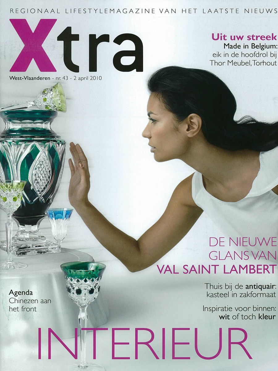
Xtra

By Magazine

Xtra Magazine (Belgium) – April 2010

Lightfacet featured as a stylish solution for dividing open-plan living spaces

In April 2010, Belgian lifestyle magazine Xtra featured Lightfacet in an article about movable room dividers and flexible interior solutions. The publication highlighted the growing need to create privacy and distinct functional zones within contemporary open-plan homes.

Stylishly Separated

The article, titled “Modieus gescheiden” (“Fashionably Separated”), explored how modern homes increasingly combine multiple functions within a single space. Home offices, play areas, guest rooms and open-plan kitchens often share the same floor plan, creating a need for flexible ways to introduce privacy without sacrificing light or openness.

Among several featured products, Lightfacet was presented as an innovative alternative to traditional room dividers.

Diamonds in the Room

Under the headline “Diamanten in de kamer” (“Diamonds in the Room”), the magazine described Lightfacet as a modular room divider created by Eindhoven designers Bas van Leeuwen and Mireille Meijs.

The article emphasised how the diamond-shaped modules can be individually opened and closed, allowing users to create their own patterns while controlling transparency and sightlines. Beyond functioning as a room divider, Lightfacet was also presented as a decorative element and even as a sun screen.

A Dynamic Architectural Element

What distinguished Lightfacet from conventional partitions was its ability to continuously transform. By rotating individual facets, users could make the divider more open or closed in specific areas, creating a unique balance between privacy, light and spatial connection.

The article noted the modular construction of the system, which allows the divider to be expanded over time and adapted to different spaces and requirements.

Publication Details

  • Publication: Xtra Magazine (Belgium)
  • Date: 2 April 2010
  • Article: Modieus gescheiden
  • Section: Interior Design
  • Featured Product: Lightfacet
  • Designers: Bas van Leeuwen & Mireille Meijs
  • Company: Bloomming

Original Publication Summary

“Xtra Magazine featured Lightfacet in an article about movable room dividers for contemporary interiors. The publication highlighted the design’s modular diamond-shaped elements, adjustable transparency and ability to create privacy while maintaining light and openness within modern living spaces.”

The Best of

By Magazine

Het Beste van 2011 – Novelties magazine for architects and other creative professionals

Het Beste van 2011 (The Best of 2011) is a Dutch-language novelties magazine compiled for architects and other creative professionals, published in January 2012. The publication was assembled by advertisers active in the architecture and design sector, and distributed to a professional audience of architects, interior designers and creative practitioners in the Netherlands. The magazine presents a selection of notable products, materials and design solutions introduced or highlighted during 2011, serving as a reference tool for professionals seeking innovative solutions for architectural and interior design projects.

Drie Dimensies, Grenzeloze Mogelijkheden – Three Dimensions, Endless Possibilities

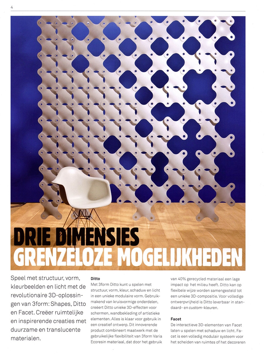
Pages 4 and 5 of the magazine feature a two-page spread for 3form, headlined “Drie Dimensies, Grenzeloze Mogelijkheden” (Three Dimensions, Endless Possibilities). The feature presents three of 3form’s modular three-dimensional product lines — Shapes, Ditto and Facet — as a cohesive family of architectural solutions that allow designers to play with structure, form, colour, shadow and light using durable and translucent materials.

The opening spread is anchored by a striking full-page photograph of the Ditto system installed as a large-scale screen against a cobalt blue wall, with an Eames DAR chair placed in front, emphasising the product’s architectural scale and visual presence.

Facet by Bloomming

Within the feature, Facet is described as a fully modular system for dividing spaces or decorating window partitions, with unlimited design possibilities. The article specifically credits the product to the young, talented duo Bas van Leeuwen and Mireille Meijs, from the creative design label Bloomming. This is one of the few instances in the 3form promotional context where Bloomming is named explicitly as the originating design studio, giving the designers direct credit alongside the manufacturer.

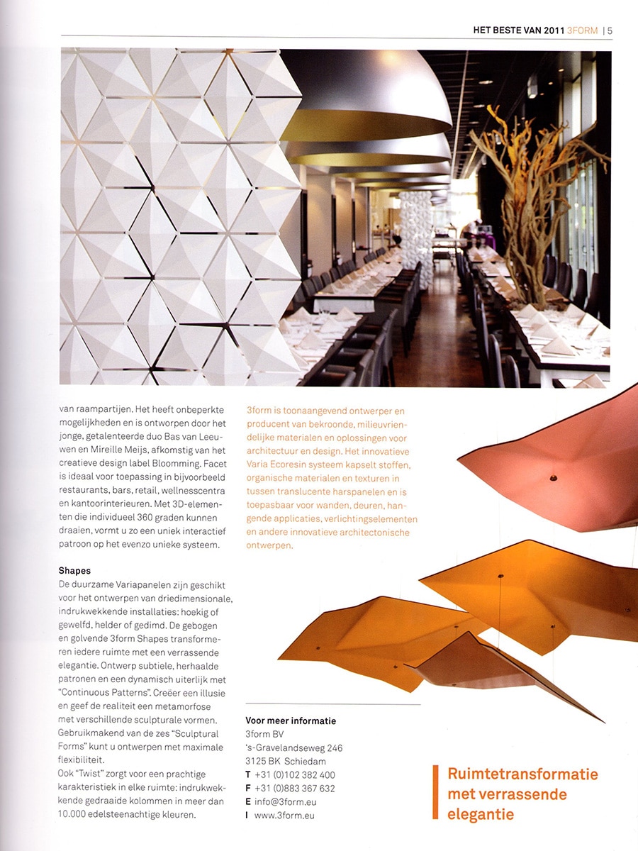
The article explains that Facet’s three-dimensional elements can each rotate individually through 360 degrees, allowing users to compose a unique, interactive pattern on an equally unique system. The product is described as ideal for application in restaurants, bars, retail environments, wellness centres and office interiors. The second page of the spread features a close-up photograph of Facet installed in a restaurant setting, shown alongside a long dining table with pendant lamps, illustrating how the screen functions as both a spatial divider and a decorative surface in a high-end hospitality interior.

3form as Manufacturer and Partner

The feature presents 3form as a leading designer and manufacturer of award-winning, environmentally responsible materials and solutions for architecture and design. The innovative Varia Ecoresin system — the material platform underlying Facet and the other products in the feature — encapsulates fabrics, organic materials and textures within translucent resin panels, and is applicable for walls, doors, hanging installations, lighting elements and other innovative architectural applications. The Ditto product, also shown in the spread, is noted as being composed of 40% recycled material, reflecting 3form’s broader commitment to sustainability.

Publication Context

Het Beste van 2011 was distributed at the start of 2012 as a professional reference for the Dutch architecture and interior design market. Its audience — architects and creative professionals — represents the primary specification audience for products like Facet. Inclusion in a publication of this kind, positioned explicitly as a best-of survey for the year just concluded, placed Facet among the products considered most noteworthy by manufacturers and suppliers active in the Dutch design sector during 2011.

The cover of the magazine itself features a dramatically lit purple installation of another three-dimensional modular wall product, reinforcing the broader editorial theme of texture, light and spatial transformation that runs through the issue.

Publication Details

Publication: Het Beste van 2011 – Noviteitenmagazine voor architecten en andere creatieve professionals
Publisher: compiled by advertisers; distributed to architecture and design professionals
Issue: January 2012
Pages: 4–5
Feature title: Drie Dimensies, Grenzeloze Mogelijkheden
Product featured: Facet Room Divider
Designers: Bas van Leeuwen & Mireille Meijs
Company: Bloomming
Manufacturer: 3form
Category: Dutch professional architecture and design novelties magazine

Why this feature mattered

Het Beste van 2011 reached architects and interior designers at the moment they were assessing new products and planning upcoming projects — making it an effective specification-oriented platform. The explicit naming of Bloomming as the creative design label behind Facet, within what was otherwise a 3form manufacturer feature, was a meaningful acknowledgement of the designers’ role. The feature reinforced Facet’s positioning as a premium architectural product suitable for demanding commercial interiors, and placed it firmly within the professional Dutch design specification market at the start of 2012.

And Mag

By Magazine

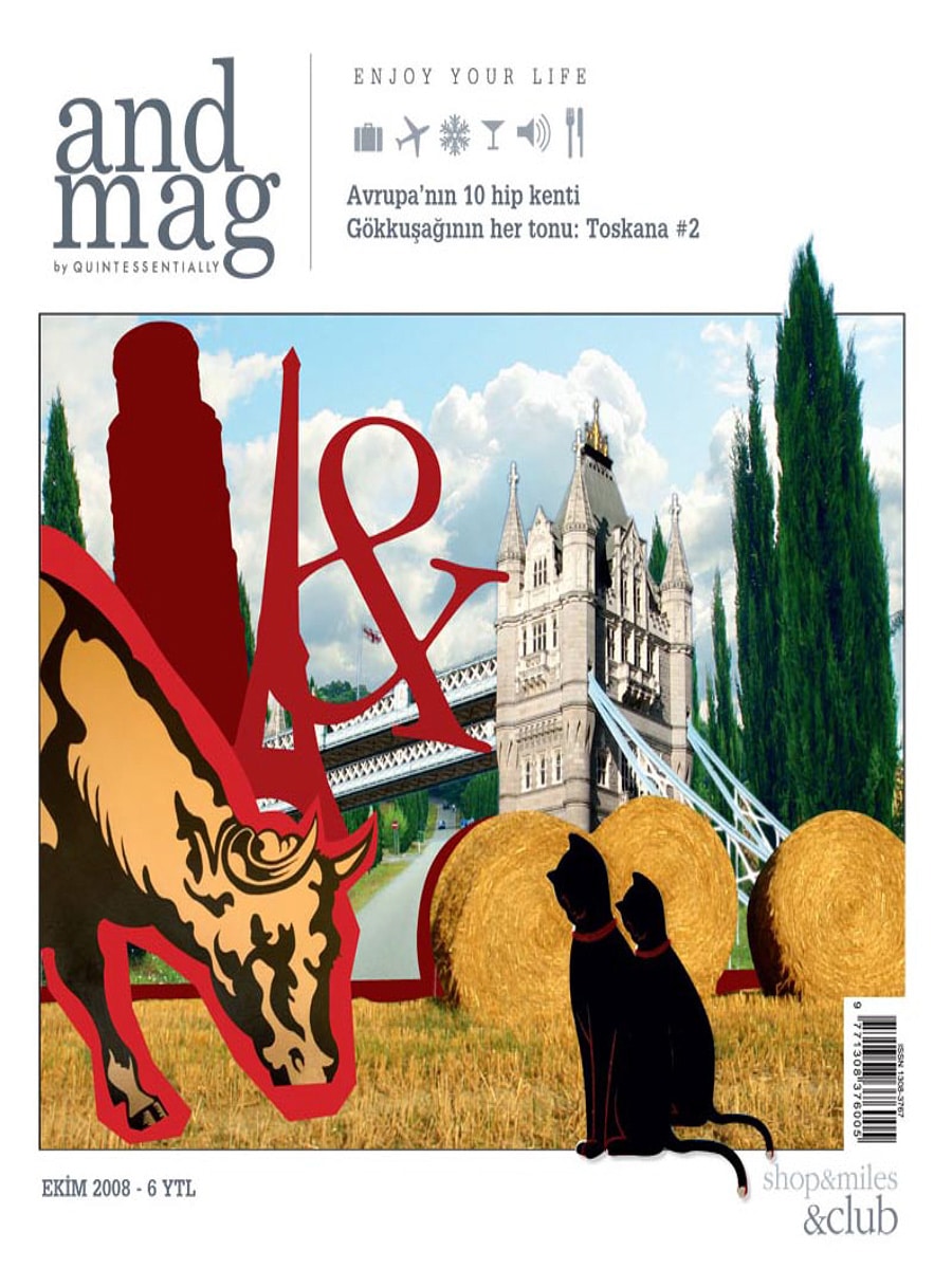
Andmag – Clock Delay by Bloomming

Turkish Lifestyle Magazine Highlights an Unconventional Dutch Clock

Published in Andmag, October 2008

Turkish lifestyle magazine Andmag featured Clock Delay, the experimental clock designed by Bas van Leeuwen for Dutch design studio STUDIObloomm (later Bloomming), in its design and trend section.

The publication presented Clock Delay as an innovative response to a modern culture of consumption, drawing attention to the clock’s exposed mechanics and unconventional way of displaying time.

Clock Delay

Clock Delay challenges the familiar image of a clock.

Rather than relying on traditional hands and a printed dial, the design uses three separate rotating wheels that represent:

  • Hours
  • Minutes
  • Seconds

The current time is revealed at the point where the three wheels intersect. This unusual approach transforms the act of reading time into a more conscious and engaging experience.

Constructed from stainless steel and aluminium, the clock exposes the mechanical process normally hidden inside conventional timepieces.

Design Inspired by a Throwaway Society

According to the article, the concept behind Clock Delay emerged from the observation that many products are purchased, used and discarded without any appreciation for how they work.

The designers sought to counter this tendency by creating an object that celebrates technology and mechanical ingenuity rather than concealing it.

By making the movement visible, Clock Delay encourages people to reconnect with the fascination of mechanisms and craftsmanship.

No Clock Hands Required

One of the most distinctive features of Clock Delay is the complete absence of traditional clock hands.

Instead, the interaction between the rotating gears becomes the display itself. The time is determined by observing where the hour, minute and second wheels meet.

This unconventional method gives the clock a sculptural presence while maintaining its practical function.

Design as Conversation

More than a tool for measuring time, Clock Delay was conceived as a conversation piece.

Its exposed structure, moving components and industrial appearance invite curiosity and encourage viewers to spend time understanding how the object works. The design rewards observation, making the passage of time visible in a way that conventional clocks rarely do.

Product Information

Product: Clock Delay
Designer: Bas van Leeuwen
Studio: STUDIObloomm / Bloomming
Materials: Stainless steel and aluminium
Dimensions: Approximately 35 × 35 × 48 cm
Category: Clock / Kinetic Sculpture

International Recognition

The appearance in Andmag contributed to the growing international attention Clock Delay received during 2008 and 2009. The project was featured in publications across Europe, North America and Asia and became one of Bloomming’s most widely published early designs.

The clock’s combination of mechanical honesty, conceptual thinking and sculptural aesthetics resonated with editors looking for products that challenged conventional expectations.

Publication Details

Publication: Andmag
Country: Turkey
Issue: October 2008
Section: Trend
Featured Product: Clock Delay
Designer: Bas van Leeuwen
Studio: STUDIObloomm / Bloomming


Original publication summary

“Clock Delay is an unusual clock that displays hours, minutes and seconds on three separate rotating wheels. Designed in stainless steel and aluminium, it was created as a response to a culture in which products are bought, used and discarded without appreciation for the technology behind them.”

101 Woonideeën

By Magazine

101 Woonideeën – Reflections by Karin van der Zanden

Dutch Interior Magazine Highlights Reflections as Contemporary Design News

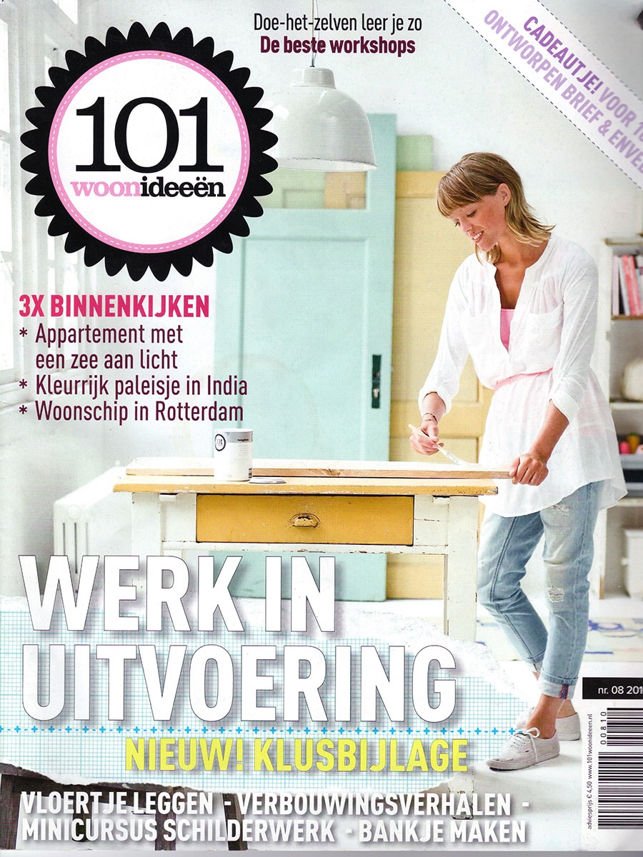
Published in 101 Woonideeën, August 2010

Dutch interior magazine 101 Woonideeën featured Reflections, the sculptural vase collection designed by Karin van der Zanden, in its design news section highlighting noteworthy contemporary products for the home.

Presented among a selection of furniture, lighting and accessories, Reflections was recognised for its striking geometric appearance and highly reflective surface. The publication emphasised the way the faceted forms interact with light, giving the vases a constantly changing visual character.

Reflections

Reflections is a collection of stainless steel vases that transforms surrounding light and space into part of the design itself.

Constructed from precisely folded metal surfaces, each vase consists of multiple geometric facets that capture and mirror their environment. The result is an object that appears different from every angle, creating an ever-changing play of reflections and highlights.

The collection balances sculptural presence with everyday functionality.

A Study in Light and Reflection

The name Reflections refers directly to the central idea behind the design.

Rather than decorating the surface, the polished stainless steel actively reflects its surroundings. Natural daylight, interior lighting, colours and movement all become part of the visual experience. This interaction ensures that no two moments—and no two interiors—look exactly the same.

The faceted geometry further enhances this effect by breaking reflections into multiple planes.

From Design Academy to International Recognition

As noted in the magazine, Karin van der Zanden developed the collection during her studies at the Design Academy Eindhoven.

The project attracted attention for its combination of architectural geometry and material experimentation. By using reflective stainless steel instead of more traditional vase materials, the design explores the relationship between object, light and environment in a distinctly contemporary way.

Sculptural Simplicity

Although functional as flower vases, Reflections also works as a standalone decorative object.

Its clean geometric form and mirror-like finish allow it to fit naturally within modern interiors while maintaining a strong visual identity. Whether displayed individually or as a group, the collection creates a subtle dialogue with the surrounding space.

Product Information

Product: Reflections
Designer: Karin van der Zanden
Brand: STUDIObloomm / Bloomming
Category: Vase Collection
Material: Chrome-plated stainless steel
Characteristics: Geometric, reflective, sculptural

Publication Details

Publication: 101 Woonideeën
Country: The Netherlands
Issue: August 2010
Section: Nieuws (Design News)
Featured Product: Reflections
Designer: Karin van der Zanden
Brand: STUDIObloomm / Bloomming


Original publication summary

“101 Woonideeën featured Reflections by Karin van der Zanden, a collection of faceted stainless steel vases whose mirrored surfaces interact with light and surroundings. The geometric forms create changing reflections, making each vase appear different from every viewing angle.”

Living Design

By Magazine

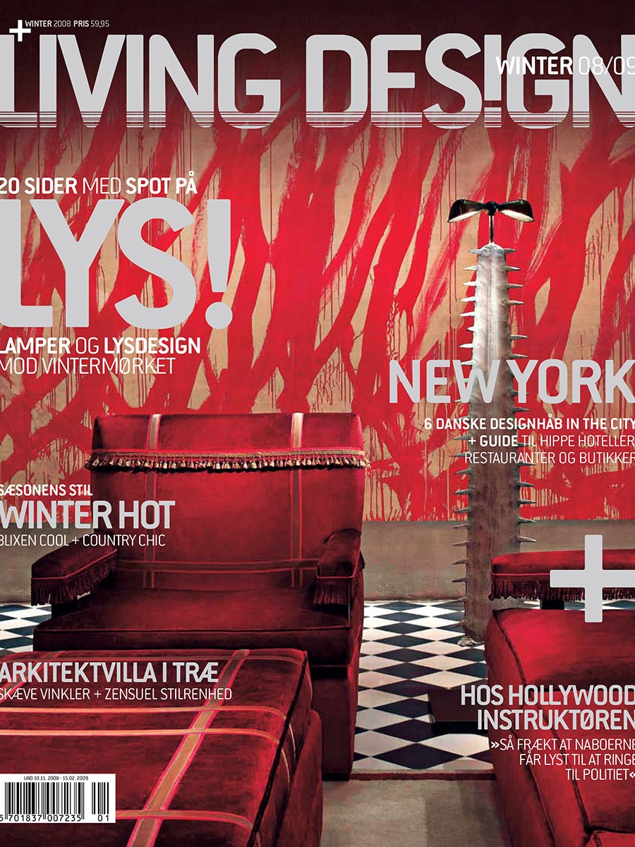
Living Design – Clock Delay by Bloomming

Danish Design Magazine Highlights an Unconventional Way of Telling Time

Published in Living Design, Winter 2008/2009

Danish interior and design magazine Living Design featured Clock Delay, the experimental clock designed by Bas van Leeuwen for Dutch design studio Bloomming, in a special editorial exploring innovative contemporary clock designs.

Presented within a curated selection of unusual timepieces, Clock Delay stood out for its exposed mechanics and sculptural interpretation of time.

Clock Delay

Rather than hiding the mechanism behind a clock face, Clock Delay makes the movement itself the centrepiece.

The design consists of three rotating gears representing:

  • Hours
  • Minutes
  • Seconds

As the gears rotate, the current time can be read where the three wheels intersect. Traditional clock hands become unnecessary, allowing the mechanics to become both the function and the visual expression of the object.

Constructed from stainless steel and aluminium, Clock Delay occupies the space between product design, engineering and kinetic sculpture.

Featured in “Clockwise”

The magazine’s editorial, titled “Clockwise”, explored the many ways contemporary designers reinterpret our perception of time.

Clock Delay was selected as one of the most distinctive examples because of its visible mechanical construction and unconventional reading method. While many modern clocks focus on simplification, Clock Delay reveals complexity and celebrates the beauty of movement.

The publication described the clock as consisting of three gears for hours, minutes and seconds that visually indicate time through their interaction.

Design Philosophy

Clock Delay was developed from the idea that modern products often conceal how they work.

By exposing the mechanism, the design encourages curiosity and appreciation for engineering. The clock transforms the normally invisible process of measuring time into something that can be observed and enjoyed.

Reading the time requires a moment of attention, making users more aware of the passage of time itself.

This approach reflects Bloomming’s broader design philosophy: creating objects that invite interaction, provoke thought and reveal their function rather than hiding it.

A Mechanical Sculpture

Beyond its practical purpose, Clock Delay functions as a moving sculpture. The continuously rotating gears create an ever-changing composition of lines, numbers and shadows.

The result is an object that becomes a focal point within an interior while simultaneously performing its role as a clock.

Product Information

Product: Clock Delay
Designer: Bas van Leeuwen
Studio: Bloomming
Materials: Stainless steel and aluminium
Dimensions: Approximately 35 × 35 × 48 cm
Category: Clock / Kinetic Sculpture

International Recognition

The feature in Living Design added to a growing list of international publications that recognised Clock Delay for its originality. The design appeared in magazines throughout Europe, North America and Asia, helping establish Bloomming as a studio known for combining conceptual thinking with strong visual design.

Clock Delay remains one of the most distinctive early projects created by the studio.

Publication Details

Publication: Living Design
Country: Denmark
Issue: Winter 2008/2009
Section: Clockwise
Featured Product: Clock Delay
Designer: Bas van Leeuwen
Studio: Bloomming


Original publication summary

“Delay by Dutch design studio Bloomming is a clock that does away with convention. Consisting of three gears for hours, minutes and seconds, it displays time through the movement and interaction of its rotating wheels.”

Excellent

By Magazine

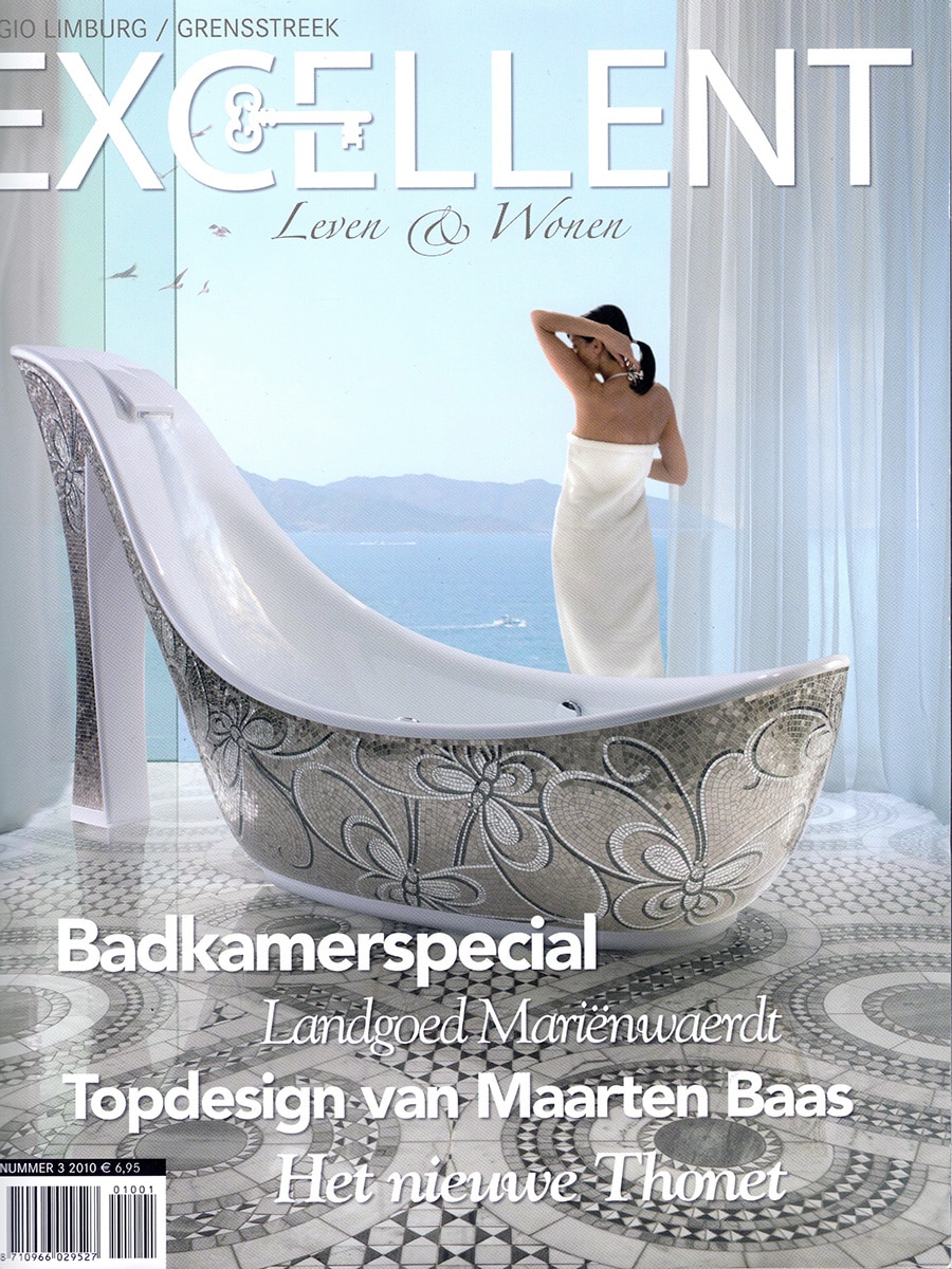
Excellent – Reflections by Bloomming

Dutch Lifestyle Magazine Highlights Reflections During Dutch Design Week 2010

Published in Excellent Magazine, 2010

Dutch lifestyle and interior magazine Excellent featured Reflections, the sculptural vase collection designed by Karin van der Zanden for Bloomming, in its coverage of Dutch Design Week 2010.

Presented among emerging talents and established names from the Dutch design scene, Reflections was selected as an example of contemporary design that combines geometric precision with a strong visual presence. The magazine showcased the collection alongside furniture, glass objects and other noteworthy designs exhibited during the event.

Reflections

Reflections is a collection of faceted steel vases inspired by the interplay between geometry, light and reflection.

Each vase is constructed from folded stainless steel surfaces that create a constantly changing appearance. Depending on the viewing angle and surrounding light conditions, the polished facets reflect their environment in unexpected ways, transforming the object throughout the day.

The collection blurs the boundary between functional object and sculptural artwork.

Inspired by Geometry and Light

The design language of Reflections is rooted in geometric forms and architectural surfaces.

Sharp edges and angled planes create a dynamic composition that captures and fragments reflections, allowing the vases to interact with their surroundings. Even without flowers, the objects function as decorative pieces that introduce depth, contrast and visual movement into an interior.

A Distinctive Presence

Featured during Dutch Design Week, Reflections demonstrated Bloomming’s interest in combining industrial production techniques with sculptural aesthetics.

The reflective stainless steel surfaces create a striking contrast between precision and fluidity, making each vase appear slightly different as light conditions change. This quality gives the collection a timeless character that complements both contemporary and classic interiors.

Dutch Design Week 2010

The feature appeared within Excellent’s preview of Dutch Design Week, the Netherlands’ largest design event. The magazine highlighted the growing importance of the event as a platform where young designers, established studios and innovative brands present new ideas and products to an international audience.

Among the selected works, Reflections stood out for its minimalist form language and strong material expression.

Product Information

Product: Reflections
Designer: Karin van der Zanden
Brand: Bloomming
Category: Vase Collection
Material: Stainless Steel
Finish: Mirror-polished reflective surface
Characteristics: Geometric, sculptural, reflective

Publication Details

Publication: Excellent – Leven & Wonen
Country: The Netherlands
Year: 2010
Section: Dutch Design Week 2010
Featured Product: Reflections
Designer: Karin van der Zanden
Brand: Bloomming


Original publication summary

“During Dutch Design Week 2010, Excellent highlighted Reflections by Bloomming, a collection of faceted stainless steel vases designed by Karin van der Zanden. The geometric forms and reflective surfaces transform the surrounding environment into part of the design, creating sculptural objects that change with light and perspective.”

Grazia Casa

By Magazine

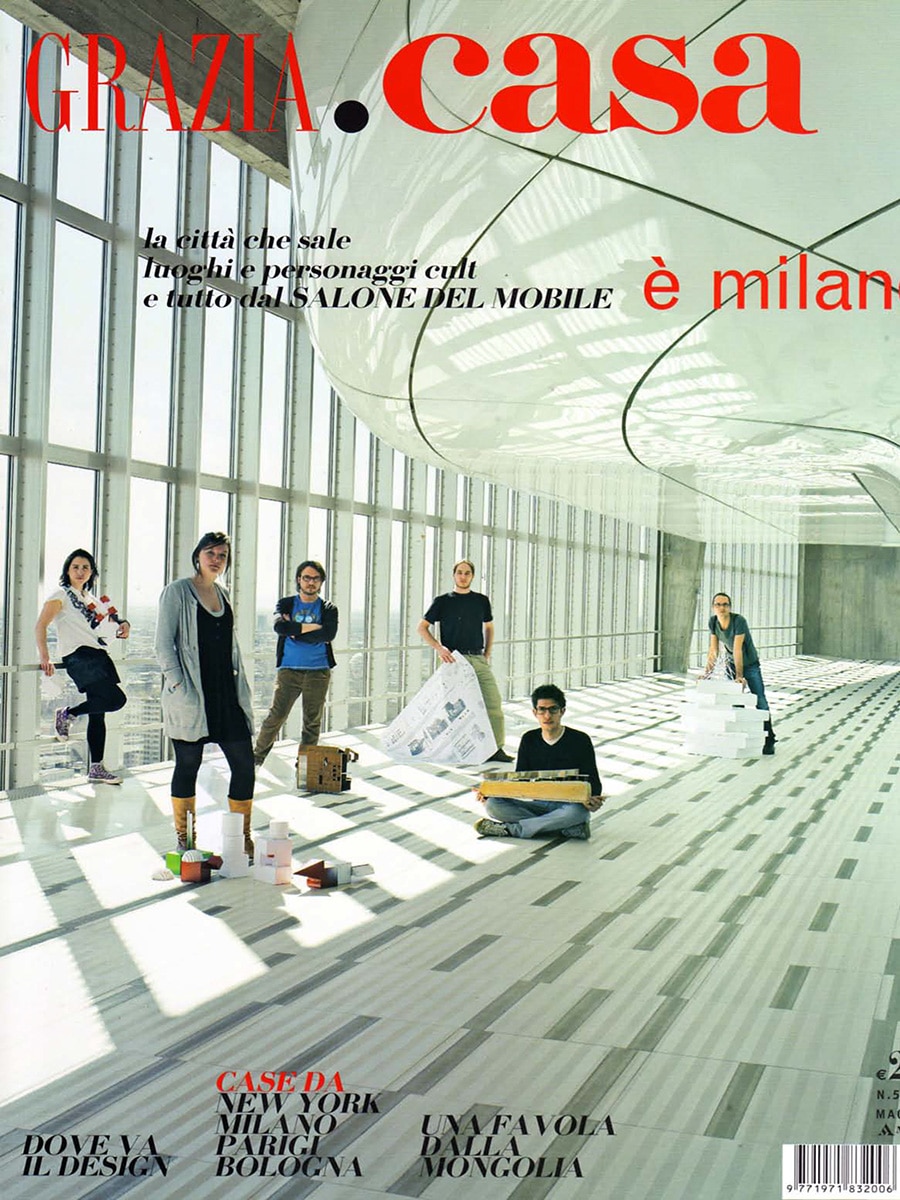
Grazia Casa – Clock Delay by Bloomming

Clock Delay Featured Among Contemporary Interpretations of Time

Published in Grazia Casa, Italy, 2009

Italian interiors and lifestyle magazine Grazia Casa featured Clock Delay, the experimental clock designed by Bas van Leeuwen for Bloomming, in a curated selection of innovative clock designs.

Presented alongside works by renowned contemporary designers, Clock Delay was highlighted for its ability to transform the familiar concept of a clock into a captivating mechanical object.

An Extraordinary Everyday Object

Under the heading “Eccezionale quotidiano” (“Extraordinary Everyday”), Grazia Casa described Clock Delay as:

“An experiment that captures the eye.”

The publication recognised the design for challenging traditional expectations of timekeeping and for turning a functional household object into a visual experience.

Clock Delay

Unlike conventional clocks, Clock Delay does not use hands or a traditional clock face.

Instead, the clock consists of three rotating wheels representing:

  • Hours
  • Minutes
  • Seconds

As the gears slowly rotate, the current time can be read at the point where the three wheels intersect. The mechanism itself becomes the display, exposing the normally hidden workings of a clock.

Constructed from stainless steel and aluminium, Clock Delay combines engineering, movement and sculpture in a single object.

Design Philosophy

Clock Delay was created from a fascination with the beauty of mechanisms and the growing tendency of modern products to hide their inner workings.

Rather than disguising technology, the design celebrates it. The visible gears, moving elements and exposed construction encourage curiosity and invite viewers to engage with the object.

Reading the time becomes a small ritual rather than an instant glance.

The project reflects Bloomming’s early interest in creating products that combine conceptual thinking, interaction and craftsmanship.

Part of a Larger Discussion About Time

The Grazia Casa feature explored different contemporary approaches to representing time, from minimalist clocks to conceptual experiments.

Clock Delay stood out because it reveals the mechanics behind timekeeping rather than simplifying or concealing them. The design demonstrates that a clock can be both a functional object and a conversation piece.

Product Information

Product: Clock Delay
Designer: Bas van Leeuwen
Studio: Bloomming
Materials: Stainless steel and aluminium
Dimensions: Approximately 35 × 35 × 48 cm
Category: Clock / Kinetic Sculpture

International Recognition

The feature in Grazia Casa contributed to the growing international visibility of Clock Delay. During this period the design appeared in magazines and publications across Europe, North America and Asia, becoming one of Bloomming’s most widely published early products.

Its unconventional interpretation of time and mechanics resonated with editors looking for design objects that went beyond pure functionality.

Publication Details

Publication: Grazia Casa
Country: Italy
Year: 2009
Section: Collezione Privata
Featured Product: Clock Delay
Designer: Bas van Leeuwen
Studio: Bloomming


Original publication caption

“Clock Delay by Bas van Leeuwen (Bloomming). An extraordinary experiment that captures the eye.”

Pi

By Magazine

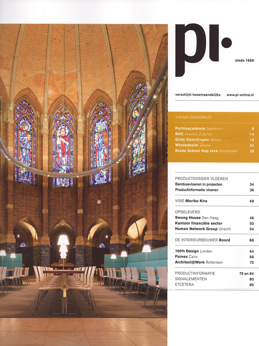
PI – Lightfacet by Bloomming

Dutch Interior Architecture Magazine Highlights Lightfacet at Architect@Work 2010

Published in PI Magazine, October–November 2010

Dutch interior architecture magazine PI featured Lightfacet, the modular room divider designed by Mireille Meijs for Bloomming, in its coverage of Architect@Work 2010 in Rotterdam.

Presented alongside innovative products and materials for architects and interior professionals, Lightfacet was selected as an example of contemporary design that combines functionality, sustainability and visual impact. The publication emphasised the product’s ability to manipulate light, shadow, reflection and transparency through a simple yet highly adaptable modular system.

Lightfacet

Lightfacet is a modular room divider composed of individually rotatable geometric elements.

By rotating each facet independently, users can control the amount of transparency across the surface, creating constantly changing patterns of light and shadow. This interactive quality allows the divider to respond to different spatial needs while maintaining an open and airy character.

The design functions as both a room divider and an architectural feature, offering privacy without sacrificing daylight or visual connection.

Playing with Light and Transparency

As noted in the article, Lightfacet is designed around the relationship between light, reflection and openness.

The adjustable modules enable users to transform a space through simple rotations, creating subtle shifts in atmosphere throughout the day. Depending on the position of the facets, the divider can appear more open or more enclosed, making it suitable for a wide variety of interior applications.

Sustainable by Design

PI highlighted Lightfacet’s durable construction and environmentally conscious approach.

The system is designed to be long-lasting, easy to install and fully recyclable. The modular elements can be produced in a variety of materials, including injection-moulded PC/ABS, aluminium, nylon and brushed stainless steel, allowing the design to be adapted to different architectural environments and project requirements.

Designed for Architects and Interior Designers

Architect@Work is a trade event dedicated to innovative products for the architecture and interior design industry. By featuring Lightfacet within this context, PI positioned the design as a solution for professionals seeking flexible ways to define space while maintaining openness and natural light.

The featured installation demonstrated how the divider can create visual separation in hospitality and commercial interiors without introducing the heaviness of traditional walls or partitions.

Product Information

Product: Lightfacet
Designer: Mireille Meijs
Brand: Bloomming
Category: Modular Room Divider
Features: Adjustable transparency, light control, modular design
Materials: PC/ABS, aluminium, nylon, brushed stainless steel
Applications: Residential, hospitality, retail and office interiors

Publication Details

Publication: PI Magazine
Country: The Netherlands
Issue: October–November 2010
Section: Architect@Work 2010
Featured Product: Lightfacet
Designer: Mireille Meijs
Brand: Bloomming


Original publication summary

“Featured at Architect@Work 2010, Lightfacet by Bloomming plays with light, shadow, reflection and transparency. The modular room divider allows spaces to be transformed through the simple rotation of individual facets. Available in any size, lightweight, easy to install, durable and fully recyclable, Lightfacet was presented as an innovative architectural solution for contemporary interiors.”

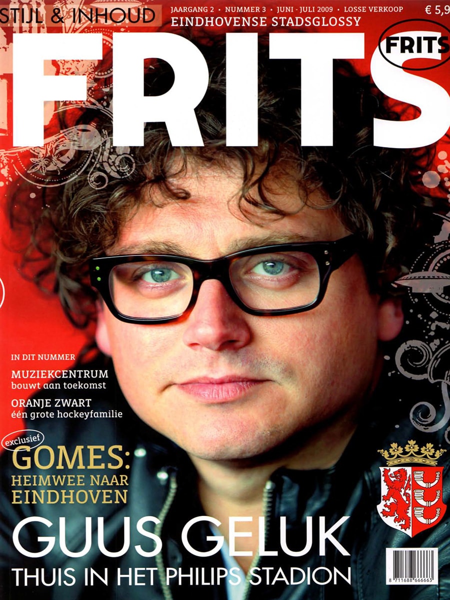
Frits

By Magazine

Frits Magazine – Ring One by Bloomming

Eindhoven Design Duo Featured in Frits Magazine

Published in Frits Magazine, June–July 2009

Dutch lifestyle magazine Frits featured Ring One, the iconic interlocking ring design created by Bas van Leeuwen and Mireille Meijs of Bloomming, in its “Favorits” section highlighting notable products from Eindhoven and the surrounding region.

The publication introduced the young Eindhoven-based designers and their innovative interpretation of a traditional symbol of connection and commitment.

Ring One

Ring One consists of two complementary rings: a men’s version and a women’s version. Individually, each ring has a distinct shape. Together, they fit perfectly and form a single unified object.

The design explores the idea that two individuals can maintain their own identity while simultaneously becoming part of something larger. Rather than using decorative symbolism, the concept is expressed through the physical interaction of the rings themselves.

When placed together, the two rings interlock seamlessly, creating a visual representation of connection, partnership and unity.

Design Concept

The strength of Ring One lies in its simplicity. The rings are designed as two separate objects that only reveal their full meaning when combined.

This interaction transforms the jewellery from a decorative accessory into a tangible expression of a relationship. The design demonstrates how form can communicate an idea without the need for additional ornamentation.

The project reflects Bloomming’s early design philosophy: creating products in which concept, functionality and aesthetics are inseparable.

Materials and Availability

According to the publication, Ring One was available in:

  • Silver
  • Gold
  • White gold

The rings were produced in a range of sizes and could be purchased either as a pair or individually.

Eindhoven Design

At the time of publication, Bas van Leeuwen and Mireille Meijs had recently graduated from the Design Academy Eindhoven and were building the foundation of what would become Bloomming.

Ring One attracted attention for its clear concept and elegant execution, earning coverage in design magazines and publications both in the Netherlands and internationally.

Product Information

Product: Ring One
Designers: Bas van Leeuwen & Mireille Meijs
Studio: Bloomming
Category: Jewellery / Wedding Rings
Materials: Silver, Gold, White Gold
Year: 2009

Publication Details

Publication: Frits Magazine
Country: The Netherlands
Issue: June–July 2009
Section: Favorits
Featured Product: Ring One
Designers: Bas van Leeuwen & Mireille Meijs


Original publication summary

“Behind the name Bloomming are the young Eindhoven designers Bas van Leeuwen and Mireille Meijs. Their Ring One consists of a men’s and a women’s ring that form a single unit together and reinforce one another. Available in silver, gold and white gold.”

Echos Coiffure

By Magazine

Echos Coiffure – Facet by Bloomming

Belgian Hairdressing Magazine Showcases Facet in a Contemporary Salon Interior

Published in Echos Coiffure, November–December 2010

Belgian professional hairdressing magazine Echos Coiffure featured Facet, the modular room divider designed by Mireille Meijs and Bas van Leeuwen for Bloomming, in a report about the renovation of M&Team Hairdressers in Wuustwezel, Belgium.

The article focused on the salon’s transformation into a more efficient, organised and calming environment. Within the redesigned interior, Facet was selected as a distinctive architectural element, separating the washing area from the styling space while maintaining openness and visual connection throughout the salon.

Facet

Facet is a modular room divider composed of individually rotatable geometric elements.

Each facet-shaped module can be adjusted independently, allowing the transparency of the divider to be customised across its surface. This creates an ever-changing interplay of light, privacy and pattern, giving the installation both a functional and sculptural presence.

The design combines spatial separation with visual openness, making it suitable for interiors where privacy is desired without sacrificing light or a sense of spaciousness.

Designed for Flexible Interiors

In the salon featured by Echos Coiffure, Facet was used to define different functional zones while preserving the bright, minimalist character of the interior.

The article notes that the individual polyester modules can be rotated independently, allowing the owner to transform the appearance of the divider according to inspiration and the desired level of openness. This flexibility makes Facet particularly suitable for commercial environments where interior layouts and visual experiences play an important role.

A Focal Point in a Minimalist Space

The renovated salon was designed around simplicity, efficiency and customer comfort.

Against a backdrop of white furniture and clean architectural lines, Facet introduced texture, depth and visual interest. Rather than acting as a conventional partition, the divider became a focal point within the space, demonstrating how functional elements can also contribute to the identity of an interior.

Product Information

Product: Facet
Designers: Mireille Meijs & Bas van Leeuwen
Brand: Bloomming
Category: Modular Room Divider
Material: High-quality synthetic material with stainless steel suspension system
Feature: Individually rotatable modules for adjustable transparency and privacy

Design Beyond Residential Spaces

The feature in Echos Coiffure illustrates Facet’s versatility beyond residential interiors.

Its ability to divide spaces without blocking light has made it a popular choice for hospitality, retail, office and wellness environments. The project demonstrates how a room divider can contribute not only to functionality but also to the overall atmosphere and visual identity of a commercial interior.

Publication Details

Publication: Echos Coiffure
Country: Belgium
Issue: November–December 2010
Article: Le temps, c’est du luxe
Featured Product: Facet
Designers: Mireille Meijs & Bas van Leeuwen
Brand: Bloomming
Project Location: M&Team Hairdressers, Wuustwezel, Belgium


Original publication summary

‘In a feature about the renovation of M&Team Hairdressers, Echos Coiffure highlighted Facet by Bloomming as a distinctive white room divider separating the shampoo area from the styling space. The article noted that the individual modules can be adjusted independently, allowing the partition to be transformed according to the desired level of openness.’