Category

Magazine

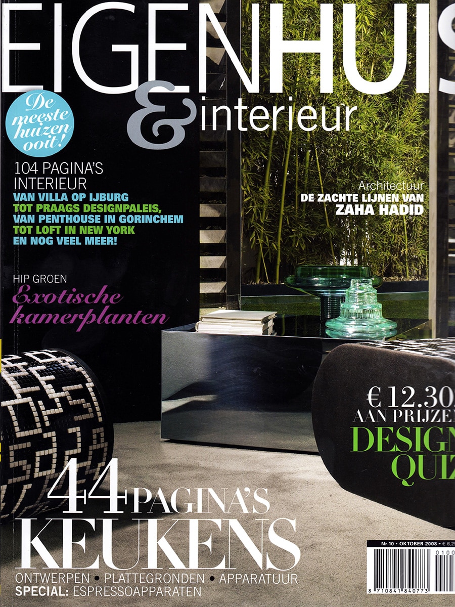
Eigen Huis & Interieur

By Magazine

Libra & Interior

Published in EH&I, October 2008

In its Libra & Interior feature, EH&I magazine explored the characteristics of a Libra-inspired interior. According to the publication, such interiors are built around a minimalist foundation, complemented by a selection of carefully chosen statement pieces and antiques.

Among the featured design objects was Clock Delay, a sculptural clock by Studio Bloomm, designed by Bas van Leeuwen.

Bringing Technology Back into Focus

The article highlighted a growing disconnect between people and the products they use every day.

As modern products become increasingly disposable, fewer people repair broken objects or understand how they function. According to the magazine, this trend has led to a gradual loss of appreciation for technology and craftsmanship.

Clock Delay was presented as a response to this phenomenon.

Rather than concealing its mechanism behind a traditional clock face, the design places the mechanics at the centre of attention. By exposing the components responsible for measuring time, the clock encourages people to rediscover the beauty of engineering and mechanical systems.

Clock Delay

Clock Delay transforms the process of telling time into a visual experience.

The design celebrates movement, precision and construction by making the mechanism itself visible. Instead of focusing solely on functionality, the clock invites users to observe and appreciate the technology that drives it.

This approach reflects one of the recurring themes within Bloomming’s early work: creating products that encourage people to engage more consciously with the objects that surround them.

Product Information

Product: Clock Delay
Designer: Bas van Leeuwen
Studio: Studio Bloomm
Dimensions: 35 × 35 × 48 cm
Retail price at publication: €1,280

Publication Details

Publication: EH&I
Issue: October 2008
Section: Libra & Interior
Featured designer: Bas van Leeuwen
Company: Studio Bloomm
Featured product: Clock Delay
Topics: Product design, clocks, technology, craftsmanship, Dutch design
Vogue

By Magazine

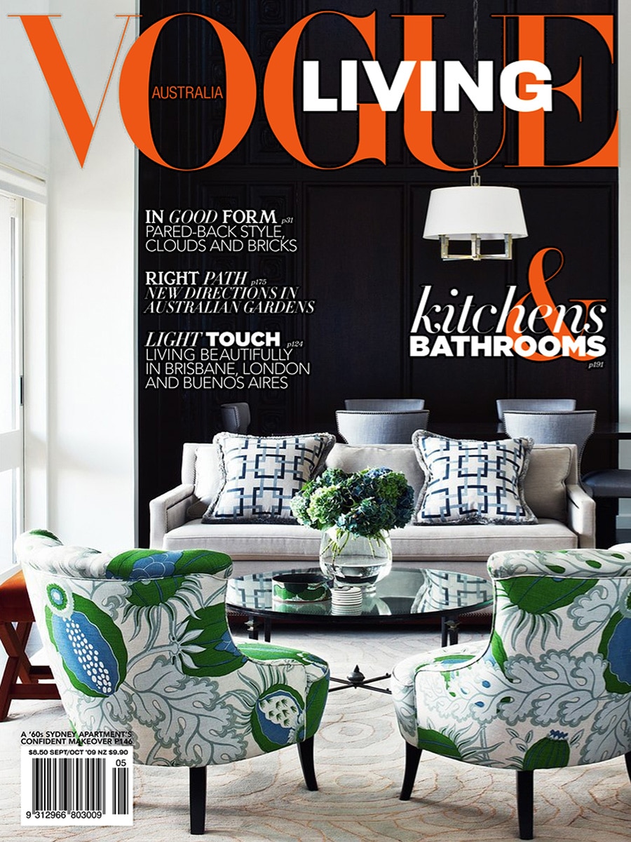
Vogue Living Australia — September / October 2009

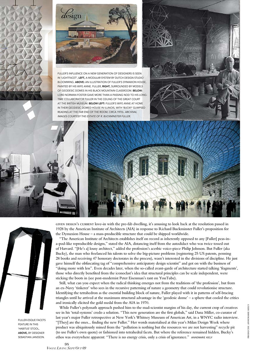
Lightfacet featured in Vogue Living’s exploration of Buckminster Fuller’s legacy

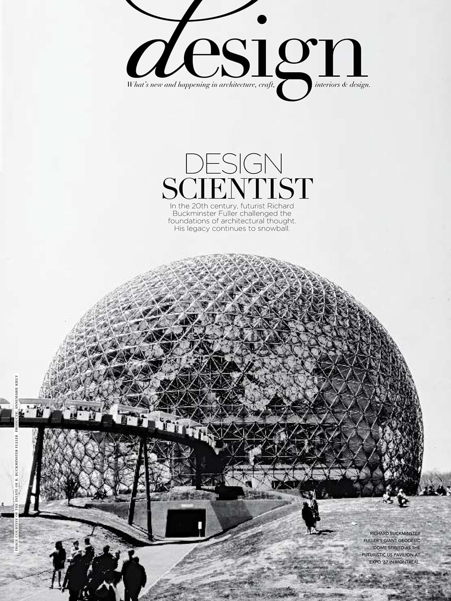
In the September/October 2009 issue of Vogue Living Australia, Lightfacet was featured in a major editorial examining the lasting influence of visionary architect, inventor and futurist Richard Buckminster Fuller. The article, titled “Design Scientist”, explored how Fuller’s ideas continue to inspire contemporary designers, architects and makers around the world.

A new generation inspired by Fuller

The article traced the impact of Fuller’s work on modern design, from geodesic domes and lightweight structures to contemporary products influenced by geometric systems and modular thinking. According to the magazine, a new generation of designers was rediscovering Fuller’s ideas and translating them into products that combine efficiency, flexibility and visual innovation.

Lightfacet was selected as one of the examples illustrating this continuing influence.

Geometry as a design language

Within the feature, Lightfacet was presented as a modular room divider by Dutch design studio Bloomming. The publication highlighted the design’s repeating geometric structure and its ability to transform space through a system of interconnected triangular and diamond-shaped elements.

Much like Fuller’s fascination with geometric principles as building blocks of nature, Lightfacet uses a simple modular element to create larger architectural compositions that can adapt to different environments and requirements.

Beyond decoration

Rather than functioning solely as a decorative screen, Lightfacet was featured as an example of design that actively engages with space, light and human interaction. By rotating individual facets, users can continuously alter transparency, visibility and pattern, creating a dynamic relationship between openness and privacy.

This adaptability reflected many of the principles celebrated throughout the article: efficiency, modularity and intelligent use of structure.

Publication details

Publication: Vogue Living Australia
Issue: September / October 2009
Article title: Design Scientist
Section: Design
Product: Lightfacet
Designers: Bas van Leeuwen & Mireille Meijs
Company: Bloomming

Featured mention

The article noted that the influence of Buckminster Fuller on a new generation of designers could be seen in “Lightfacet, a modular system by Dutch design studio Bloomming.” The design was presented alongside examples of Fuller’s work and contemporary interpretations of his geometric thinking.

Why this feature mattered

Being featured in Vogue Living Australia placed Lightfacet within an international design conversation rather than solely an interior design context. Instead of focusing on its function as a room divider, the magazine positioned the design within a broader architectural and conceptual framework, connecting it to the ideas of one of the twentieth century’s most influential design thinkers.

The feature underscored how Lightfacet embodies principles of modularity, adaptability and geometric innovation—qualities that continue to define the design today.

Villas

By Magazine

Bloomming featured in Villas magazine

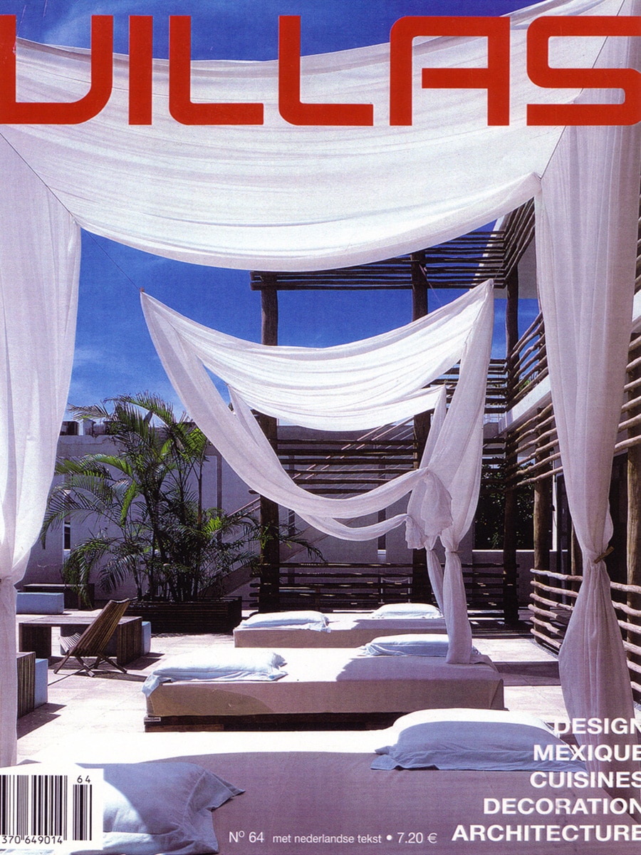
The influence of Dutch design extends far beyond the Netherlands. In issue 64 of Villas, the French architecture and interior design magazine dedicated a feature to contemporary Dutch designers and innovative furniture concepts. Among the selected projects: Bloomming and the work of founders Bas van Leeuwen and Mireille Meijs.

Dutch design through an international lens

The editorial explores a new generation of Dutch designers who combine functionality, experimentation, and a strong visual identity. Rather than focusing solely on form, the featured designers are presented as thinkers and makers who respond to the changing way we live, work, and experience our surroundings.

Within this context, Bloomming was included as part of a curated selection showcasing the diversity and creativity of Dutch design.

A feature for Bloomming

In the design overview, Bas van Leeuwen and Mireille Meijs appear alongside other emerging Dutch designers whose work attracted international attention. The publication highlights Bloomming’s distinctive approach to geometry, modularity, and spatial design — themes that continue to define the brand today.

The feature also includes the Grip table leg system, an early Bloomming design. Grip was conceived as a flexible stainless-steel table base that can be combined with a wide variety of tabletop materials and dimensions. By separating the tabletop from its supporting structure, the design offers freedom for customisation while maintaining a refined architectural appearance.

Recognition beyond borders

For a young design studio, being featured in an international publication such as Villas represented an important milestone. It demonstrated how Dutch design was gaining recognition abroad and how Bloomming’s work resonated with an audience interested in innovation, craftsmanship, and contemporary interiors.

Today, many of the same principles visible in these early projects remain at the heart of Bloomming’s collection: modular thinking, architectural form, and products that transform the way spaces are experienced.

Publication details

Publication: Villas Magazine
Issue: No. 64
Country: France
Feature: Dutch Design (Design des Pays-Bas)
Products featured: Grip table leg system and Bloomming studio work
Designers: Bas van Leeuwen & Mireille Meijs

More than a decade later, these early international publications offer a glimpse into the origins of Bloomming and the design philosophy that continues to shape the brand today.

Eigen Huis & Interieur

By Magazine

Playing with Light

Published in EH&I, February 2008

In February 2008, Dutch design magazine EH&I featured designer Mireille Meijs and her graduation project Light Facet, a room divider that explored new ways of shaping sunlight within interior spaces.

At the time, the project was still in its early stages, years before Facet would become an internationally recognised room divider and the foundation of Bloomming’s success.

The Origin of Light Facet

According to Mireille Meijs, sunlight can transform a room, but traditional solutions such as curtains and blinds often create a static result.

When closed, these systems block light and can make a space feel darker. Light Facet was conceived as an alternative approach: a room divider that allows users to actively shape the flow of light through a space.

The design consists of individually rotatable geometric modules. By adjusting the position of the modules, users can create changing patterns of light and shadow while simultaneously controlling privacy and openness.

As Mireille explained:

“To create changing patterns of light and shadow, the surfaces of Light Facet can be rotated independently. This allows any desired area to be opened or closed.”

The resulting pattern resembles an abstract field of flowers and creates a playful interaction between sunlight and interior space.

Design Academy Eindhoven

Light Facet was developed while studying at Design Academy Eindhoven.

When asked why she chose Eindhoven, Mireille emphasised the importance of strong ideas and thorough research:

“A good idea is the foundation of a good product. By exploring all possible angles of a problem, you discover new solutions.”

This design philosophy would later become a defining characteristic of Bloomming’s products: combining visual elegance with a clear functional purpose.

Building a Design Practice

At the time of the interview, Mireille had already started her own design studio and was actively developing the Light Facet concept further.

She expressed a clear ambition for the future:

“I think it would be fantastic to one day see Light Facet hanging in people’s homes all over the world.”

Looking back, this statement proved remarkably prophetic. What began as a graduation project eventually evolved into Facet, a room divider now used in homes, offices, restaurants, hotels and public spaces around the world.

Inspiration and Learning

Mireille credited the designers at Feiz Design Studio, who supervised her graduation project, as important sources of inspiration.

She admired their ability to take simple everyday themes and develop them into refined and intelligent design solutions.

When asked what frustrated her most, her answer was concise:

“Arrogant designers.”

Future Plans

At the time of publication, Mireille’s goal was to further develop her ideas, bring products to market and inspire people through design.

She also shared a broader ambition:

“I would like to work in a developing country for a period of time in order to help people there.”

A Design That Endured

What makes this article particularly significant is that it documents one of the earliest public appearances of Light Facet, the project that would later become Facet.

The core concept described in the article remains unchanged today: a room divider composed of individually rotatable modules that allow users to shape light, privacy and transparency according to their needs.

More than fifteen years later, Facet continues to embody the same idea that inspired its creation: transforming light into an interactive part of interior design.

Publication Details

Publication: EH&I
Issue: February 2008
Featured designer: Mireille Meijs
Project: Light Facet
Institution: Design Academy Eindhoven
Topics: Room dividers, light and shadow, interior design, Dutch design, product design

Excellent

By Magazine

Excellent – Leven & Wonen (Eindhoven Edition) — Winter 2009

Lightfacet featured in a trend report on timeless interiors

In the Winter 2009 edition of Excellent – Leven & Wonen, Lightfacet was featured in a curated shopping and interior trends section titled “Tijdloos sfeervol” (Timeless atmosphere). The article explored the enduring appeal of monochrome interiors, highlighting how white, grey and black continue to create elegant and sophisticated living environments.

Timeless atmosphere

The feature focused on products that embrace simplicity, strong silhouettes and refined patterns. Rather than following short-lived trends, the selected objects demonstrated how carefully chosen design pieces can create a lasting sense of style and harmony within the home.

Among decorative accessories, furniture and homeware, Lightfacet was presented as a striking architectural element that brings both visual interest and practical functionality to an interior.

A room divider shaped by light and pattern

The magazine described Lightfacet as a room divider composed of interconnected diamond-shaped modules that can each be opened or closed individually. This allows users to create changing patterns throughout the surface while adjusting the balance between openness and privacy.

Its geometric appearance perfectly complemented the article’s theme of monochrome elegance, where texture, shadow and form take centre stage.

Design that evolves with the space

Unlike conventional partitions, Lightfacet was presented as an interactive interior element. By rotating individual facets, users can continuously transform the appearance of the divider, creating unique compositions that respond to changing needs and lighting conditions.

The result is a room divider that functions not only as a spatial separator, but also as a sculptural design object.

Publication details

Publication: Excellent – Leven & Wonen (Eindhoven Edition)
Date: Winter 2009
Article title: Tijdloos sfeervol
Section: Shop
Product: Lightfacet
Designers: Bas van Leeuwen & Mireille Meijs
Company: Bloomming

Featured description

The magazine described Lightfacet as a room divider consisting of interconnected diamond-shaped plastic elements that can each be opened or closed individually. The design allows users to create ever-changing patterns while introducing structure, privacy and visual rhythm into a space.

Why this feature mattered

Excellent positioned Lightfacet within a broader interior trend focused on timeless design rather than seasonal fashion. By featuring the divider alongside carefully selected lifestyle products, the magazine highlighted Lightfacet’s ability to function simultaneously as architecture, decoration and a flexible spatial solution—qualities that would become central to Bloomming’s design philosophy.

Aeroflot Magazine

By Magazine

Аэрофлот Бортовой Журнал / Aeroflot Inflight Magazine

Aeroflot Inflight Magazine is the official in-flight publication of Aeroflot – Russian Airlines, distributed to passengers across the airline’s domestic and international network. Published monthly, the magazine covers travel, culture, lifestyle and design, reaching a broad audience of business and leisure travellers throughout Russia and beyond.

The March 2013 issue marks a significant milestone: Aeroflot’s 90th anniversary, celebrated on the cover with archival imagery spanning the airline’s history from Soviet-era propaganda posters to contemporary cabin interiors.

My Other Half – A Design Feature on Romantic Gifts

Pages 102–106 of the issue contain a multi-page design feature titled “Половинка моя!” (“My Other Half!”), written by Katerina Afonchenkova. The article explores how contemporary designers are reimagining romantic gifts — objects that hint at deep feeling while remaining genuinely useful and considered. The feature presents eleven numbered products, each selected for its clever concept and design quality.

The editorial premise is built around the idea of pairing: gifts designed for two people, where each half belongs to the other. Products range from a dual-reservoir teapot by Polish designer Ewa Sendecka, to a heart-shaped anatomical wine decanter, to a set of lovers’ gloves connected by a shared mitten, to a kinetic wooden heart sculpture by British artist Martin Smith.

Bloomming in the Feature

Among the eleven products presented, Bloomming’s interlocking ring collection is featured as item 8. The rings are described as gold or silver jewellery sets from the Dutch team Bloomming. The editorial highlights the defining characteristic of the One collection: each piece can only connect with its own counterpart. The interlocking mechanism means that no two rings from different pairs can be joined — making the set a literal, physical expression of exclusivity and belonging.

The rings are presented alongside a bold red heart sculpture, visually reinforcing the romantic theme of the spread. Their clean, minimal form contrasts with the more elaborate objects in the feature, allowing the concept — rather than decoration — to carry the emotional weight.

The One Collection: Jewellery as Commitment

The One collection by Bloomming translates the idea of a unique bond into a wearable object. The interlocking rings are engineered so that each pair fits together precisely, and only together. This mechanical exclusivity makes the collection not just a piece of jewellery, but a statement: two rings that belong to each other and to no one else.

By including the collection in a feature about romantic design gifts, the Aeroflot editors positioned the One rings alongside some of the most inventive couples-oriented products on the international design market in early 2013.

Reach and Context

As an inflight magazine distributed across Aeroflot’s network, this publication reached a substantial international readership at a moment when Aeroflot was one of Europe’s largest airlines by passenger volume. The March 2013 issue, timed around Valentine’s Day gift-giving, placed Bloomming’s work in front of a diverse, design-aware audience across Russia, Europe and beyond.

The feature appeared in the “Дело вкуса / Дизайн” (Matter of Taste / Design) section, a recurring editorial slot dedicated to highlighting notable product design from international studios and designers.

Publication details

Publication: Аэрофлот Бортовой Журнал / Aeroflot Inflight Magazine
Section: Дело вкуса / Дизайн (Matter of Taste / Design)
Article title: Половинка моя! (My Other Half!)
Author: Katerina Afonchenkova
Issue: March 2013
Pages: 102–106
Product featured: One – Interlocking Ring Collection
Company: Bloomming
Designers: Bas van Leeuwen & Mireille Meijs
Category: Inflight lifestyle and design magazine

Why this feature mattered

Placement in an airline inflight magazine represents a distinct form of editorial reach. Unlike design press read primarily by industry professionals, inflight publications are consumed by a general audience with broad purchasing power and an appetite for lifestyle and gift ideas. The March 2013 timing — shortly after Valentine’s Day gift guides would have been relevant — meant the One collection was presented to readers in a mindset receptive to meaningful, design-led gifts. The feature reinforced Bloomming’s growing international profile and placed the One collection in a context that emphasised its emotional concept as much as its aesthetic qualities.

Smartlife

By Magazine

Is That the Time? No, Really, Is It?

Published in SmartLife Magazine

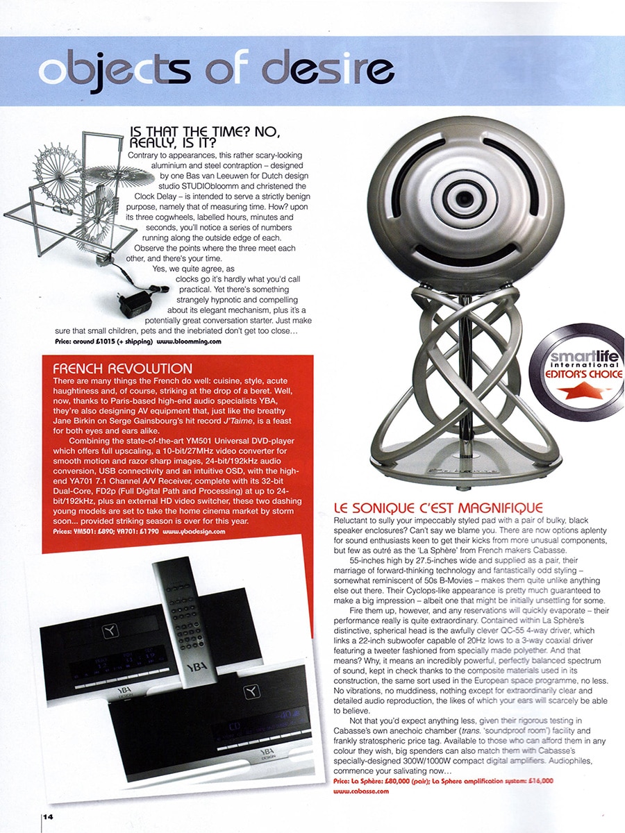
Among the products featured in SmartLife’s Objects of Desire section was Clock Delay, a sculptural clock designed by Bas van Leeuwen for Dutch design studio STUDIOBloomm.

The magazine highlighted the unusual appearance of the design, describing it as a striking aluminium and steel object that looks more like a kinetic sculpture than a traditional clock.

A Different Way of Reading Time

Clock Delay was created to challenge conventional expectations of how a clock should function and appear.

Instead of using traditional hands and a dial, the design displays time through three rotating cogwheels representing hours, minutes and seconds. Numbers run along the outer edge of each wheel, and the current time is determined by observing the point where the three indicators align.

The result is a clock that transforms the act of telling time into an engaging visual experience.

Technology as Sculpture

While the publication humorously acknowledged that Clock Delay is not the most practical way to read the time, it praised the design for its hypnotic quality and elegant mechanical appearance.

The exposed mechanism invites viewers to observe the movement of time itself rather than simply reading a number from a display. In doing so, the clock becomes both a functional object and a conversation piece.

According to the magazine, the design possesses a compelling presence that encourages people to stop, look and interact with it.

International Recognition

Clock Delay was featured as one of the magazine’s selected design objects and was presented alongside high-end audio equipment and luxury lifestyle products.

The publication described the clock as a memorable and distinctive design that stands apart from conventional timepieces through its exposed mechanics and sculptural character.

About Clock Delay

Product: Clock Delay
Designer: Bas van Leeuwen
Studio: STUDIOBloomm (later Bloomming)
Materials: Aluminium and steel
Function: Clock displaying time through three rotating cogwheels representing hours, minutes and seconds
Price at publication: Approximately £1,015 plus shipping
Website: www.bloomming.com

Publication Details

Publication: SmartLife Magazine
Section: Objects of Desire
Featured designer: Bas van Leeuwen
Company: STUDIOBloomm
Featured product: Clock Delay
Topics: Product design, kinetic design, clocks, exposed mechanics, Dutch design

Viva

By Magazine

VIVA Magazine (The Netherlands) — April 2010

Lightfacet featured in VIVA’s Chinese-inspired interiors trend report

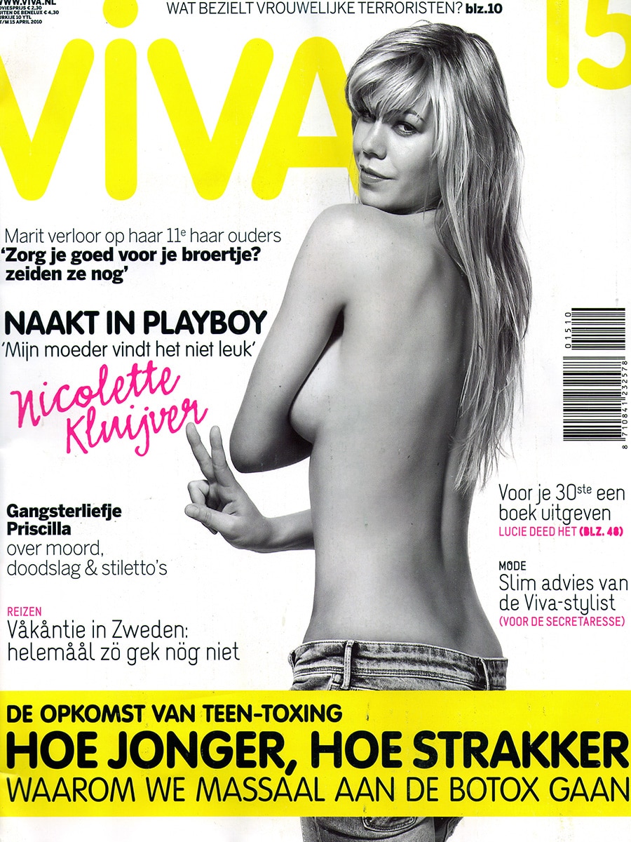
In April 2010, Dutch lifestyle magazine VIVA featured Lightfacet in a colourful interior trend report titled “Van Chinese thee tot drakenslingers” (From Chinese tea to dragon garlands). The article presented a curated collection of products, accessories and decorative objects inspired by Chinese culture, craftsmanship and aesthetics, highlighting the growing popularity of Asian influences in contemporary interiors.

A modern interpretation of decorative pattern

Within the selection of Chinese-inspired products, Lightfacet was presented as a contemporary design object that combines decoration with functionality. The magazine showcased the room divider’s distinctive geometric surface, formed by individually adjustable diamond-shaped elements that create a repeating pattern across the entire composition.

Placed alongside colourful textiles, wallpaper, ceramics and decorative accessories, Lightfacet demonstrated how architectural products can also contribute to the visual richness of an interior.

Create your own pattern

The article emphasised the interactive nature of the design. By rotating individual facets, users can continuously alter the appearance of the divider, creating their own combinations of open and closed elements. This allows the screen to evolve from a subtle spatial divider into a striking decorative feature.

Rather than being a static partition, Lightfacet was presented as a living element within the interior—one that changes through light, shadow and personal interaction.

Publication details

Publication: VIVA Magazine
Country: The Netherlands
Date: April 2010
Article title: Van Chinese thee tot drakenslingers
Section: Interior & Lifestyle
Product: Lightfacet
Designers: Bas van Leeuwen & Mireille Meijs
Company: Bloomming

Featured description

The magazine described Lightfacet as a room divider with a repeating pattern that allows users to open and close individual panels, creating their own unique compositions. The ability to customise transparency and pattern was highlighted as one of the design’s defining characteristics.

Why this feature mattered

While many early publications focused on Lightfacet’s architectural and spatial qualities, VIVA introduced the design to a broader lifestyle audience. The feature positioned Lightfacet as both a practical room divider and a decorative statement piece, demonstrating how contemporary Dutch design could seamlessly blend functionality, flexibility and visual expression.

The inclusion in VIVA reflected the growing appeal of Lightfacet beyond architecture and design professionals, bringing the concept of adaptable interiors to a wider consumer audience interested in home decoration, trends and personal style.

Frame

By Magazine

Here is the index text for this publication:


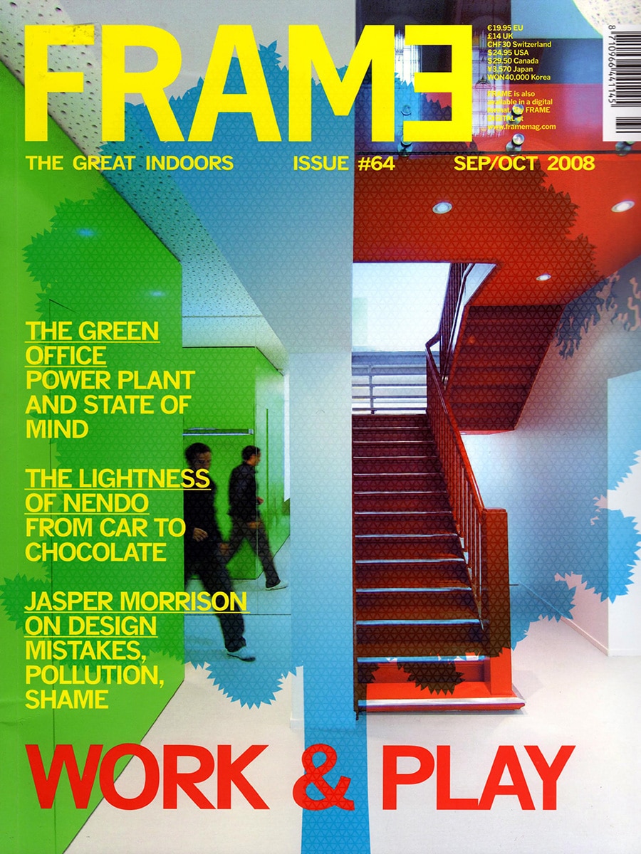
Frame Magazine – The Great Indoors, Issue #64, September/October 2008

Frame is an Amsterdam-based international magazine dedicated to interior design, spatial design and architecture. Published six times a year and distributed across more than 70 countries, Frame is one of the most widely read and respected interior design publications in the world, reaching architects, interior designers, spatial designers, retailers and design professionals across Europe, North America, Asia and beyond. The magazine covers spatial concepts, interior projects, products and design thinking, with a consistently high editorial standard and strong international credibility.




Issue 64 (September/October 2008) is themed around Work & Play, covering topics including the green office, the work of Japanese design studio Nendo, and an interview with Jasper Morrison on design, mistakes and pollution. The issue also contains coverage of 100% Design Rotterdam, one of the Netherlands’ leading annual design fairs.


Wide White Woods – 100% Design Rotterdam Coverage

Page 222 of the issue features an editorial product roundup titled “Wide White Woods,” presenting a selection of furniture and interior products shown at 100% Design Rotterdam. The article’s subtitle reads: “Rotterdam went back to basics with a host of furniture that lived up to the name 100% Design.” The page presents four products selected from the fair, each with a photograph and a short editorial description. The products featured are Light Facet by Studiobloomm, the Kitt’Table by Zuiver, the Casalino chair reissue by Casala, and the Frame chair by Chair Baltic.

Light Facet by Bloomming

Light Facet is the first product presented on the page, given prominent placement in the left column with a full-height vertical photograph showing the screen suspended from the ceiling. The editorial describes it as composed of diamond-shaped modules that rotate independently of one another. The product is characterised as a room divider or blind that plays with light and shadow to create a beautifully patterned surface. The description notes that the product relies on a smart click system and can be assembled in any size to fit any space. The product is credited to Studiobloomm, with the website www.studiobloomm.com listed.

Publication Context

Frame Magazine’s coverage of 100% Design Rotterdam placed Light Facet within a highly curated editorial selection of standout products from one of the Netherlands’ most important annual design events. Being chosen as one of only four products highlighted from the entire fair — and receiving the lead position on the page — represented a meaningful editorial endorsement from one of the most authoritative interior design publications in the world.

Frame’s international distribution meant that this brief but prominent feature introduced Light Facet to a global audience of design professionals, specifiers and architects who would not necessarily have attended 100% Design Rotterdam in person. At the time of publication, Bloomming was operating under the name Studiobloomm, reflecting an earlier phase of the studio’s identity before the Bloomming brand was established.

Publication Details

Publication: Frame – The Great Indoors
Issue: #64
Date: September/October 2008
Article title: Wide White Woods
Section: Furniture / 100% Design Rotterdam
Page: 222
Product featured: Light Facet room divider
Company: Bloomming (listed as Studiobloomm)
Designers: Bas van Leeuwen & Mireille Meijs
Category: International interior design and architecture magazine

Why this feature mattered

Frame Magazine was, and remains, one of the most influential interior design publications globally. Editorial selection in Frame — particularly within a fair roundup where only a handful of products are highlighted from an entire design event — carried significant weight in the professional design community. The feature placed Light Facet in front of an international audience of specifiers, architects and interior designers at an early and formative stage in Bloomming’s development, helping to establish the product’s credibility within the international interior design market. The prominent positioning of Light Facet as the lead product on the page, ahead of established brands such as Zuiver and Casala, further underscored the editorial recognition the product received.

Zuiderlucht

By Magazine

Design from the Cradle

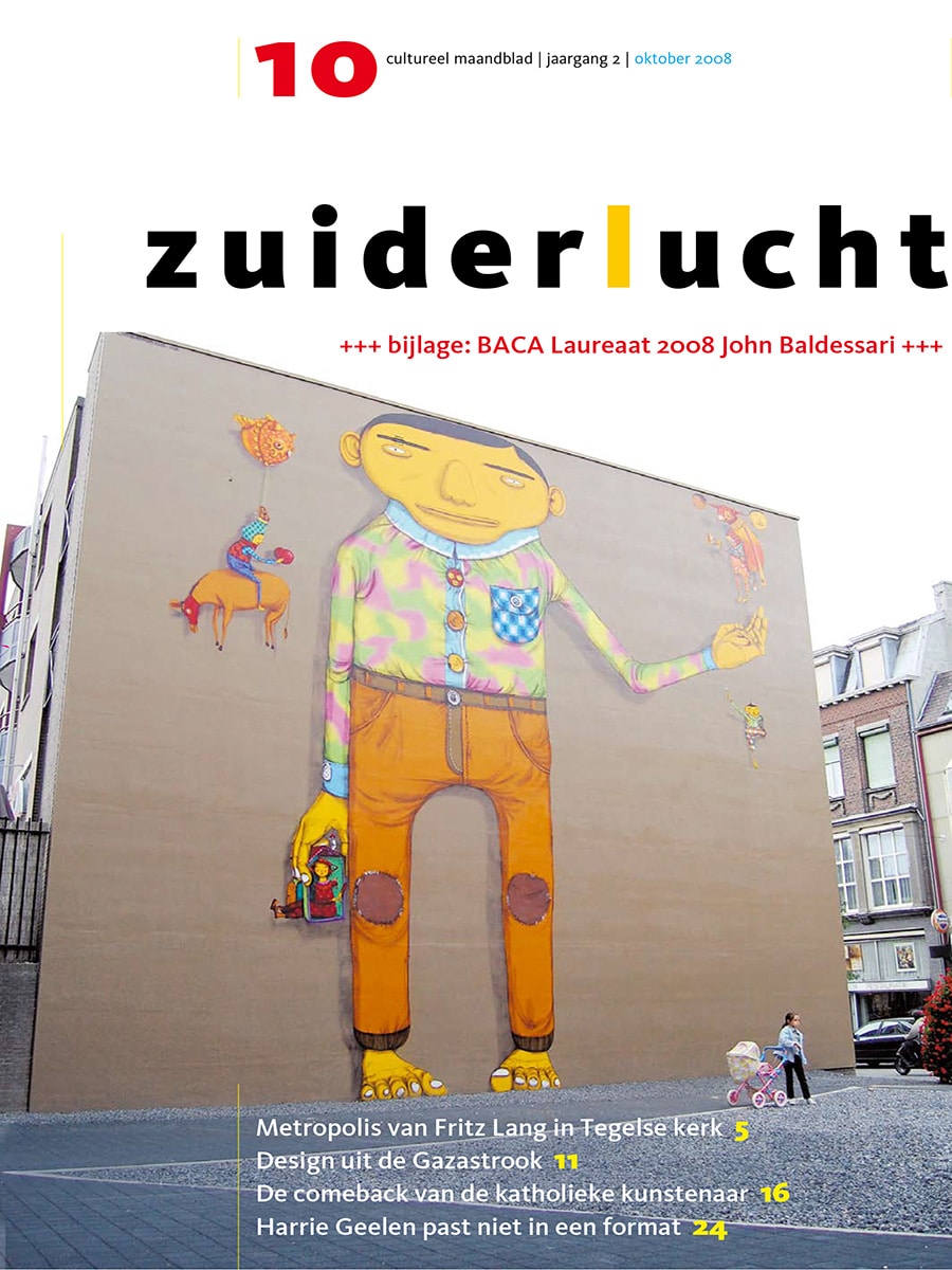
Published in Zuiderlucht, October 2008

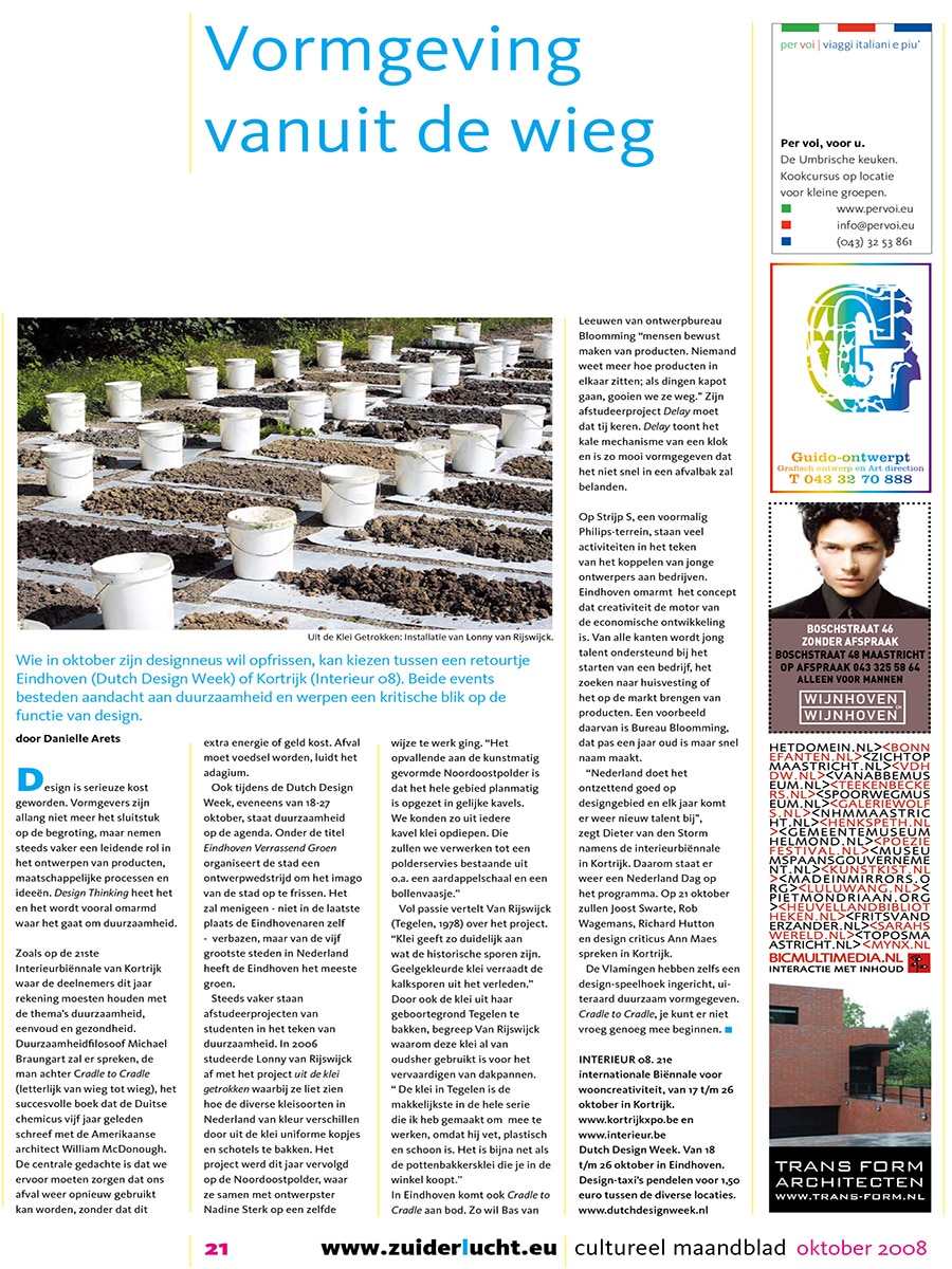
In October 2008, sustainability was a major theme at both Dutch Design Week in Eindhoven and Interieur Kortrijk in Belgium. Designers, architects and thought leaders explored how products could be created with greater consideration for resources, re-use and longevity.

One of the concepts receiving considerable attention at the time was Cradle to Cradle, developed by Michael Braungart and William McDonough. Rather than creating products that eventually become waste, the philosophy promotes designs in which materials can be continuously re-used.

Delay by Bloomming

At Dutch Design Week, designer Bas van Leeuwen presented Delay, a project developed through Bloomming.

The project originated from a simple observation:

“Nobody knows anymore how products are put together; if they break, we simply throw them away.”

With Delay, Van Leeuwen sought to restore appreciation for technology and craftsmanship. Instead of concealing the mechanics of a clock behind a traditional dial, the design exposes its inner workings and turns the mechanism itself into the focal point.

By revealing how time is measured, Delay encourages users to engage with the object, understand its operation and develop a stronger connection with the product. The project reflects Bloomming’s belief that thoughtful design can create lasting value and help reduce our throwaway mentality.

Eindhoven’s Creative Ecosystem

The article also highlighted Eindhoven’s growing reputation as a centre for design and innovation. Through initiatives at Strijp-S and Dutch Design Week, young designers and entrepreneurs were supported in developing products, launching businesses and bringing new ideas to market.

Bloomming was mentioned as one of the emerging creative companies contributing to this movement.

According to Bas van Leeuwen:

“The Netherlands remains exceptionally strong in design. Every year new talent emerges.”

About Delay

Delay transforms the traditional clock into a sculptural object that celebrates technology rather than hiding it. By exposing the mechanism behind the passage of time, the design invites reflection on how products are made and how we interact with them.

The project became an early example of Bloomming’s interest in sustainability, product longevity and creating meaningful connections between people and the objects that surround them.

Publication Details

Publication: Zuiderlucht
Issue: October 2008
Featured designer: Bas van Leeuwen
Company: Bloomming
Featured project: Delay
Topics: Dutch Design Week, sustainability, Cradle to Cradle, product design, Eindhoven