Category

Magazine

Vogue

By Magazine

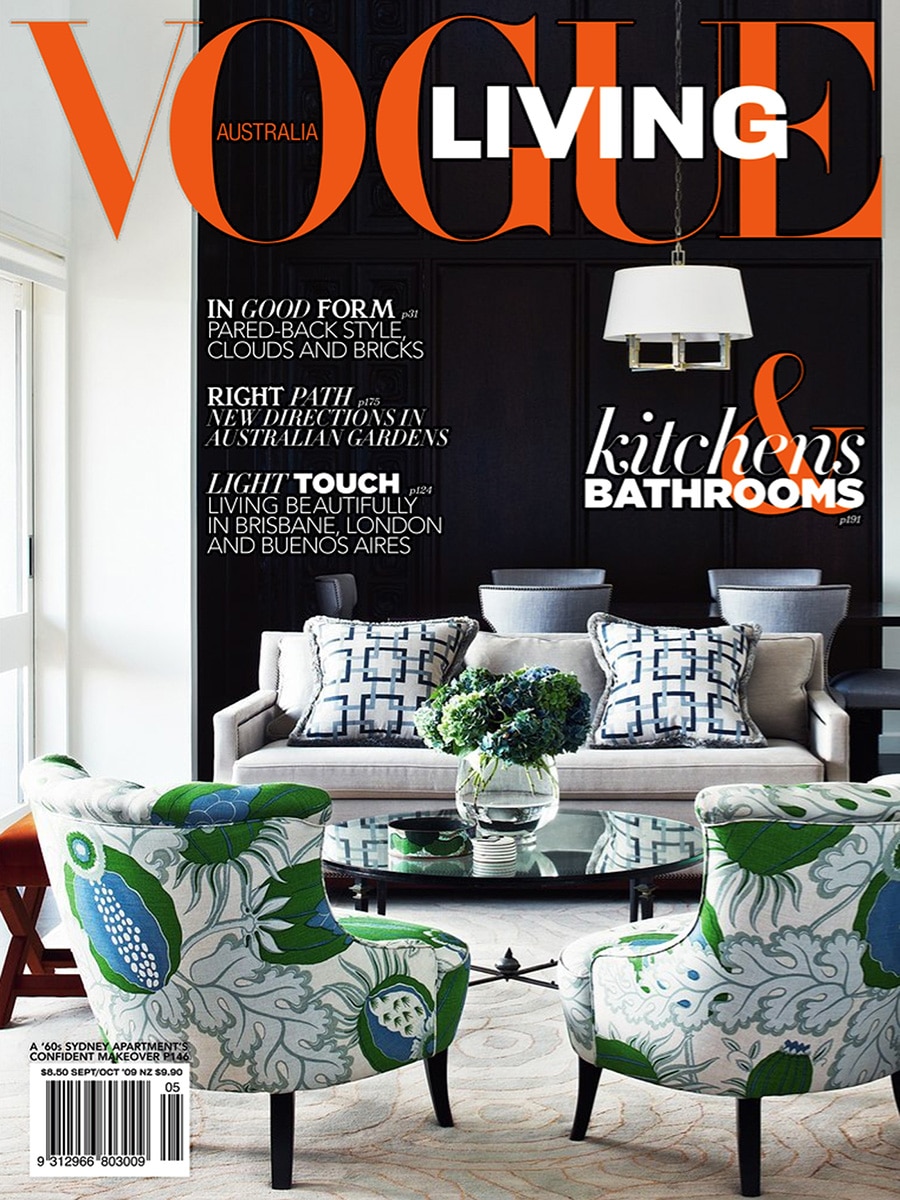
Vogue Living Australia — September / October 2009

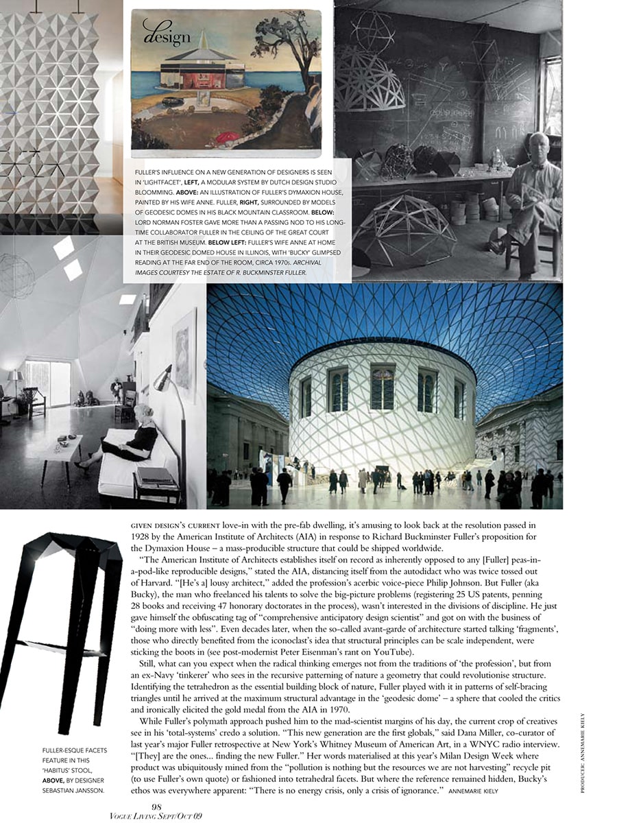
Lightfacet featured in Vogue Living’s exploration of Buckminster Fuller’s legacy

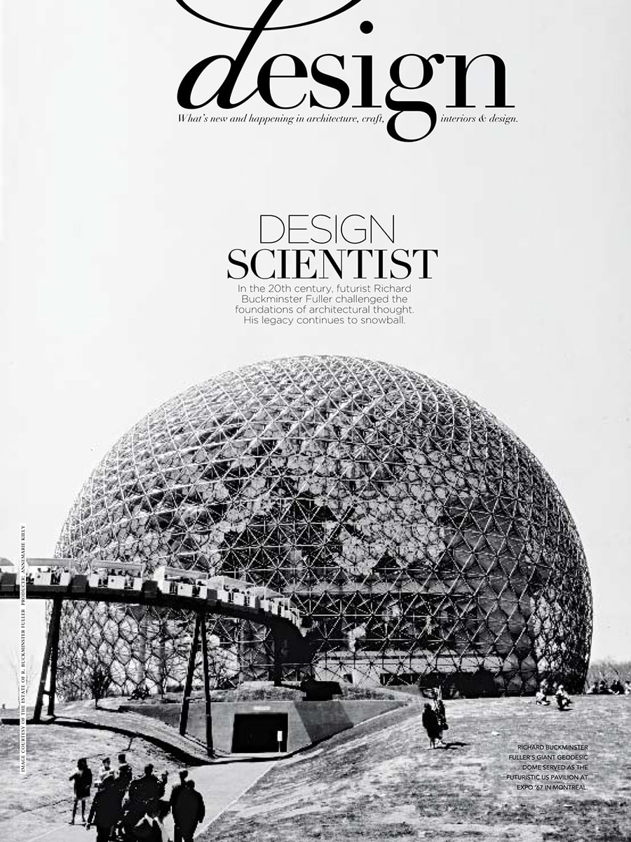
In the September/October 2009 issue of Vogue Living Australia, Lightfacet was featured in a major editorial examining the lasting influence of visionary architect, inventor and futurist Richard Buckminster Fuller. The article, titled “Design Scientist”, explored how Fuller’s ideas continue to inspire contemporary designers, architects and makers around the world.

A new generation inspired by Fuller

The article traced the impact of Fuller’s work on modern design, from geodesic domes and lightweight structures to contemporary products influenced by geometric systems and modular thinking. According to the magazine, a new generation of designers was rediscovering Fuller’s ideas and translating them into products that combine efficiency, flexibility and visual innovation.

Lightfacet was selected as one of the examples illustrating this continuing influence.

Geometry as a design language

Within the feature, Lightfacet was presented as a modular room divider by Dutch design studio Bloomming. The publication highlighted the design’s repeating geometric structure and its ability to transform space through a system of interconnected triangular and diamond-shaped elements.

Much like Fuller’s fascination with geometric principles as building blocks of nature, Lightfacet uses a simple modular element to create larger architectural compositions that can adapt to different environments and requirements.

Beyond decoration

Rather than functioning solely as a decorative screen, Lightfacet was featured as an example of design that actively engages with space, light and human interaction. By rotating individual facets, users can continuously alter transparency, visibility and pattern, creating a dynamic relationship between openness and privacy.

This adaptability reflected many of the principles celebrated throughout the article: efficiency, modularity and intelligent use of structure.

Publication details

Publication: Vogue Living Australia
Issue: September / October 2009
Article title: Design Scientist
Section: Design
Product: Lightfacet
Designers: Bas van Leeuwen & Mireille Meijs
Company: Bloomming

Featured mention

The article noted that the influence of Buckminster Fuller on a new generation of designers could be seen in “Lightfacet, a modular system by Dutch design studio Bloomming.” The design was presented alongside examples of Fuller’s work and contemporary interpretations of his geometric thinking.

Why this feature mattered

Being featured in Vogue Living Australia placed Lightfacet within an international design conversation rather than solely an interior design context. Instead of focusing on its function as a room divider, the magazine positioned the design within a broader architectural and conceptual framework, connecting it to the ideas of one of the twentieth century’s most influential design thinkers.

The feature underscored how Lightfacet embodies principles of modularity, adaptability and geometric innovation—qualities that continue to define the design today.
101 Woonideeën

By Magazine

Trend: The Art of Folding

Published in 101 Woonideeën

In this feature, Dutch interior magazine 101 Woonideeën explores a design trend that emerged prominently during the Milan furniture fairs: products that appear to be folded from paper.

Although the objects featured are made from durable materials such as ceramics, composites and plastics, their geometric forms create the illusion of folded surfaces and origami-like structures. The result is a collection of products that are both sculptural and functional.

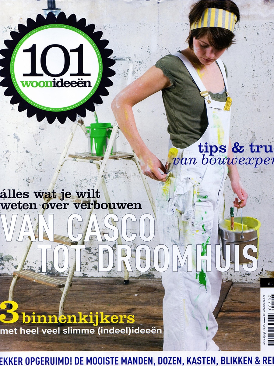
Light Facet by Mireille Meijs

One of the designs selected to illustrate this trend was Light Facet, a room divider created by Dutch designer Mireille Meijs.

Positioned in the background of the editorial photograph, Light Facet demonstrates how geometric folding principles can be translated into interior architecture. The divider consists of repeating faceted elements that create a dynamic play of light and shadow throughout a space.

Rather than acting as a solid partition, the design filters daylight and allows varying degrees of transparency. By adjusting the individual elements, the visual openness of the divider can be changed while maintaining its sculptural appearance.

Inspired by Light and Geometry

The publication highlights how folded forms can create unexpected visual effects within interiors. Light Facet exemplifies this approach by combining geometric repetition with practical functionality.

The faceted surfaces reflect and diffuse light differently throughout the day, creating constantly changing patterns and adding visual depth to a room.

This balance between decoration and functionality would later become one of the defining characteristics of the product.

From Light Facet to Facet

At the time of publication, Light Facet was still an early design concept by Mireille Meijs. In the years that followed, the design evolved into Facet, the room divider that would later become Bloomming’s signature product.

Today, Facet is used worldwide in homes, offices, hotels, restaurants and public spaces, while retaining the same fundamental principle featured in this article: using geometry and adjustable surfaces to shape light, privacy and space.

Original Caption

“In the background: Room Divider Light Facet, designed by Mireille Meijs.”

Publication Details

Publication: 101 Woonideeën
Feature: Trend: The Art of Folding
Featured designer: Mireille Meijs
Featured product: Light Facet
Topics: Origami-inspired design, room dividers, geometric design, interior design, Dutch design, light and shadow

Mooi & Bijzonder

By Magazine

Mooi & Bijzonder – Verfijning uit het Verre Oosten

In the Dutch interior magazine Mooi & Bijzonder, Bloomming’s Lightfacet was featured in an editorial exploring the influence of Asian aesthetics on contemporary interiors. The article, titled “Verfijning uit het Verre Oosten” (“Refinement from the Far East”), examines how elements such as symmetry, origami-inspired forms, indigo blue and craftsmanship continue to shape modern interior design.

Eastern Influences in Contemporary Design

The editorial highlights the enduring impact of Asian cultures on Western interiors. It traces influences from Japanese paper lamps and lacquerware to contemporary furniture and decorative objects, noting how designers continue to draw inspiration from Eastern principles of simplicity, geometry and balance.

According to the article, one of the defining characteristics of the trend is the growing popularity of furniture and interior elements inspired by origami-like structures and faceted forms.

Lightfacet as an Example of the Trend

To illustrate this movement, the magazine selected Lightfacet as a featured product within the editorial spread. The room divider is shown in a full-page interior styling image, where its geometric composition echoes the folded-paper aesthetics discussed in the article.

The accompanying text states:

“De vorm van meubilair lijkt geïnspireerd op origami-vouwwerk. We zien bijvoorbeeld meubels met scherpe vouwen en facetstructuren.”

Translated:

“The shape of furniture appears inspired by origami folding. We see, for example, furniture with sharp folds and faceted structures.”

Lightfacet’s repeating diamond-shaped modules create a sculptural surface that reflects many of these characteristics, combining geometric precision with a sense of lightness and rhythm.

Geometry, Pattern and Craftsmanship

The editorial positions faceted forms as part of a broader movement toward carefully crafted interiors that balance modern design with traditional influences. Alongside indigo tones, natural materials and symmetrical compositions, geometric structures are presented as a defining aesthetic for the season.

Within this context, Lightfacet is not presented merely as a room divider, but as a decorative architectural element that contributes pattern, texture and visual depth to an interior.

Editorial Recognition

Unlike product advertisements, editorial features are selected by a publication’s editorial team to illustrate design themes and trends. The inclusion of Lightfacet in Mooi & Bijzonder reflects its relevance within the broader discussion of geometry, craftsmanship and Eastern-inspired design that was influencing interior styling at the time.

Publication details

Publication: Mooi & Bijzonder
Article: Verfijning uit het Verre Oosten
Year: circa 2010
Publisher: Mooi & Bijzonder Magazine
Product featured: Lightfacet
Studio: Bloomming
Designers: Bas van Leeuwen & Mireille Meijs
Category: Editorial trend feature

Why this feature mattered

This editorial connected Lightfacet to a larger international design movement inspired by Asian aesthetics and origami-like geometry. By highlighting the room divider alongside discussions of symmetry, craftsmanship and faceted forms, Mooi & Bijzonder recognised Lightfacet as an example of how contemporary Dutch design was translating these influences into innovative architectural products.

Excellent

By Magazine

Excellent – Leven & Wonen (Eindhoven Edition) — Winter 2009

Lightfacet featured in a trend report on timeless interiors

In the Winter 2009 edition of Excellent – Leven & Wonen, Lightfacet was featured in a curated shopping and interior trends section titled “Tijdloos sfeervol” (Timeless atmosphere). The article explored the enduring appeal of monochrome interiors, highlighting how white, grey and black continue to create elegant and sophisticated living environments.

Timeless atmosphere

The feature focused on products that embrace simplicity, strong silhouettes and refined patterns. Rather than following short-lived trends, the selected objects demonstrated how carefully chosen design pieces can create a lasting sense of style and harmony within the home.

Among decorative accessories, furniture and homeware, Lightfacet was presented as a striking architectural element that brings both visual interest and practical functionality to an interior.

A room divider shaped by light and pattern

The magazine described Lightfacet as a room divider composed of interconnected diamond-shaped modules that can each be opened or closed individually. This allows users to create changing patterns throughout the surface while adjusting the balance between openness and privacy.

Its geometric appearance perfectly complemented the article’s theme of monochrome elegance, where texture, shadow and form take centre stage.

Design that evolves with the space

Unlike conventional partitions, Lightfacet was presented as an interactive interior element. By rotating individual facets, users can continuously transform the appearance of the divider, creating unique compositions that respond to changing needs and lighting conditions.

The result is a room divider that functions not only as a spatial separator, but also as a sculptural design object.

Publication details

Publication: Excellent – Leven & Wonen (Eindhoven Edition)
Date: Winter 2009
Article title: Tijdloos sfeervol
Section: Shop
Product: Lightfacet
Designers: Bas van Leeuwen & Mireille Meijs
Company: Bloomming

Featured description

The magazine described Lightfacet as a room divider consisting of interconnected diamond-shaped plastic elements that can each be opened or closed individually. The design allows users to create ever-changing patterns while introducing structure, privacy and visual rhythm into a space.

Why this feature mattered

Excellent positioned Lightfacet within a broader interior trend focused on timeless design rather than seasonal fashion. By featuring the divider alongside carefully selected lifestyle products, the magazine highlighted Lightfacet’s ability to function simultaneously as architecture, decoration and a flexible spatial solution—qualities that would become central to Bloomming’s design philosophy.

Trend

By Magazine

Clock Delay Featured in Trend Magazine Russia

Published in Trend Magazine, September 2008

Dutch designer Bas van Leeuwen and his sculptural clock Clock Delay were featured in the September 2008 edition of the Russian lifestyle magazine Trend.

The article presented Clock Delay as a response to modern society’s increasingly complicated relationship with time and technology. Rather than functioning as a conventional clock, the design transforms the measurement of time into a visible mechanical process.

Delayed Time

The Russian title of the article translates approximately as “Forced Delay” or “Delayed Time.”

According to the publication, clocks have long ceased to be simple instruments for measuring time. This observation inspired Bas van Leeuwen to create a clock that encourages people to slow down and engage with the mechanics behind the passage of time.

The article describes Clock Delay as a challenge to contemporary “single-use culture”—a world filled with disposable products that require little attention and provide little understanding of how they work.

Revealing the Mechanism

Unlike traditional clocks that conceal their mechanics behind a dial, Clock Delay exposes the entire process of timekeeping.

The design consists of three rotating wheels representing:

  • Hours
  • Minutes
  • Seconds

Rather than reading the time from hands or a digital display, users observe where the three indicators align. The clock turns the act of telling time into a small puzzle that requires attention and participation.

As the article explains, learning to read the time on Clock Delay requires temporarily stepping away from the automated routines of everyday life.

A Tribute to Technology

The publication notes that many people rarely repair or examine the products they use every day. As a result, appreciation for technology and engineering is gradually disappearing.

Clock Delay was designed to counter this trend by celebrating the beauty of mechanics. Its exposed gears, rotating number wheels and visible construction encourage users to rediscover the fascination of how things work.

The design reflects Bas van Leeuwen’s interest in combining technology, interaction and visual storytelling within everyday objects.

Design and Construction

The article describes Clock Delay as a fully functional clock constructed from:

  • Stainless steel
  • Aluminium

Dimensions:

  • 35 × 35 × 48 cm

The publication notes that the unusual appearance ensures the object will not go unnoticed in any interior.

International Recognition

Clock Delay attracted attention beyond the Netherlands and was featured in several international publications. Its combination of engineering, sculpture and conceptual thinking positioned it as a distinctive example of contemporary Dutch design.

About Clock Delay

Designer: Bas van Leeuwen
Studio: Studio Bloomm
Product: Clock Delay
Materials: Stainless steel and aluminium
Dimensions: 35 × 35 × 48 cm
Year: 2008

Publication Details

Publication: Trend Magazine (Russia)
Issue: September 2008
Featured designer: Bas van Leeuwen
Featured product: Clock Delay
Topics: Product design, clocks, engineering, contemporary Dutch design, kinetic objects

Residential Zone

By Magazine

Residential Zone – International Residential Architecture & Interior Design

Residential Zone is an international architecture and interior design yearbook that showcases outstanding residential projects from around the world. The publication presents a curated selection of villas, private residences, resorts and hospitality projects, highlighting noteworthy architectural solutions, interior concepts and custom design elements.

Among the selected projects is Private Area Eindhoven, a residential interior in which Facet plays a central role as a sculptural room divider. The project demonstrates how the modular design can be used not only to divide space, but also to introduce texture, light and architectural character into an interior.

A Sculptural Divider Within the Home

The featured project shows Facet suspended between the kitchen and living area of a contemporary residence. Rather than creating a solid barrier, the divider subtly separates functions while maintaining openness throughout the space.

The publication highlights the interplay between privacy and transparency. The geometric modules create a dynamic surface that changes with the viewing angle, while allowing light to pass through and preserving visual connections between different areas of the home.

Geometry as Architecture

The large-format photography in the book focuses on Facet’s faceted surfaces and three-dimensional structure. Close-up images reveal the precision of the individual modules, while wider interior views demonstrate how the divider becomes an integral architectural element rather than a decorative accessory.

The project illustrates how geometric repetition can generate both visual rhythm and spatial definition. Depending on the viewing angle, the room divider appears alternately transparent, textured or almost sculptural, creating a constantly changing experience within the interior.

Integrating Light and Space

One of the reasons the project was selected is the way Facet contributes to the flow of light through the home. Positioned near large windows and open living spaces, the divider filters daylight while preserving brightness throughout the interior.

Rather than interrupting the architecture, the installation enhances it by introducing depth, shadow and subtle patterns that evolve throughout the day.

International Recognition

The inclusion of Private Area Eindhoven in Residential Zone placed the project alongside distinguished residential developments from around the world. The publication serves as a reference for architects, interior designers and developers seeking innovative approaches to residential design.

By featuring Facet within this context, the editors recognised the room divider as an architectural solution capable of contributing to high-end residential interiors on an international level.

Publication details

Publication: Residential Zone – Resorts & Villa, Hotel & Apartment, Private Residence
Edition: Dreamwork Space 2
Publisher: Universal Media Co. Ltd.
Year: circa 2012
Project: Private Area Eindhoven
Product featured: Facet Room Divider
Designers: Bas van Leeuwen & Mireille Meijs
Company: Bloomming
Category: International architecture and interior design yearbook

Why this feature mattered

Unlike magazine product roundups or trend articles, Residential Zone focuses on completed architectural projects. The selection of Private Area Eindhoven demonstrated how Facet could function as an integral part of residential architecture, contributing simultaneously to privacy, spatial organisation, light control and visual identity. Its inclusion in this internationally distributed design reference reinforced Facet’s position as a product that bridges the disciplines of interior design, architecture and art.

Viva

By Magazine

VIVA Magazine (The Netherlands) — April 2010

Lightfacet featured in VIVA’s Chinese-inspired interiors trend report

In April 2010, Dutch lifestyle magazine VIVA featured Lightfacet in a colourful interior trend report titled “Van Chinese thee tot drakenslingers” (From Chinese tea to dragon garlands). The article presented a curated collection of products, accessories and decorative objects inspired by Chinese culture, craftsmanship and aesthetics, highlighting the growing popularity of Asian influences in contemporary interiors.

A modern interpretation of decorative pattern

Within the selection of Chinese-inspired products, Lightfacet was presented as a contemporary design object that combines decoration with functionality. The magazine showcased the room divider’s distinctive geometric surface, formed by individually adjustable diamond-shaped elements that create a repeating pattern across the entire composition.

Placed alongside colourful textiles, wallpaper, ceramics and decorative accessories, Lightfacet demonstrated how architectural products can also contribute to the visual richness of an interior.

Create your own pattern

The article emphasised the interactive nature of the design. By rotating individual facets, users can continuously alter the appearance of the divider, creating their own combinations of open and closed elements. This allows the screen to evolve from a subtle spatial divider into a striking decorative feature.

Rather than being a static partition, Lightfacet was presented as a living element within the interior—one that changes through light, shadow and personal interaction.

Publication details

Publication: VIVA Magazine
Country: The Netherlands
Date: April 2010
Article title: Van Chinese thee tot drakenslingers
Section: Interior & Lifestyle
Product: Lightfacet
Designers: Bas van Leeuwen & Mireille Meijs
Company: Bloomming

Featured description

The magazine described Lightfacet as a room divider with a repeating pattern that allows users to open and close individual panels, creating their own unique compositions. The ability to customise transparency and pattern was highlighted as one of the design’s defining characteristics.

Why this feature mattered

While many early publications focused on Lightfacet’s architectural and spatial qualities, VIVA introduced the design to a broader lifestyle audience. The feature positioned Lightfacet as both a practical room divider and a decorative statement piece, demonstrating how contemporary Dutch design could seamlessly blend functionality, flexibility and visual expression.

The inclusion in VIVA reflected the growing appeal of Lightfacet beyond architecture and design professionals, bringing the concept of adaptable interiors to a wider consumer audience interested in home decoration, trends and personal style.

Vormberichten

By Magazine

Long Live Technology!

Published in Vormberichten, September 2008 (BNO – Association of Dutch Designers)

The Dutch design publication Vormberichten featured Clock Delay, a conceptual clock designed by Bas van Leeuwen for Studio Bloomm.

Rediscovering Technology

The article addresses a growing tendency in modern society: we buy products, use them, and throw them away when they break.

As a result, fewer people repair objects themselves and appreciation for technology is gradually disappearing.

Clock Delay was created as a response to this development.

Rather than hiding the mechanism behind a traditional clock face, the design reveals the inner workings of timekeeping and encourages people to engage with the technology behind everyday objects.

Clock Delay

The operation of time is made visible through a mechanical system consisting of three rotating wheels:

  • One wheel for seconds
  • One wheel for minutes
  • One wheel for hours

When the three indicators nearly align, the current time can be read. Because the clock has no traditional hands or display, users must actively observe the mechanism and understand how it functions.

This transforms the clock from a simple utility object into an interactive design piece.

Design Philosophy

Clock Delay reflects Studio Bloomm’s interest in creating products that invite curiosity and encourage interaction.

By exposing rather than concealing technology, the design seeks to restore a sense of wonder for mechanical systems and the objects that surround us.

The clock demonstrates how functionality and storytelling can be combined into a single object.

Original Text (Translated)

‘We buy products, use products, and when they break, we throw them away. We rarely repair anything anymore. As a result, we lose our interest in and appreciation for technology. With Clock Delay, Studio Bloomm aims to bring that feeling back.’

Product Information

Product: Clock Delay
Designer: Bas van Leeuwen
Studio: Studio Bloomm
Materials: Stainless steel and aluminium
Function: Mechanical time display
Year: 2008

Publication Details

Publication: Vormberichten
Publisher: BNO (Association of Dutch Designers)
Issue: September 2008
Featured designer: Bas van Leeuwen
Featured product: Clock Delay
Company: Studio Bloomm

Villas

By Magazine

Bloomming featured in Villas magazine

The influence of Dutch design extends far beyond the Netherlands. In issue 64 of Villas, the French architecture and interior design magazine dedicated a feature to contemporary Dutch designers and innovative furniture concepts. Among the selected projects: Bloomming and the work of founders Bas van Leeuwen and Mireille Meijs.

Dutch design through an international lens

The editorial explores a new generation of Dutch designers who combine functionality, experimentation, and a strong visual identity. Rather than focusing solely on form, the featured designers are presented as thinkers and makers who respond to the changing way we live, work, and experience our surroundings.

Within this context, Bloomming was included as part of a curated selection showcasing the diversity and creativity of Dutch design.

A feature for Bloomming

In the design overview, Bas van Leeuwen and Mireille Meijs appear alongside other emerging Dutch designers whose work attracted international attention. The publication highlights Bloomming’s distinctive approach to geometry, modularity, and spatial design — themes that continue to define the brand today.

The feature also includes the Grip table leg system, an early Bloomming design. Grip was conceived as a flexible stainless-steel table base that can be combined with a wide variety of tabletop materials and dimensions. By separating the tabletop from its supporting structure, the design offers freedom for customisation while maintaining a refined architectural appearance.

Recognition beyond borders

For a young design studio, being featured in an international publication such as Villas represented an important milestone. It demonstrated how Dutch design was gaining recognition abroad and how Bloomming’s work resonated with an audience interested in innovation, craftsmanship, and contemporary interiors.

Today, many of the same principles visible in these early projects remain at the heart of Bloomming’s collection: modular thinking, architectural form, and products that transform the way spaces are experienced.

Publication details

Publication: Villas Magazine
Issue: No. 64
Country: France
Feature: Dutch Design (Design des Pays-Bas)
Products featured: Grip table leg system and Bloomming studio work
Designers: Bas van Leeuwen & Mireille Meijs

More than a decade later, these early international publications offer a glimpse into the origins of Bloomming and the design philosophy that continues to shape the brand today.

Xtra

By Magazine

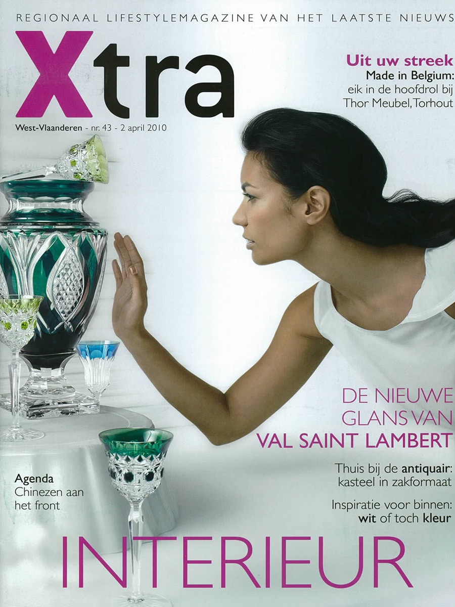
Xtra Magazine (Belgium) – April 2010

Lightfacet featured as a stylish solution for dividing open-plan living spaces

In April 2010, Belgian lifestyle magazine Xtra featured Lightfacet in an article about movable room dividers and flexible interior solutions. The publication highlighted the growing need to create privacy and distinct functional zones within contemporary open-plan homes.

Stylishly Separated

The article, titled “Modieus gescheiden” (“Fashionably Separated”), explored how modern homes increasingly combine multiple functions within a single space. Home offices, play areas, guest rooms and open-plan kitchens often share the same floor plan, creating a need for flexible ways to introduce privacy without sacrificing light or openness.

Among several featured products, Lightfacet was presented as an innovative alternative to traditional room dividers.

Diamonds in the Room

Under the headline “Diamanten in de kamer” (“Diamonds in the Room”), the magazine described Lightfacet as a modular room divider created by Eindhoven designers Bas van Leeuwen and Mireille Meijs.

The article emphasised how the diamond-shaped modules can be individually opened and closed, allowing users to create their own patterns while controlling transparency and sightlines. Beyond functioning as a room divider, Lightfacet was also presented as a decorative element and even as a sun screen.

A Dynamic Architectural Element

What distinguished Lightfacet from conventional partitions was its ability to continuously transform. By rotating individual facets, users could make the divider more open or closed in specific areas, creating a unique balance between privacy, light and spatial connection.

The article noted the modular construction of the system, which allows the divider to be expanded over time and adapted to different spaces and requirements.

Publication Details

  • Publication: Xtra Magazine (Belgium)
  • Date: 2 April 2010
  • Article: Modieus gescheiden
  • Section: Interior Design
  • Featured Product: Lightfacet
  • Designers: Bas van Leeuwen & Mireille Meijs
  • Company: Bloomming

Original Publication Summary

“Xtra Magazine featured Lightfacet in an article about movable room dividers for contemporary interiors. The publication highlighted the design’s modular diamond-shaped elements, adjustable transparency and ability to create privacy while maintaining light and openness within modern living spaces.”