Category

Book

Crazy Design

By Book

Crazy Design – Rings That Join Together

Bloomming Rings Featured in

Crazy Design

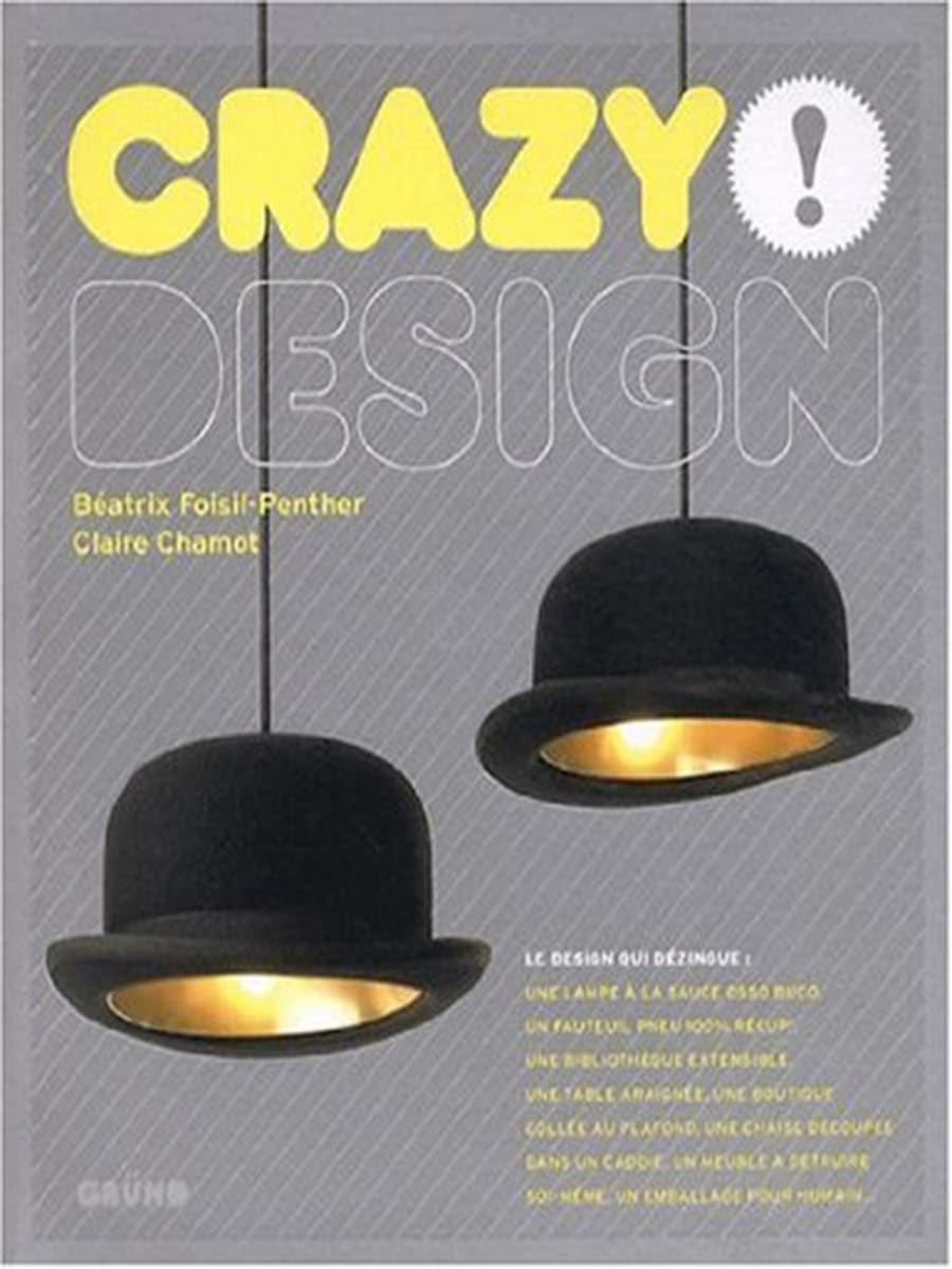
Published in Crazy Design by Béatrix Foisil-Penther & Claire Chamot (Gründ Editions)

Bloomming’s Rings That Join Together were selected for inclusion in Crazy Design, an international publication showcasing unconventional and innovative design concepts from around the world.

The book presents products that challenge traditional thinking through creativity, symbolism and unexpected functionality. Among these projects, Bloomming’s ring concept was featured as a contemporary reinterpretation of the traditional wedding ring.

One Ring for Two

The article describes Bloomming’s rings as a symbolic design that transforms two separate rings into a single object.

Unlike conventional wedding bands, the male and female versions are designed to physically connect. When joined together, the two rings form one complete shape, visually expressing partnership, unity and connection.

The design was developed around the idea that a relationship consists of two individuals who remain themselves while also becoming part of something larger together.

Original Article Translation

“One Ring for Two”

We remain together, in harmony, and our rings become one.
The wedding rings created by design studio Bloomming reject traditional distinctions and are available in both male and female versions. Designed to join together and connect physically, the shape of the jewellery allows the two rings to fit together precisely, symbolising fusion and union.

A pair of silver wedding rings starts at approximately £290 and was also available on request in yellow gold or white gold.

The individual version was available separately for approximately £160.

Historical Reference

The publication also included a short note about the history of wedding rings:

The tradition of wearing a wedding ring on the ring finger dates back to Ancient Greece. Physicians believed that this finger was directly connected to the heart through a vein known as the “vein of love”.

Design Concept

The Rings That Join Together project reflects Bloomming’s early interest in creating products that communicate an idea rather than simply perform a function.

Rather than treating a wedding ring as a standalone object, the design turns the relationship itself into part of the product. The two rings only reveal their full form when brought together, creating a tangible representation of partnership.

Product Information

Product: Rings That Join Together
Designer: Bas van Leeuwen
Studio: Bloomming
Materials: Silver, with custom versions available in gold
Concept: Two rings that physically connect to form a single object
Featured in: Crazy Design (Gründ Editions)

Why It Matters

The inclusion in Crazy Design placed Bloomming among an international selection of inventive design projects that challenge conventions and reinterpret familiar objects.

The Rings That Join Together project illustrates how a simple everyday object can be transformed into a meaningful design statement through symbolism, interaction and thoughtful detailing.

Publication Details

Publication: Crazy Design
Authors: Béatrix Foisil-Penther & Claire Chamot
Publisher: Gründ Editions
Featured Project: Rings That Join Together
Designer: Bas van Leeuwen
Studio: Bloomming

Product Design Now: Renderings

By Book

Product Design Now: Renderings – Bloomming Designs Featured in International Design Publication

Bloomming Projects Included in Global Design Rendering Showcase

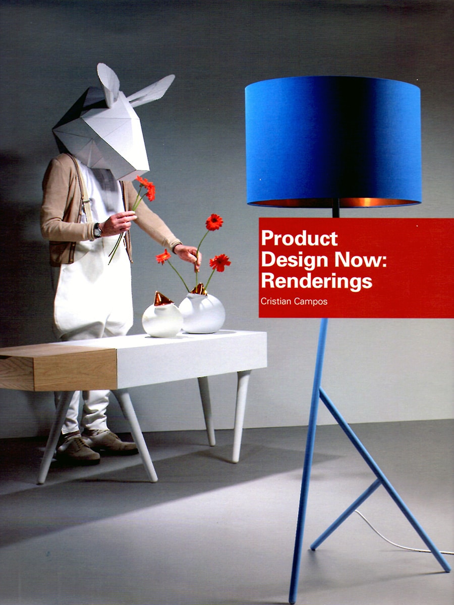
Published in Product Design Now: Renderings by Cristian Campos, Collins Design

Several early Bloomming designs were selected for inclusion in Product Design Now: Renderings, an international publication by design author Cristian Campos that explores the role of digital visualisation in contemporary product design.

The book presents renderings and concepts from designers around the world and highlights how digital tools are used to develop, communicate and refine design ideas before production. Among the featured projects are Lightfacet, Clock Delay, and Ringset ONE, designed by Mireille Meijs and Bas van Leeuwen.

Lightfacet

One of the featured projects is Lightfacet, the modular room divider designed by Mireille Meijs.

The publication presents Lightfacet as a flexible architectural element composed of individually rotatable diamond-shaped modules. By adjusting the orientation of each facet, users can influence transparency, light, shadow and privacy, creating endlessly changing patterns.

Originally conceived as a room divider, Lightfacet can also function as a decorative screen or window treatment. Its modular structure allows it to be adapted to spaces of virtually any size.

Clock Delay

Also featured is Clock Delay, the experimental clock designed by Bas van Leeuwen.

Clock Delay reinterprets the traditional clock by replacing hands and a dial with three separate rotating wheels representing hours, minutes and seconds. The current time appears at the intersection of the three wheels, turning the act of reading time into a more engaging experience.

The book highlights the clock’s exposed mechanics and technical construction in stainless steel and aluminium, emphasising its combination of functionality, engineering and sculptural expression.

Ringset ONE

The publication additionally includes Ringset ONE, a minimalist jewellery concept by Bas van Leeuwen and Mireille Meijs.

The design consists of two nearly identical rings that differ through a subtle detail: one features a slightly convex profile while the other is slightly concave. When combined, the rings fit perfectly together, expressing the concept of duality through a simple geometric gesture.

The project demonstrates Bloomming’s interest in reducing objects to their essential form while maintaining a strong conceptual foundation.

Design Through Visualisation

Product Design Now: Renderings focuses on the importance of digital visualisation within the design process.

By bringing together projects from different disciplines, the publication illustrates how renderings have become an essential tool for exploring ideas, communicating concepts and presenting products before physical prototypes exist.

The inclusion of several Bloomming projects reflects the studio’s early experimentation with form, geometry and product storytelling through both design and visualisation.

Featured Bloomming Projects

Lightfacet
Designer: Mireille Meijs
Category: Modular Room Divider

Clock Delay
Designer: Bas van Leeuwen
Category: Clock / Kinetic Object

Ringset ONE
Designers: Bas van Leeuwen & Mireille Meijs
Category: Jewellery

Publication Details

Publication: Product Design Now: Renderings
Author: Cristian Campos
Publisher: Collins Design / HarperCollins
Country: International
Year: 2009
Featured Projects: Lightfacet, Clock Delay, Ringset ONE
Designers: Mireille Meijs & Bas van Leeuwen
Studio: STUDIObloomm / Bloomming


Original publication summary

“Product Design Now: Renderings showcased several Bloomming projects, including Lightfacet, Clock Delay and Ringset ONE. The publication highlighted how digital visualisation can communicate innovative ideas, from modular architectural products and experimental timepieces to minimalist jewellery concepts.”

The hand behind every single design

By Book

Milk Magazine – Interview with Mireille Meijs of Bloomming

Taiwanese Design Magazine Explores the Creative Process Behind Lightfacet

Published in Milk Magazine, circa 2010–2011

Taiwanese lifestyle and design magazine Milk featured an interview with designer Mireille Meijs, co-founder of Dutch design label Bloomming, focusing on the development of Lightfacet, one of the studio’s most recognisable early designs.

The interview offered readers a rare look behind the scenes, showcasing sketches, prototypes and the design thinking that led to the creation of the modular room divider.

Lightfacet

Lightfacet was conceived as an interactive room divider that allows users to influence both light and transparency.

The design consists of individually rotatable faceted elements connected into a flexible modular surface. By adjusting the orientation of the elements, users can create changing patterns, control visibility and alter the way light moves through a space.

The result is a room divider that continuously adapts to its surroundings and creates a unique visual experience.

From Sketch to Product

The feature highlighted the extensive design process behind Lightfacet, including early hand sketches and material studies.

According to Mireille Meijs, the project began with the ambition to create a product that would actively interact with its environment and its users. Through experimentation with form, movement and modularity, the designers developed a system in which a simple repeated element could generate countless patterns and configurations.

The publication illustrated how the concept evolved from initial drawings into a fully realised product.

Design Through Interaction

A central theme of the interview was the relationship between designer, object and user.

Rather than creating a static partition, Bloomming developed a design that invites participation. Every rotation of an individual module subtly changes the overall composition, allowing users to personalise the appearance of the divider and shape the atmosphere of a space.

This interactive quality became one of the defining characteristics of the design.

Product Information

Product: Lightfacet
Designer: Mireille Meijs
Brand: Bloomming
Category: Modular room divider / interior partition
Concept: Adjustable transparency through individually rotatable elements
Customisation: Available in various sizes and configurations

International Recognition

The publication in Milk Magazine contributed to the growing international visibility of Lightfacet throughout Asia. The project attracted attention for its combination of geometric aesthetics, user interaction and architectural functionality.

By presenting both the finished design and the creative process behind it, the magazine demonstrated how Lightfacet evolved from a conceptual idea into a product recognised by design publications worldwide.

Publication Details

Publication: Milk Magazine
Country: Taiwan
Feature: Designer Interview
Featured Product: Lightfacet
Designer: Mireille Meijs
Brand: Bloomming


Original publication summary

“In an interview with Milk Magazine, designer Mireille Meijs discussed the development of Lightfacet, Bloomming’s modular room divider. The feature explored the project’s sketches, design process and interactive concept, highlighting how individually adjustable elements allow users to create changing patterns of light, transparency and visual depth.”

Goods

By Book

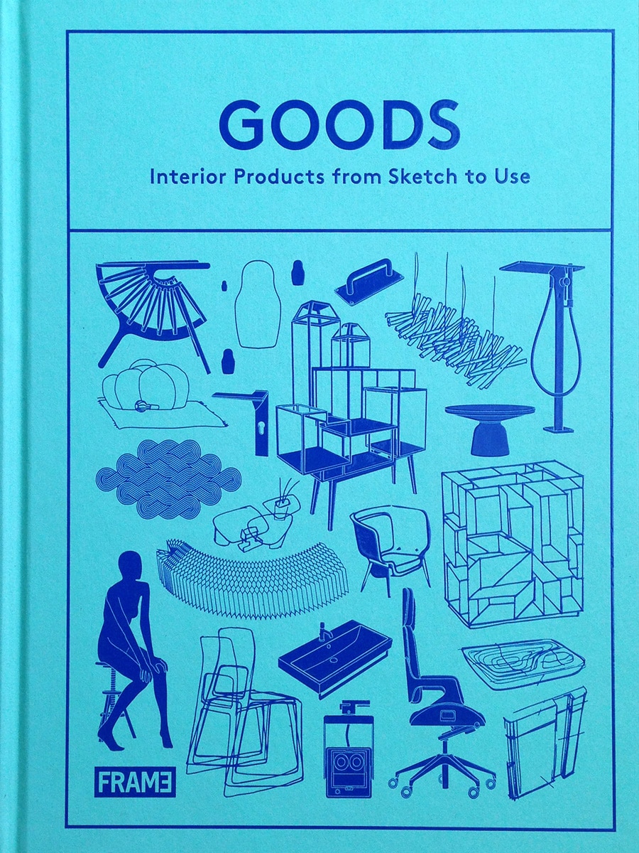
GOODS – Interior Products from Sketch to Use

GOODS: Interior Products from Sketch to Use is a comprehensive design reference book published by Frame Publishers, the Amsterdam-based publisher behind Frame Magazine, one of the world’s leading interior design and architecture publications. The book documents a curated selection of interior products in depth, tracing each object from its initial concept and design process through to its application in real interiors. Rather than presenting products as isolated objects, GOODS places them within the full arc of their development — sketches, technical drawings, material choices, prototypes and completed installations — making it a valuable resource for designers, architects, manufacturers and design educators alike.

The book is organised by product category and section, with each featured product receiving substantial editorial space: a dedicated specification page, design narrative, process documentation and multiple installation photographs. The “Space in Space” section, in which Bloomming’s Facet room divider appears, focuses on products that define, divide or transform interior space without relying on conventional walls or fixed architecture.

Facet by Bloomming

Facet is featured across pages 346 to 353 of GOODS, making it one of the more extensively documented products in the book. The entry opens with a full-page installation photograph — a large-scale Facet installation suspended in a private villa in Waalre, the Netherlands, completed in 2010 — before moving to a structured specification page that records the essential product details:

Product: Facet Designer: Bloomming Manufacturer: 3form Year: 2009 Colour: White (or any colour on request) Dimensions: 34 × 34 cm per module, customisable Materials: PC/ABS, aluminium, stainless steel Section: Space in Space

From Sketch to System

True to the book’s editorial premise, the Facet entry traces the product from its earliest design phase. Early sketchbook pages are shown alongside initial concept drawings, revealing how the designers explored the geometry of the faceted diamond-shaped leaves and the modular connector system from the outset. The book notes that the design concept started from a more static vertical idea before Bloomming developed it into the fully flexible, three-dimensional modular system it became.

The technical pages explain the construction logic in detail. Facet consists of only five components. The screen is suspended from the ceiling via rods of stainless steel, to which injection-moulded PC/ABS connectors attach. These connectors — available in two-point and three-point variants — allow the honeycomb-shaped leaves to be assembled into configurations of virtually any size and form. The connection tube slides over the connectors during assembly, locking the frame into place. The faceted leaves clip into each slot individually, giving installers precise control over density, pattern and light behaviour. All materials adhere to strict sustainability guidelines, and the PC/ABS plastic used for the connectors is fully recyclable.

The Faceted Leaves Manipulate Light and Shadow

A recurring editorial theme throughout the Facet pages is the product’s relationship with light. The book emphasises that the three-dimensional geometry of each individual leaf — its angled, faceted surface — actively catches and redirects light, creating shifting patterns of shadow and highlight across the screen and the surfaces behind it. This quality changes throughout the day as natural light moves, and varies depending on viewing angle, making Facet a dynamic rather than static element within an interior.

A grid of photographs showing Facet installed in a residential apartment in Eindhoven, the Netherlands, illustrates how different configurations of the same screen produce noticeably different light effects. The installation, photographed by Bart Boon, shows the screen used as a room divider between a kitchen and living space.

Installation Across Scales and Contexts

The GOODS entry for Facet is notable for the range of installation contexts it documents. Alongside the residential Waalre villa and the Eindhoven apartment, the book presents Facet installed in a number of commercial interiors, demonstrating the product’s scalability and adaptability:

The IBO office in Helmond, the Netherlands, designed in 2011 by NR Interior Architecture, features Facet as a large-format wall screen within a contemporary workspace interior. Le Dôô restaurant in Sprang-Capelle, the Netherlands, designed by Dosis, shows Facet as a feature wall element within a refined dining environment. The El Rincón Bar & Lounge of the Four Points by Sheraton Barcelona Diagonal hotel, completed in 2011, features Facet as a decorative screen integrated into the hotel’s bar and lounge interior. The restaurant of the Dutch Design Hotel Artemis in Amsterdam, the Netherlands, shows Facet installed as part of an exhibition in 2003 — one of the earliest documented applications of the product in a hospitality setting.

A sidebar within the spread lists further interiors that have featured Facet, including the Clarion Hotel in New York (United States, 2011), MKGest in Japan, Monolith Lounge in Spain (2010) and an exhibition at the Van Abbe Museum in Eindhoven, the Netherlands (2010).

Space in Space: The Editorial Context

The section heading under which Facet appears — “Space in Space” — reflects a broader editorial argument that GOODS makes about contemporary interior design: that wall-less spaces have become a highly desirable interior environment, and that products capable of creating spatial definition without permanent construction are increasingly valued by architects and interior designers. Facet is presented as a leading example of this approach: a product that can define zones, manage acoustics, filter light and introduce architectural character, all without a single fixed wall.

The book notes that Facet can adapt to all interior spaces, from small residential applications to large-scale commercial projects. Weighing approximately 4,500 grams per square metre, it is described as equally suitable for permanent installations and temporary or event-specific settings, since the system is as easy to disassemble and relocate as it is to install.

Publication Details

Publication: GOODS – Interior Products from Sketch to Use Publisher: Frame Publishers Product featured: Facet Room Divider Pages: 346–353 Section: Space in Space Year of publication: circa 2012–2013 Designers: Bas van Leeuwen & Mireille Meijs Company: Bloomming Manufacturer: 3form Category: Interior design product reference book

Why this feature mattered

GOODS represents one of the most thorough editorial treatments Facet has received in any publication. Unlike magazine features or award listings, the book’s format allowed for a complete account of the product: its origins, its technical logic, its material composition and its performance across a diverse range of completed interiors. Being selected for inclusion placed Facet alongside a curated set of products that Frame Publishers considered to represent the standard of interior design at that moment. The depth of the entry — seven full pages, spanning sketch material, technical diagrams, specification data and multiple installation photographs across residential, hospitality and commercial contexts — provided an authoritative and lasting document of Facet’s design intelligence and its real-world application.