Category

Trendbook

Swarovski Elements

By Trendbook

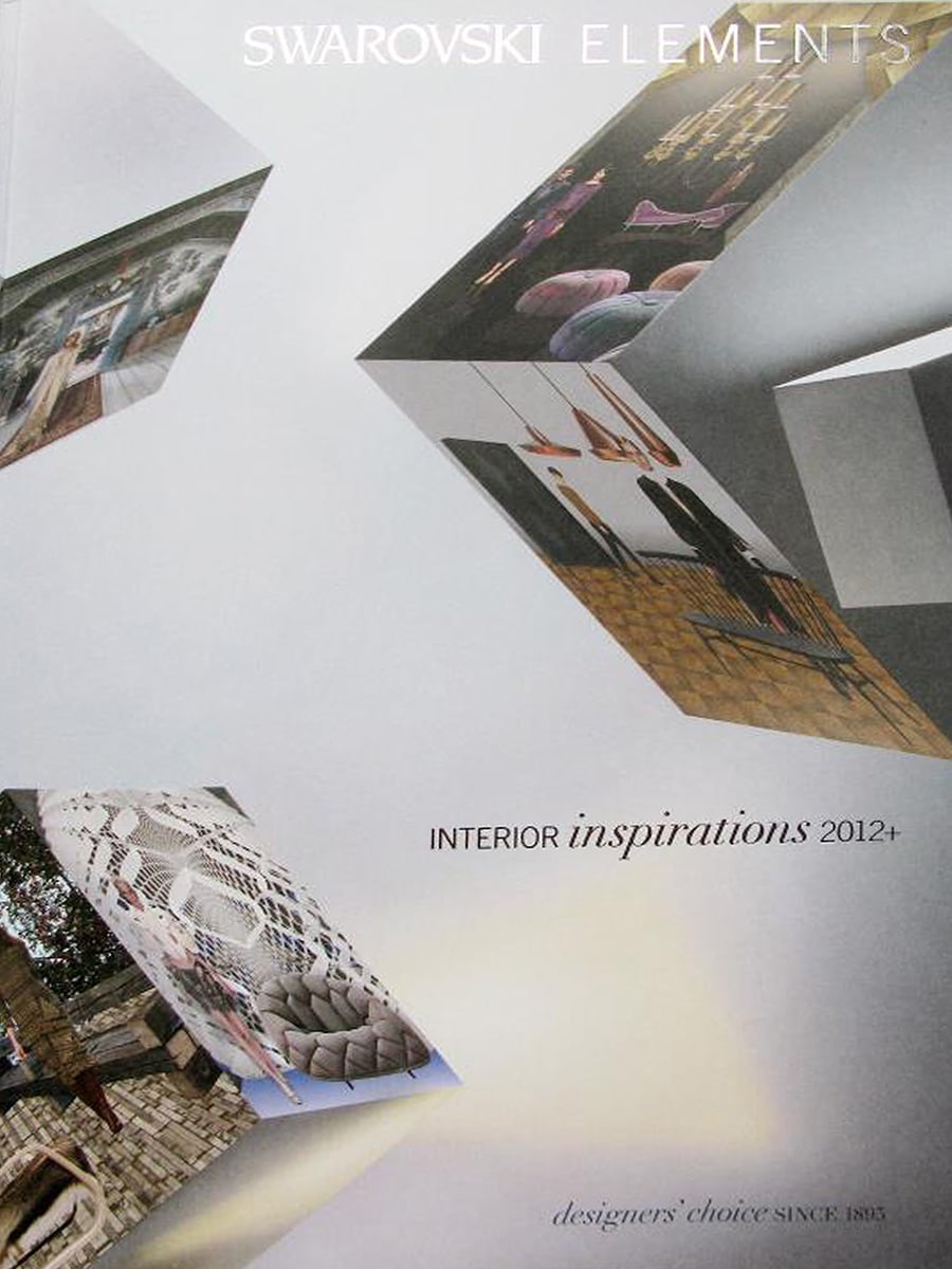
Swarovski Elements – Interior Inspirations 2012+

Progressive: Sharp Angles

In Interior Inspirations 2012+, the annual trend publication by Swarovski Elements, Bloomming’s Lightfacet was selected as part of the international trend forecast ‘Progressive – Sharp Angles’. The publication showcases emerging directions in interior design, materials, architecture and decoration, highlighting products and concepts that reflect influential design movements.

Progressive: Sharp Angles

The trend report focuses on the growing influence of angular geometries, faceted surfaces and fragmented forms in contemporary interiors. According to the publication, designers were increasingly exploring sharp lines, folded structures and geometric patterns that create dynamic visual effects through light, shadow and perspective.

Under the theme ‘Spaces and Furniture’, the publication states:

“Facets form complex mosaic patterns, angular silhouettes and faceted outlines.”

The report identifies faceted forms as a key visual language within contemporary interiors, where abstract sculpting and geometric structures create the impression of objects being fragmented and reassembled.

Lightfacet Featured as a Trend Example

Lightfacet appears prominently among the selected examples illustrating this international design trend. The publication includes a large image of the modular room divider and references it directly in the accompanying text.

Within the numbered descriptions, Lightfacet is identified as:

“Diamond-shaped dividers and decorations.”

Its inclusion places Bloomming alongside products, materials and concepts selected by Swarovski Elements as representative of emerging design directions for architects, interior designers and manufacturers worldwide.

Light, Pattern and Spatial Experience

The report emphasises how faceted structures create changing visual effects through light and shadow. This aligns closely with Lightfacet’s core design principle: individual modules can be rotated independently, allowing users to adjust transparency and create evolving patterns throughout a space.

Rather than functioning as a conventional partition, Lightfacet is presented as a decorative architectural element capable of influencing the perception of space through geometry and light.

International Design Recognition

Being included in a Swarovski Elements trend publication is notable because these forecasts are distributed internationally and are widely consulted by designers, manufacturers and trend forecasters. The publication does not focus on individual brands or products alone, but on identifying broader movements that are expected to influence future design and interiors.

The selection of Lightfacet demonstrates how Bloomming’s work resonated with larger international developments in geometric design, faceted surfaces and architectural ornamentation.

Publication details

Publication: Swarovski Elements – Interior Inspirations 2012+
Publisher: Swarovski Elements
Year: 2011/2012
Trend Theme: Progressive – Sharp Angles
Product featured: Lightfacet
Studio: Bloomming
Designers: Bas van Leeuwen & Mireille Meijs
Category: Interior design trend forecast

Why this feature mattered

Unlike traditional editorial coverage, Interior Inspirations 2012+ positioned Lightfacet within a global design trend rather than presenting it as a standalone product. Its inclusion confirmed that Bloomming’s modular room divider embodied key themes that were gaining international relevance: faceted geometry, spatial flexibility, light manipulation and architectural pattern-making. Through Swarovski Elements’ worldwide trend network, Lightfacet became part of a broader conversation about the future direction of interior design.
Bloomming_StyleGuide-1

Style Guide

By Trendbook

Style Guide Home – Perscentrum Wonen / Woonmodetrends

Style Guide Home is a Dutch interior trend publication produced by Perscentrum Wonen, the Netherlands’ central press centre for the home and living sector. Published twice a year, the Style Guide Home presents the Woonmode (Living Fashion) trend report — a curated overview of the most current interior styles, colour directions and product trends, compiled in collaboration with international design fairs, new interior collections and experts in interior design, photography and styling. The publication is distributed to retailers, interior professionals and media, and serves as the official trend reference that underpins national media coverage of interior fashion across newspapers, magazines and online platforms. Its purpose is to inspire consumers to shop for home products more frequently, and to give retailers the visual language to confirm these trends at point of sale.

Facet by Bloomming in the Indigo Blauw Trend

Within the Style Guide Home, Facet by Bloomming is featured as a key visual element within the “Indigo Blauw” (Indigo Blue) trend chapter. This trend is characterised by the keywords indigo blue, black and white in balance, East and West, symmetry and order — a direction built around clarity, geometric structure and the interplay between Eastern and Western aesthetics.

Page 33 of the publication, within the Oost & West (East & West) section, presents a full-page styled interior photograph in which Facet serves as the hero backdrop. The image shows a large white Facet screen installed against a vivid blue wall, with a Japanese-inspired tabletop arrangement in the foreground: a black lacquer vase with cherry blossom, a white ceramic teapot, a small pink teacup, a round white lacquer box and a dark oval tray. The composition deliberately echoes the East-West tension of the trend, with Facet’s geometric, almost origami-like faceted surface reinforcing the symmetry and order theme at the heart of the colour story.

The same image also appears on pages 6 and 7 of the publication as one of four photographs used to introduce the Woonmode concept overall, where it is cropped and placed alongside images representing other trend directions in the issue. This gives the Facet image double visibility within the publication — once as a trend chapter opener and again as part of the editorial introduction to the full Woonmode report.

The Role of the Style Guide Home

The Style Guide Home occupies a distinctive position in the Dutch interior media landscape. Because it is produced by Perscentrum Wonen — the organisation responsible for coordinating interior trend communication across national media — the imagery and products selected for the Style Guide become the visual reference for a broad cascade of editorial coverage in Dutch newspapers, consumer magazines and retail communications. A product selected for use in a Style Guide Home trend photograph is therefore likely to appear repeatedly across multiple media outlets and retail point-of-sale materials as the trend is communicated to consumers throughout the season.

The availability of point-of-sale material derived from the Woonmodetrends — including banners, posters and digital advertising files — meant that the Facet image could appear in physical retail environments across the Netherlands, further extending the reach of its inclusion beyond the print publication itself.

Publication Details

Publication: Style Guide Home – Inspiratie voor Interieur & Styling
Producer: Perscentrum Wonen / Woonmodetrends
Trend chapter: Indigo Blauw / Oost & West
Pages: 6–7 (intro) and 33 (full-page feature)
Product featured: Facet Room Divider
Designers: Bas van Leeuwen & Mireille Meijs
Company: Bloomming
Category: Dutch national interior trend guide for retail and media professionals

Why this feature mattered

Inclusion in a Perscentrum Wonen Style Guide Home was one of the most strategically significant forms of editorial placement available to a Dutch interior product. Unlike standard magazine features, selection for the Woonmode trend report meant that Facet became part of an officially coordinated national trend narrative, with the potential for its image to cascade across print, online and retail channels throughout the season. The prominent placement of Facet as the lead visual in the Indigo Blauw / Oost & West trend chapter — and its additional use in the publication’s editorial introduction — gave Bloomming’s product exceptional visibility within a publication designed specifically to shape consumer behaviour and retail presentation across the Netherlands.

Bloomming_FacetDesignTrendbook-1

Facet Design Trendbook

By Trendbook

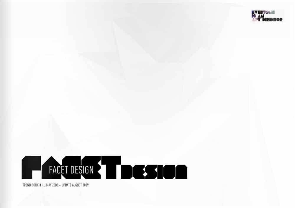
Trend Book #1 – Lightfacet by Bloomming

Everyone Is An Art Director – Trend Book #1 is a curated publication that explores emerging movements, geometric aesthetics, and vanguard design concepts. Titled “Facet Design,” this specific volume focuses heavily on the rise of faceted, crystalline, and modular polygonal shapes across industrial design, architecture, and visual arts. Distributed as an industry reference for forward-thinking designers and trend forecasters, it catalogues products that break away from traditional flat surfaces to embrace multi-dimensional, light-shifting geometry.

Lightfacet by Bloomming in Trend Book #1

Within Trend Book #1 (May 2008 • Update August 2009), the Lightfacet room divider system by Bloomming is prominently featured as a prime example of the “Facet Design” movement. The publication highlights the modular system’s capability to transform interior spaces through its sharply defined, geometric structure.

The feature illustrates the inherent synergy between the product’s form and the trend book’s core theme. The visual presentation includes three key components: a lifestyle application showing Lightfacet as an elegant, free-hanging room divider in a modern interior, a striking macro close-up detailing the interconnected, diamond-shaped facets, and a clean technical rendering showcasing its ceiling-mounted installation method. The layout emphasises how the product utilises modular repetition to create a larger, dynamic architectural installation.

The “Facet Design” Context

By categorising Lightfacet under the umbrella of “Facet Design,” the publication frames the product not merely as a decorative partition, but as a vanguard representation of a shifting design paradigm. This design movement relies heavily on how light fractures and behaves across angled, three-dimensional planes. Lightfacet perfectly encapsulates this ideology, serving as a physical manifestation of a trend where mathematical precision meets functional interior architecture.

The Role of Everyone Is An Art Director

“Everyone Is An Art Director” serves as a highly specialised platform for identifying cutting-edge design trends before they enter mainstream production. By publishing trend books that focus on singular aesthetic and structural phenomena—such as faceting—they provide critical inspiration and creative direction for architects, interior stylists, and product developers worldwide.

Publication Details

  • Publication: Trend Book #1 (Everyone Is An Art Director)

  • Title: Facet Design

  • Date: May 2008 (Update August 2009)

  • Product Featured: Lightfacet

  • Company: Bloomming

  • Category: Design Trend & Trend Forecasting Publication

Why this feature mattered

Inclusion in Trend Book #1 early in the product’s lifecycle (2008–2009) was a vital piece of industry validation for Bloomming. It positioned Lightfacet at the absolute forefront of an emerging international design trend. Being selected by a trend-forecasting publication confirmed that Lightfacet’s modular, diamond-faceted geometry was setting the benchmark for the future of interior architecture, cementing its status as an innovative, trend-defining product for high-end modern spaces.